I would like to have the dark mode theme from version 3.5.1 back.
The theme from version 3.5.1 was permanently integrated in Audacity? Is it possible to get it as a user theme?
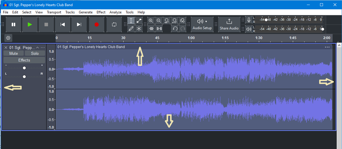
In Windows, all buttons in the new Dark Theme have white corners. It all looks very jarring. Not so on Themes - Audacity Manual.
In the new Dark Theme, the windows or some displays have this thick border, as if someone were shouting, here, here, look.
The waveform colors also do not work with the new Dark Theme. They barely stand out from the background.
In almost every text editor it is possible to change the colors - couldn’t we do the same? Shouldn’t that be possible for the waveform at least?
The new waveform is only monochrome? Why is that? Or is this a mistake on my part? If that’s what you want, it’s not a good idea from my point of view. How about frequency information in the waveform?
Custom themes are always totally broken for me, or is that due to Windows?
Couldn’t you add a user theme that works and that the user can change themselves in case of doubt?
Function goes before appearance, but a slightly more appealing design would be nice. User-friendliness can also be improved!
You’re right, the dark them did not have the white corner dots in earlier alpha test versions of 3.6.0 when I screen-shotted the images for the Themes page.
That’s because RMS display is now turned off by default.
The old theme and changing the waveform (important) worked, thanks for that too!
Please also note the thickness of the border for the currently selected track, time toolbar and selection toolbar.
My suggestion would be to make it half as thin and use a darker gray instead of white.
I understand that this is a matter of taste, but I see no reason to emphasize these areas so much.
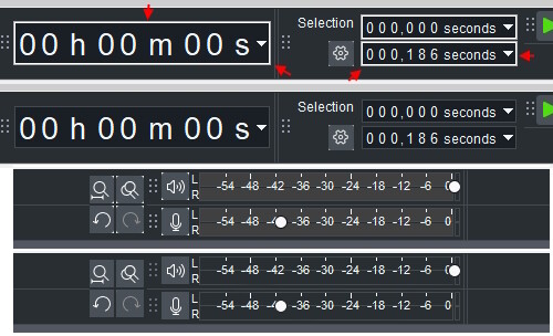
For the Recording Meter Toolbar and the Playback Meter Toolbar, the gray background seems to come from a different theme?
Maybe the same color as the toolbar?
As I said, it would be nice if we could perhaps set some colors ourselves in the future. Perhaps in a current user theme.
Yes, exactly, I meant Focus Border. The border draws too much attention to itself with the new color. If you want to keep the color, I would make the focus border a little thinner or darken the color.
I’m also talking about the time toolbar and selection toolbar. Why are they highlighted like that?
This gray does not appear anywhere else and is disruptive.
Some places just draw too much attention to themselves and are distracting, you know what I mean?
When do you anticipate fixing the white corners? The dark theme looks so much better in the Mac version, as the windows version design looks outdated. Looks like a Windows XP interface. Why can’t you make the Windows version visually the same as the Mac, especially with the colour scheme? May I make some suggestions in the design of the UI? The white scroll bars at the side and bottom are aesthetically ugly. Same with the white background of the menu bar at the top. The thick white borders in the time toolbar and selection toolbar are overbearing. Dark theme should not have any white background. Make the UI slightly darker like the Mac version. Make all rectangles in the UI with rounded corners for a more modern look. Make the background of the waveform darker to contrast better against the waveform. Change the generic Arial font to a modern Helvetica Neue font like it shows in the Mac version. As suggested by Kaji in this thread, perhaps an option for the user to colour the UI however they wish as well as an option to change the font.
Why can’t you make the Windows version visually the same as the Mac
Due to technical limitations of wxWidgets and the Windows APIs it uses. Some parts of the UI we currently have no control over, and that shows especially in the dark theme. Audacity 4 will use a different UI framework which doesn’t have this issue.
Maybe in a year, maybe two. We’ve made the releases since 3.0 in a 3-way split between new feature releases, refactoring and preparatory Audacity 4 work. After this release, we’ll be focusing most of our attention towards making Audacity 4 happen.
Thank you once again for the prompt replies. Will look forward to the release of Audacity 4. Keep up the great work. You mentioned you would fix the bug of the white corners by today. Will there be an update released at some stage today?
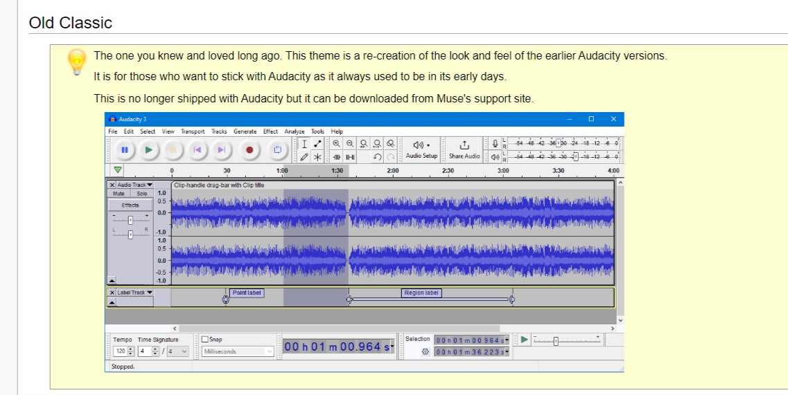
Excuse me, I would like to have the classic theme from version 3.5.1 back. What should I do for it? From the discussion I didn’t quite understand. Can you add it to the dropdown list in “Interface” - “Themes”, for example: classic old, classic2 or something like this. Because the present classic is not quite the same as the old classic, they someway differ.
I’ve read, I still don’t understand. Why “download it” from anywhere, it’s easier just to choose in user interface. Please, restore! Because in the new one the bright-white color of selection strikes the eyes.
Despite having the default Dark Mode throughout Windows 11 and Dark mode in Audacity, why does file explorer open in light mode when opening a file in Audacity?
They open a different file explorer. The file explorer that can be customized with public Windows APIs is only available in light mode, and also doesn’t have modern features like search, typable address bars and favorites.
We’ll use the modern (uncustomized) one in Audacity 4.