My wife uses Audacity for editing conversations for different radio stations/broadcasts (basically zero music mixing/authoring/editing) for a good 20 years coming from CoolEdit… Kind of what we called radio broadcast journalism in the past before podcasts come along. She fixes speech defects or mispronunciations just editing the waveforms, I think it’s magic.
Anyway, in her use-case the waveform has much more signature than the headphones… yes, she uses headphones when working on the road or at home, but in a studio it’s all about those studio monitor speakers. Based on this I thought I might drop my 2¢ here, with the waveform, the capital ‘A’ and some headphones.. it might be too crowded with the gain meters also added. Audacity characters are just std, that should be more unique:


I like what calumk did - here is a slightly updated version:

I’m with this guy. I like the original. If you want to redesign it, at least let me “feel” the lightning or the signal. I want to feel it like a drop, or that dynamic intro blast in Fast as a Shark, or Aldo Nova’s Fantasy, or like this song right before the word “wire”, lol!: https://youtu.be/etyVsPdJCAg?t=177 .
Love the direction–everything about it! When II worked at Synopsys (previously Synplicity) we made the switch from some Windows to Linux porting tool (I’m old and the name slips my mind at the moment–maybe “Win-Something”) to Qt and I LOVED it. Qt was so much better. It was super-well documented and just what I consider code that is a pleasure to peruse! The only thing I hated was the opaque-pointers, but I did (sorta) get the rational–just didn’t think the bang was worth the (what I considered) very steep bucks, lol!
Anyway, it’s been years, but if y’all want any help w/ the Qt stuff or AI stuff, I could lend a hand here and there, although, I’m not the greatest coder in the world. Maybe just tell me to debug something. I’m decent at the detective work for an old man, lol!
Thank you so much for everything you are doing with Audacity 4. I love EVERYTHING I heard in the video. FWIW, I am the minority guy that WOULD like to see more DAW features, but I also totally don’t want to make Audacity any more complicated. When CoolEdit (sp?) first came out, I thought it was VERY kewl! The mouse just did what I expected it to do. I think Audacity 4 is going to feel like that to me, too AFAICT.
Love Y’all!
Mark
My main issue with this is that it says “adudacity”.
It’s a nice logo, but one I want to buy hiking boots and a parka from, not edit my audio with.
Yes, I’ve pointed that out in the full breakdown.
Hey everyone,
Audacity has always been one of my favorite audio tools, so I wanted to try a modern logo concept for fun. As a graphic designer, I felt the current branding could push the audio identity further while still keeping the recognizable vibe.

Would love to hear your thoughts and feedback ![]()
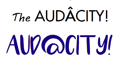
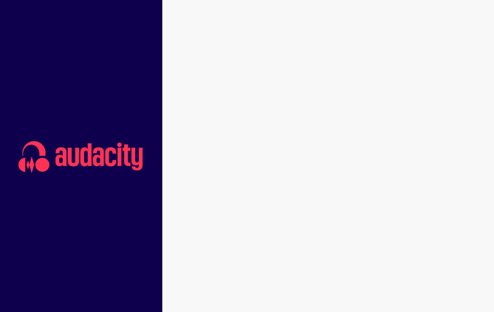
Hi there, I’m new here and just wanted to share what I thought would be a nice logo. I think the one they’re using now for Audacity 4 is lacking too much of the old style. PS - I wasn’t able to find the original font.

…And that is no less “AudAcity” related!
I can’t draw!
But I can SEE “AudÂcity!” with an exclamation mark + headphones over the middle “A”… which then becomes the logo.
This reinforces the meaning of the word itself - daring, adventurous, speaking truth to power, unbowed, etc. etc. with the emphasis on the “A” syllable (even stronger), and while incorporating the headphones on the middle “A” – and “A” is also the first letter so the logo stands for that too.
The word now means something, it is symmetric with the headphones in the middle, the logo fits (or can be made to) with the group style. Everything fits. ![]()
Here I’m just fiddling with fonts (Futura, Luna & MV Boli) to attempt to communicate the idea –
I’ll see if I can get an AI to picture it.
Also, the cross in the  itself could have a simple “wave” built into it, between the headphones.
I’m with you.
Yes, simpler, but also, put that logo in the middle “A” adding the emphasis & the meaning of actual “audacity”, which no other logo does as far as I’ve seen. (I’d also add a “!” at the end to further emphasise it.![]() )
)
I mean, why the name “Audacity” at all if its actual meaning isn’t conveyed in the logo?

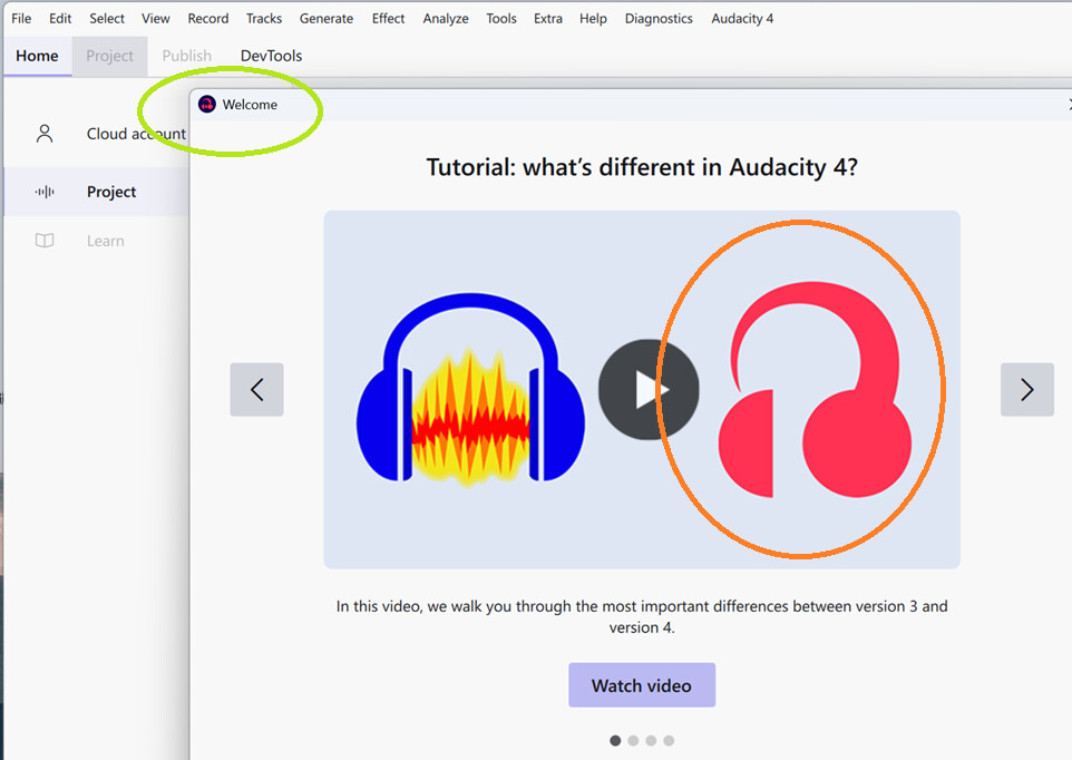
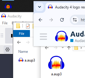
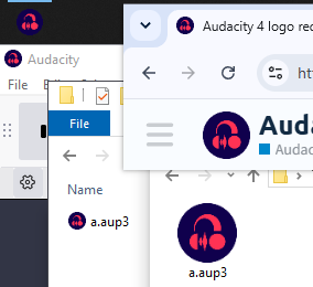
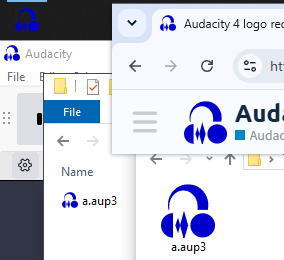
Yes, but not entirely consistently yet. This is from the latest nightly where
the icon at top left is the new log but the big one on the splash is still the old one:
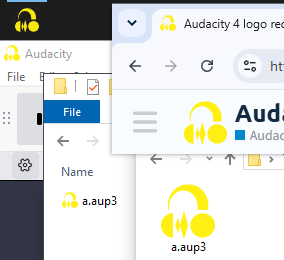
A new logo is the way to go. The old seems very outdated. But the headphones alone is not to recognizable enough.
I tried out to implement the waveform on the headband and changed the color to mach the old one but took the yellow already used in the other programms. I think, two colors is the right choice. Whatever it will be at the end.
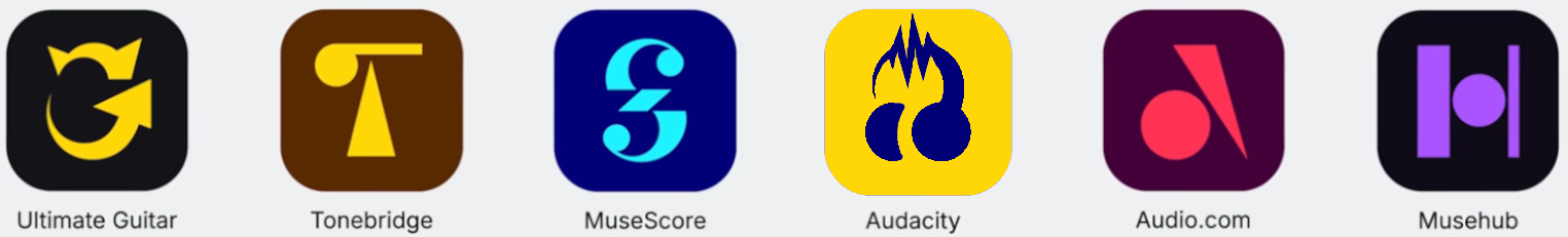
Between the other logos:
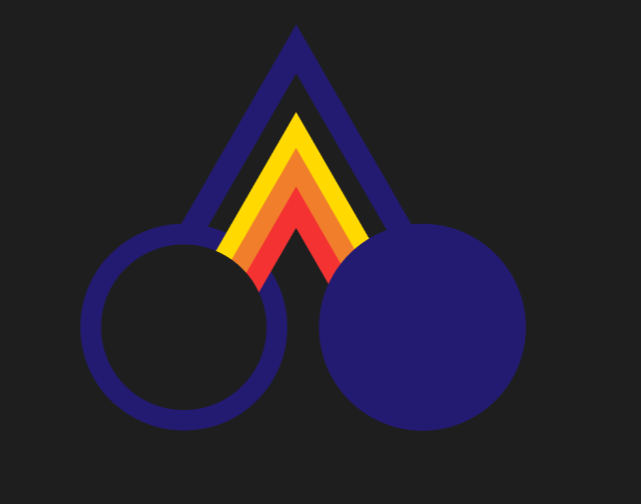
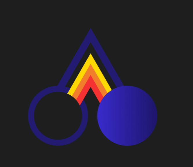
hey everyone , i tried going with simple shapes because why not,so the circles are ear pieces and the first triangle is that headband thingy which also works as the letter “A” and the sound waves,i went with triangles to keep that sharp look of the waves,i hope you like it ![]()

The May 2026 files: New iconography by grliszas14 · Pull Request #10868 · audacity/audacity · GitHub
![]()
![]()
![]()
![]()

Personally I care about the look of:
- the icon in my taskbar in Windows
- the top left corner window icon in Windows
- the icon of files in Windows Explorer
- the tab favicon of the forums in Chrome
- the logo at the top left of the forums website
Don’t care about the big version(s) that much.
Here’s a tool for testing the icons, more or less live:
Audacity Logo/Icon Tester
Turns out the May 2026 headphones are nearly perfectly square:
Perhaps they could be trimmed like this:
or like this:
at least for the icons where squareness matters and every pixel (square 16, 24, 32… pixel sizes) matters.
I had some fun with some of the designs:
from Audacity 4 logo redesign thread - #5 by LWinterberg
from Audacity 4 logo redesign thread - #9 by NicCrimson
from Audacity 4 logo redesign thread - #65 by hintoflime
Two non-serious attempts:
ouch.
P.S. the May 2026 design looks much better. Thanks for improving it!
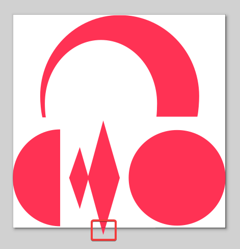
It’s good that a diamond-wave pattern was added. But, that’s exactly what I was trying to avoid in my Audacity logo concept. It’s one of those things you always want to watch out for when designing logos — make sure it doesn’t accidentally look like certain things people are known for drawing on walls.
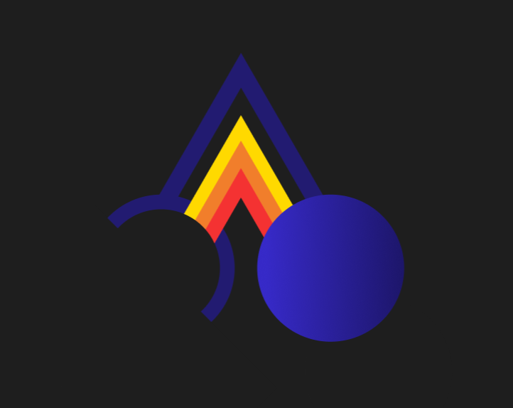
Audacity, please use my logo design or the concept based on my idea — connect the arc to the circle on the right so there’s no “bump”.