Tooke me a bit to get it. I had previously only noticed the male reproductive cell look of the circle-with-a-tail shape, which the May 2026 revision successfully eliminated.
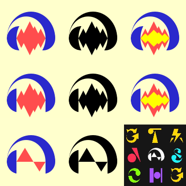
Very cool, I for one prefer your design over the May 2026 revision. Had some fun by throwing variations into Audacity Logo/Icon Preview Tester :
Here are my attempts, I prefer the top two rows but the bottom fits more with MuseScore icons
I tried to preserve the brand recognition of the classic Audacity logo by somewhat matching the shapes and by having a range of monochrome to the full 3 colors of the classic logo
I think both the official redesigns’s turned headphone earcup makes it unrecognizable as an Audacity logo which is a crime considering Audacity has brand recognition orders of magnitude stronger then MuseScore
And the current re-redesign still looks somewhat like a “swimmer” but now ALSO looks like the vary thing “swimmers” come out of… but hey it brought back the waveform!
Nothing needs changing, ever. People in this very forum are known to happily use 2.4.2, 3.1.3 or 3.6.4 without succumbing to ill effects. The only way to ensure audacity is getting only the changes you need is to fork it and cherry-pick the changes you like while discarding the others.
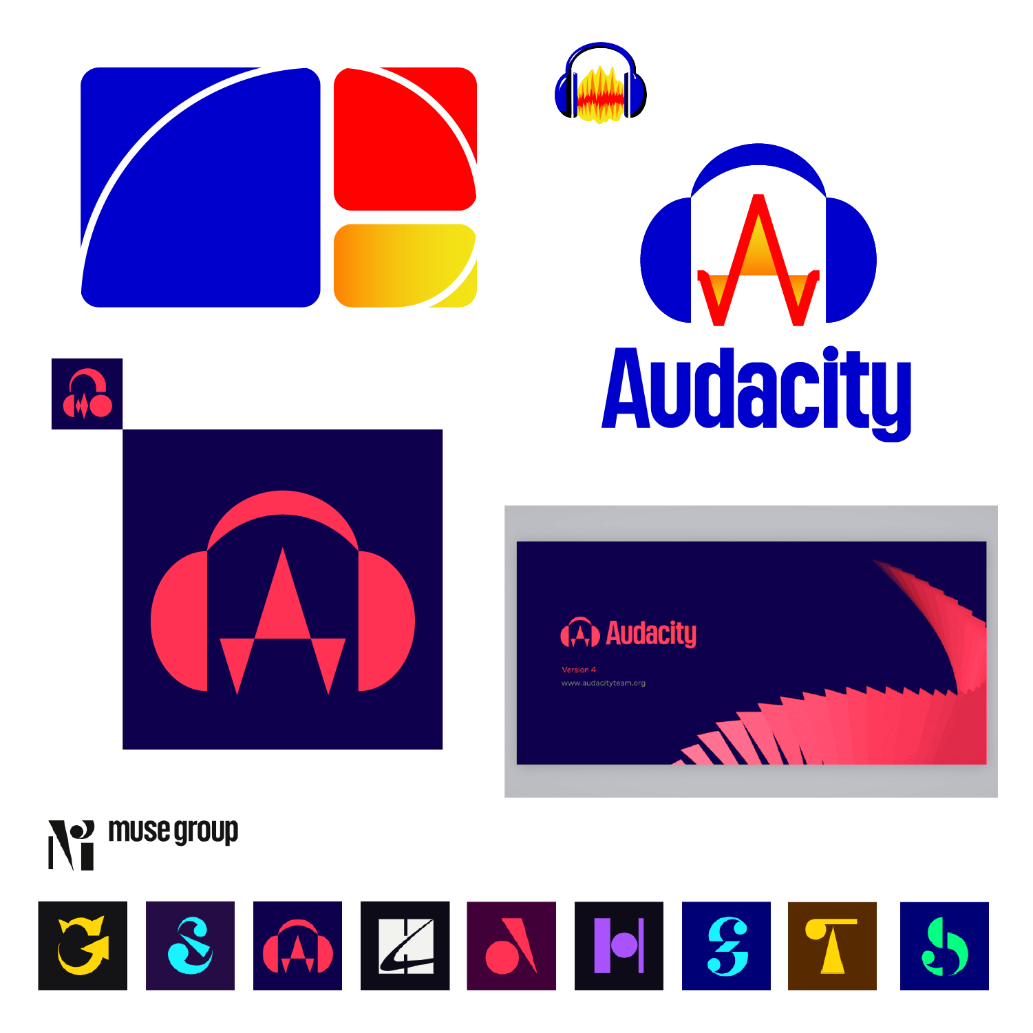
Hi! After spending far longer on this than I originally expected, I wanted to share my proposal for an Audacity 4 logo, and the thought process behind it.
Audacity’s identity is built around its classic, slightly bizarre logo, making it instantly recognizable and even endearing even though it’s a bit outdated (or maybe particularly because of it). I believe that uniqueness to be a strength far too great to abandon. The first thing I did was to highlight the elements that made the old logo iconic to me. I ended up deciding on three; the waveform, the color palette, and of course the headphones. I tried to reflect all that, staying as faithful as I could to the spirit of the original.
Next, I took a good look at Muse Group’s ecosystem and could also identify three common themes; all of them hint at the app’s initial, are built around basic shapes, and most also incorporate variable visual weight. Since the waveform is the element that needed the most work, I gave it a pointy uppercase “A” shape. Besides standing for Audacity, it also vaguely resembles a sinc function if you squint hard enough. I wanted to leave that nerdy reference for anyone to catch as a second layer of meaning, since it’s not really necessary on a first-glance reading. Later I noticed that the final result seems to take almost every shape of the current logo in Muse Group’s website and rearrange it in some way, which wasn’t really intentional, but I’m happy with the coincidence.
Lastly, I designed two matching versions of the same idea, as I’ve seen other people do here. One is meant to live alongside the rest of the Muse Group suite, while the second is for any other usage context. That looked like a solid decision since a single icon would have struggled to satisfy all those constraints while still staying somewhat refreshing and creative.
Let me know what you guys think! I’d like to keep improving what works and working on what could be improved.
I’m really loving this redesign challenge! As a long-time user, I’m a big fan of Audacity and I’m excited to contribute.
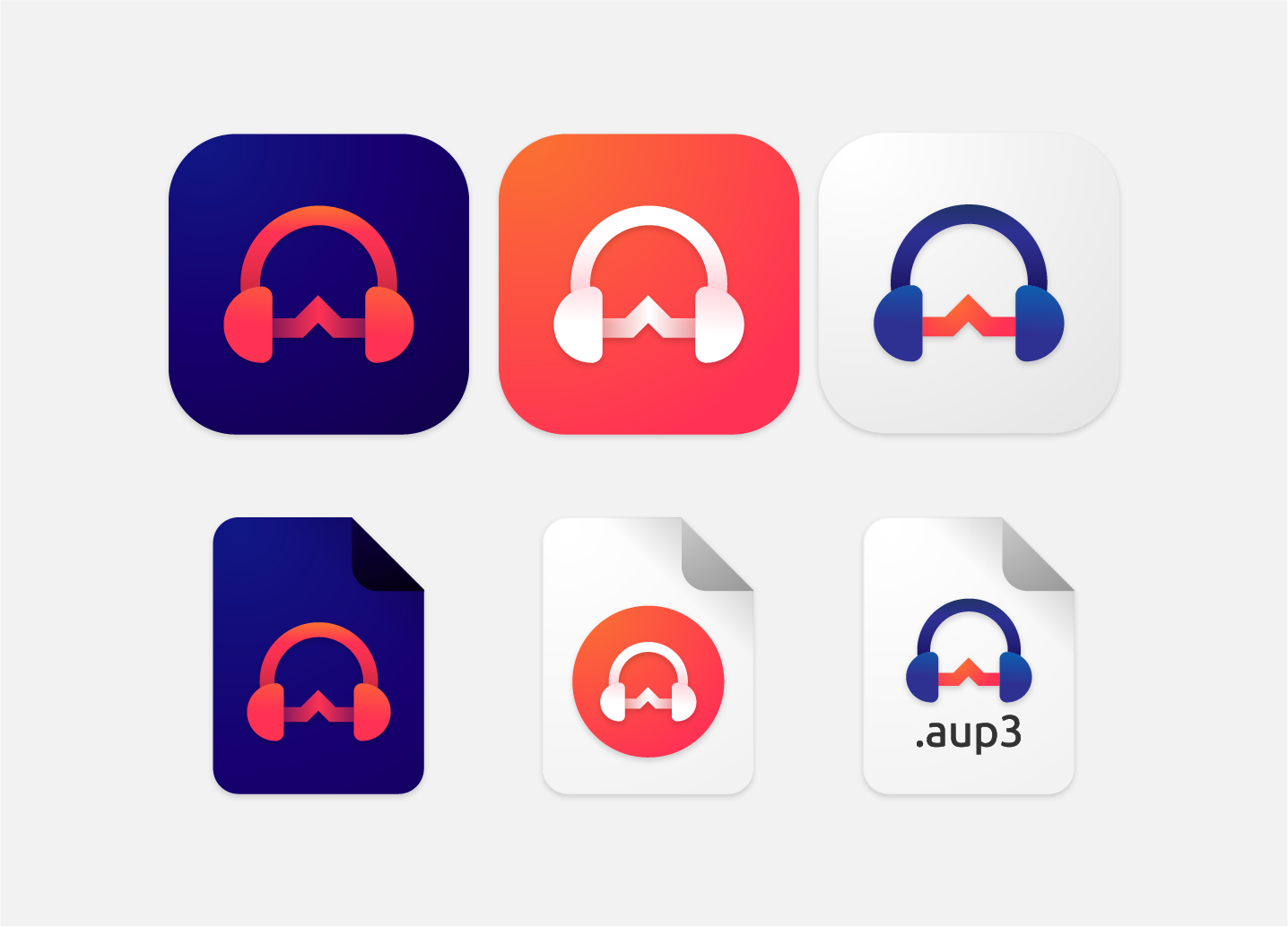
My main idea is to step away from the traditional flat look and try out a vibrant gradient style. Since flat logos are starting to feel a little outdated, I think a sleek gradient could really bring the Audacity icon into 2026 and make it stand out on modern home screens.