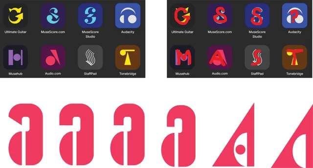
In the same vein as the old Audacity Logo Gallery, this is a space for everyone to post their Audacity 4 logo ideas
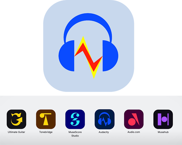
Hello! Just saw the video, great work! There was so much more going on under the hood than I was aware of! The UX improvements in particular were pretty slick! The rebrand, however, I was less enthusiastic about. There was definitely a loss in the Audacity identity, I feel, with the logo simplification. I would like to provide an alternate design for the logo, with a monocolored variant for when it is placed next to other MuseHub items. Let me know what you think! Hope the Audacity 4 launch goes well, and thank you so much for contributing to this amazing project!
AntiVector, you basically took the thoughts out of my head. I like your suggested icon/logo, too, though I think I prefer the original. If Zeus decreed the logo must be changed for the benefit of the winter harvest, then your revision would be perfectly fine.
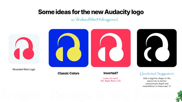
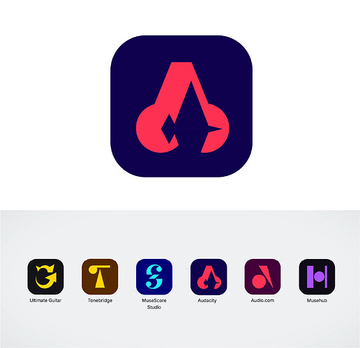
My thoughts on the rebrand logo are not very kind. It’s Corporate Memphis at its worst. The perspective is nonsensical (if the headphones are angled as the foreground earpiece suggests, then it’s impossible - or at least very unlikely - to slice the background earpiece into a perfect half-circle). It calls attention to the negative space, but there’s nothing in the negative space. The silhouette is like a Founding Father just woke up after sleeping on his side with his wig on.
The original logo may look very “Windows XP”, but, respectfully, so what? The Coca-Cola logo looks very 1900s, but it serves its purpose. Obviously, the point isn’t that the classic Audacity logo is as iconic as Coca-Cola, but that both are iconic in a way that the new logo just simply is not. A logo isn’t supposed to fit in on a shelf alongside other logos, it’s supposed to identify a thing. The old logo does that. Coca-Cola does that. George Washington’s Red Bedhead does not.
I’m not a developer, my participation in the Audacity community has been sporadic, but I am a user, and those are my “any”-key-looking-for, calling-the-monitor-the-computer, booger-eating user thoughts.
https://www.reddit.com/r/audacity/comments/1nv1bms/some_of_my_suggestions_for_the_new_logo/
https://www.reddit.com/r/audacity/comments/1nxjuko/logo_design_for_fun/
https://www.reddit.com/r/audacity/comments/1nxkwbf/some_quick_fun_logo_design/
This is my proposed design.
Full breakdown here:
https://www.reddit.com/r/audacity/comments/1nxv9y1/this_is_my_proposed_design_for_a_new_logo/
https://www.reddit.com/r/audacity/comments/1nxnrsp/my_take_on_the_new_audacity_logo_as_a_nongraphic/
from discord, message link
Hello, I don’t really like the official redesign and the redesigns here also didn’t quite catch my eye but they have the right idea with sticking more to the original so I came up with my own idea to a redesign. I believe something more like this would look good. It sticks to the original design when it comes to colors and doesn’t leave any elements from the original logo left out but makes it look slightly more up to date in my opinion. It’s more simple but not oversimplified and I think a lot of the attempts are a lil oversimplified. Feel free to share your opinion and contribute to finding the logo redesign that audacity deserves.
Hi all, I came up with this design. It drifts away a bit from the classic logo and the other ones in this thread, but I think it keeps with the spirit of the app. I also has a reference to the earphones.
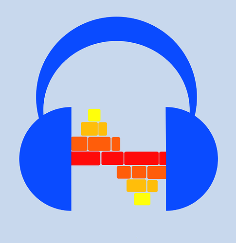
I have less of a submission and more a design concept to throw into the ether. Has anyone thought of recreating the waveform using the new colourful track blocks? (concept made from ~desecrating~ modifying AntiVector’s superb concept at the top of the thread) It’d make the space between the headphones look kinda like the workspace timeline. It probably won’t work in MuseScore mono tho…
I just watched Tantacruls video and read some of the comments under the video. Most of the critique for the new logo seems to be the missing waveform. I personally noted, that the current Audacity logo is the only one not resembling an initial letter of the MuseHub family. So this is my attempt of creating a logo in the new style with a waveform and resembling the letter A. I don’t think it’s perfect, as the left speaker on the headphone may look a bit weird, but I guess that happens if you try to encorporate too many aspects…
The old colors should definitely be kept, but if possible it would be nice to add a splash of the red and yellow of the original logo, although it wouldn’t match as well with the other logos in muse hub
gimp project file:
https://www.reddit.com/r/audacity/comments/1nxtz01/my_attempt_at_a_new_logo/
https://www.reddit.com/r/audacity/comments/1nxxqm6/logo_attempt/
I have to commend all of your attempts btw @here. As you can see, the Audacity logo is inherently tricky; it is simply difficult to make something that
- has a great shape,
- works well on small sizes (think: taskbar, or the little icon in this tab), and
- is audio-related.
As you can see with the logo gallery shared above, it’s been attempted many a time, but so far, I don’t think anyone (including Collins) have managed to come up with something that “just works”.
However, at least all of you are giving it an honest try on making a logo, as opposed to this anonymous AI enthusiast who completely flubbs the assignment (but makes 3x as many!) ![]()


