I know there’s going to be a logo change with version 4.0 but I’m a “practical person” and I don’t care about the logo.
I’m sure it’s fun and easy for the team because and they won’t have to bugs or anything… Just users who will complain. It should be a good distraction from all the hard work. (They do have to take care that it’s not too-close to someone else’s trademark.)
I remember many years ago when everybody was complaining about slow mail service. The U.S. Postal Service made a more streamlined logo… They made the logo faster!!! That cracked me up! The Internet says that was 1993.
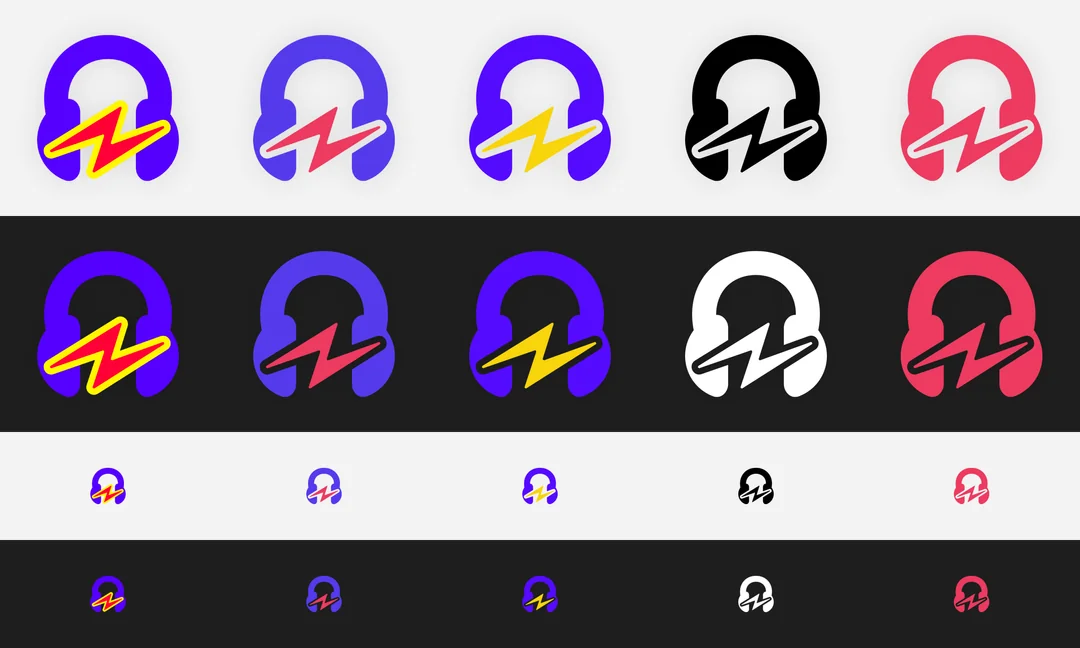
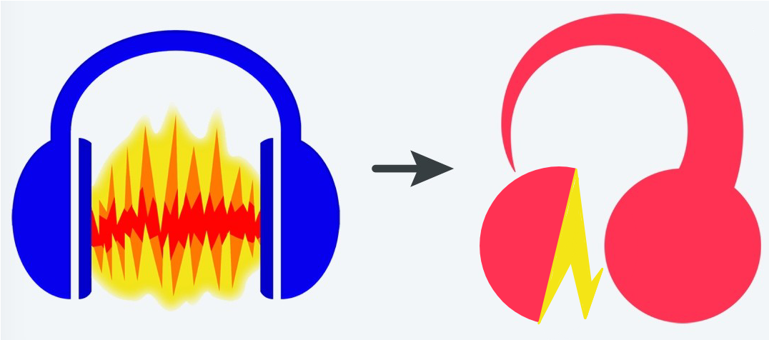
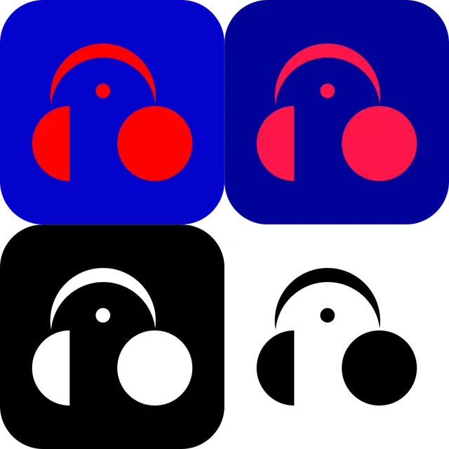
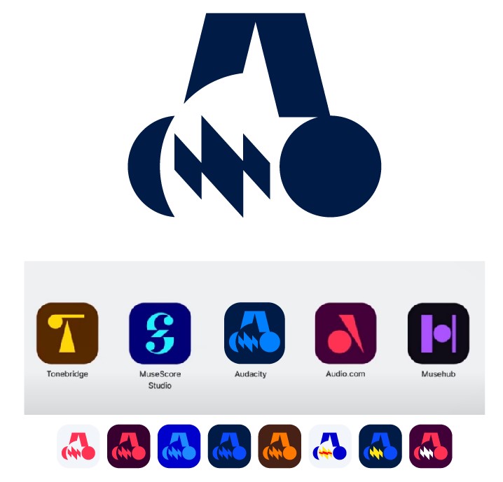
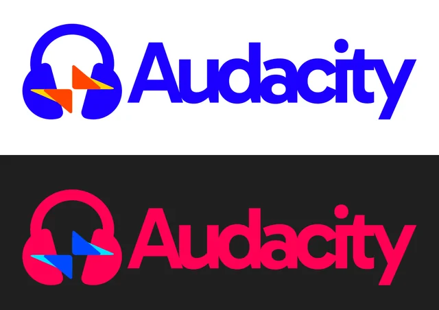
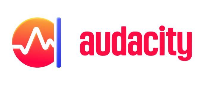
The new logo is shockingly different from the traditional one, but then I understood it was trying to match the MuseHub family. Still, I think there is something very odd about the proportions, perspective, and the “tadpole” shape.
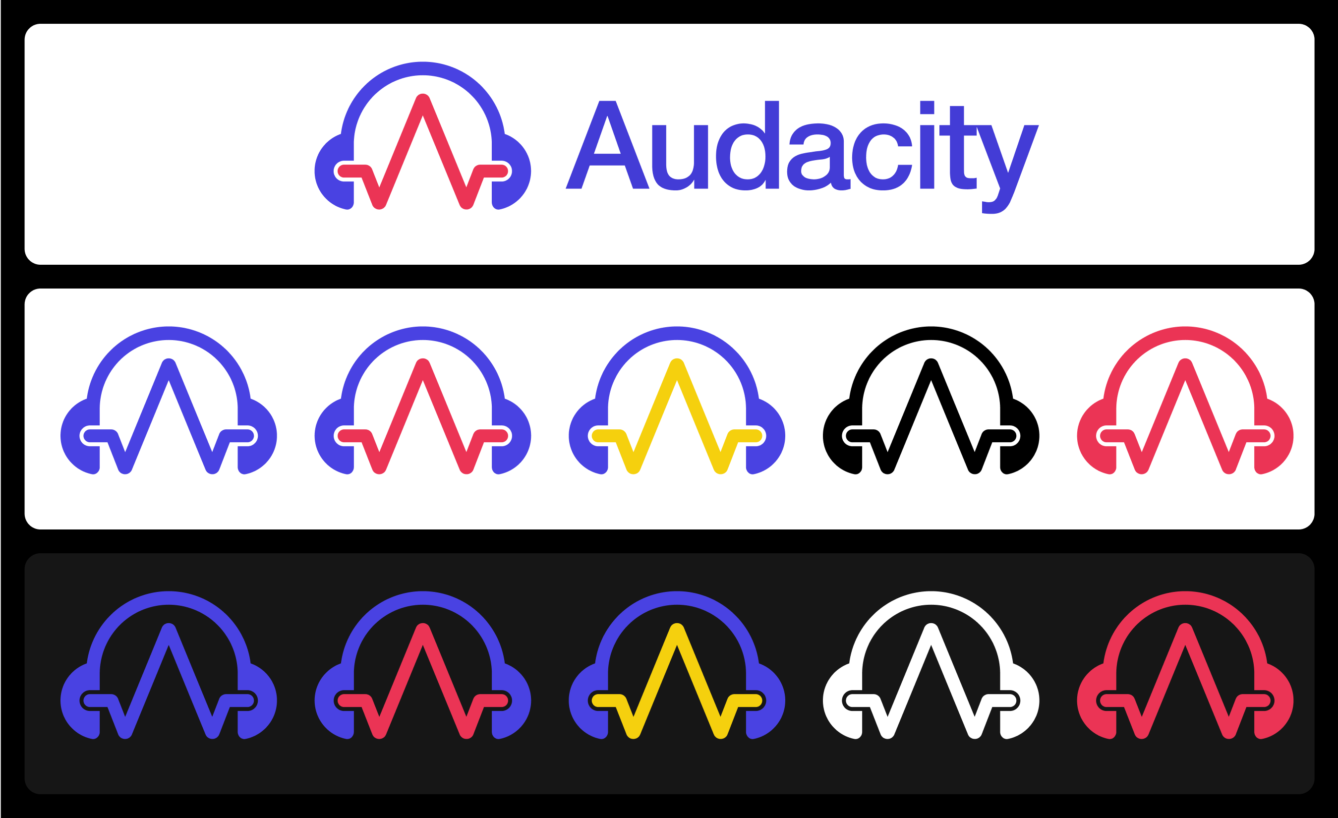
My suggestion is to try following these guidelines:
Connects with the MuseHub family
Resembles an “A” or an “a” (first letter of the product)
Includes at least one circular shape
Uses simple forms
Uses two overtone colors
Does not resemble an unsolicited d*** or a “tadpole”
Resembles the traditional logo (a headset with a wavelength)
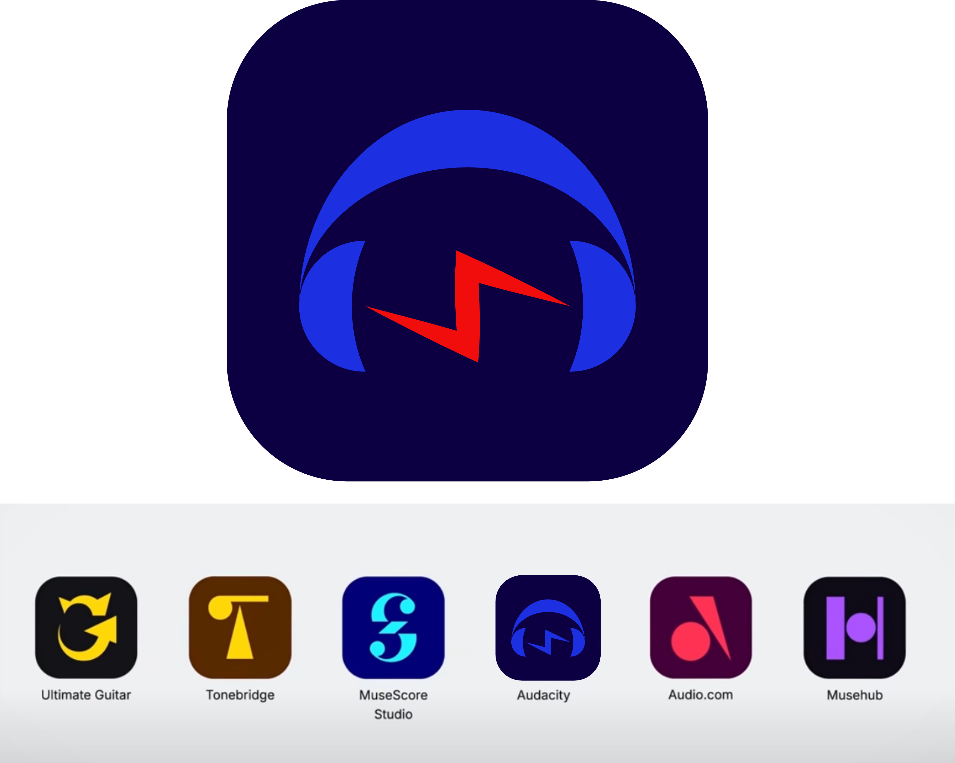
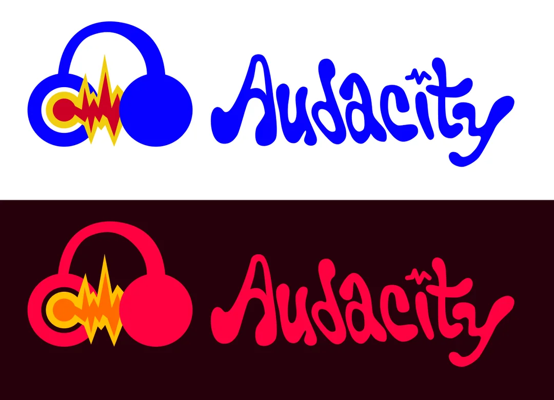
Had a crack at this myself when I saw the redesign — thought it could be interesting to try and show an ‘A’ in the waveform. Didn’t expect there to be so many people doing this! It’s cool to see and there are some really great ones here. I think other people have done a better job of still fitting with the Muse themes but might as well share my attempt anyway.
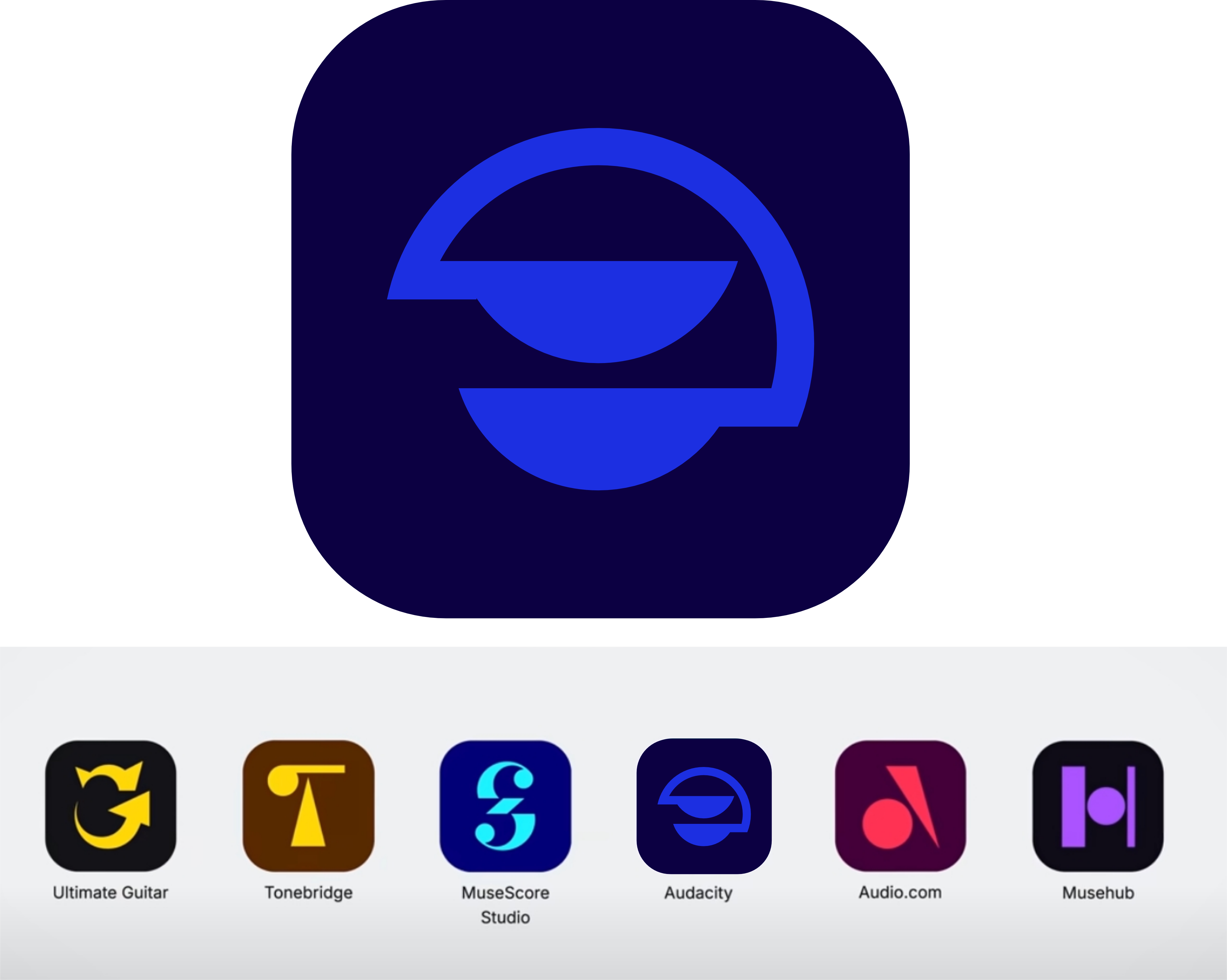
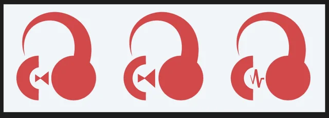
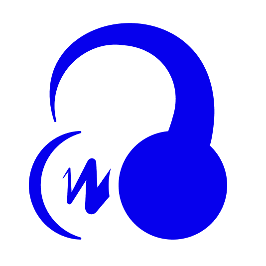
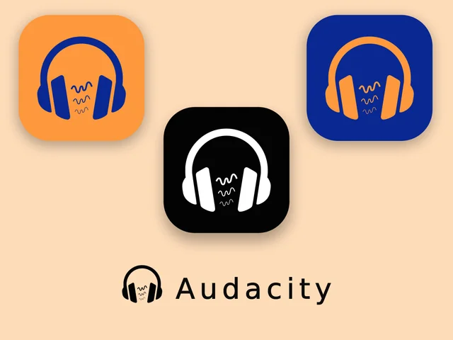
Because armchair logo / icon design is so much fun, I took a try at what an alternate direction than the headphones could be - e.g. keep the idea of the logo making an “a” but bring back a waveform element.
Here the waveform is getting clipped by an editing bar which I think speaks to the specific role of the program.
I also put it in colors reminiscent of the original for that nostalgia factor.
Just a quick take so I didn’t do much to resolve it with the wordmark - e.g. it’d probably make sense to prefer a single story A (ɑ) to match the play in the logo.
Hi I just watched the video and immediately felt, that it should not become napster or telekom or anything.
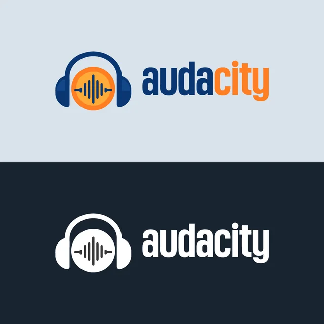
Audacity is blue
Audacity is written with a capital A
Audacity is no city
I think the headphones are less important than the 8-character-word (symmetrical length 4+4).
The old blue is too dark which makes it always look a little blurry, so a less saturated blue is required. Instead of the gradient it should be a two-tone logo with two similar shades.
I think the best guide for logo-development over time is Google. They never lost authenticity, while changing the logo over and over.
If Audacity becomes audacity that looks like AUDACITY, Audacity will die.