My take on it. I don’t think the headphones should stay, because headphones are not always “there” when people use audio tools. Maybe they use speakers, so headphones isn’t universal to audio. The waveform, yes. I don’t think that a logo always has to clearly show what the app does, but since most Audacity users seem to have a “thing” for the old waveform in the logo, I decided to keep it.
Here I shared some variations, including a gradient from the 2 colors from the old logo’s waveform, red and yellow. I also made the blue less saturated, which to me always felt a bit “off”.
Audacity definitely needs a new logo, and I think the old color scheme has to go, too.
Blue, yellow and red just don’t work together well. Also, the logo should of course be pretty much simplified from the original one. The suggested rebrand however is not recognizable as an audacity logo, because the iconic waveform between the headphones disappeared.
My suggestion would therefore look roughly like this: (quick mockup)
To maintain the big circle from the original new logo, which seems to be something to match the other logos, yours seems to be more appropriate so far.
Here’s my 3 approaches by just inverting the shapes (it feels more balanced to me, at least):
I watched Tantacrul’s video and wanted to show my take on redesigning the logo. (The program interface is in good hands.) Changing the logo of a popular program is an interesting challenge, so I decided to have a try.
I see the following conditions and requirements for the logo:
The new logo should be consistent with the original logo and retain the headphones and waveform, simple lettering, and bright blue, yellow, and red colors.
The new logo should have a consistent style with the logos of other Muse Group programs and use simple geometry: circles and triangles. The logo should be shaped like the letter “a” or “A.” The logo should look good in a single color, in the brand’s original contrasting color combination.
Since the Muse Group style is too radically different from the familiar Audacity look, my proposal includes an option with a different font that has a modern, light geometric design. The new style should be introduced gradually, replacing the shape, font, and colors one by one, so that over the course of several updates to v4, it will seamlessly blend in with all other products.
A separate post about this option, with more images.
I too have watched the video, and I must say that I’m very excited about the next version, everything looks amazing except the logo. For me, it’s not even the missing waveform … it’s the semicircle. So I’ve made a few adjustments, keeping in mind that the new design has to fit with the rest of the MuseHub items. In fact, I started with the new logo, and after a few tries, I realised that all that it needs is to make the straight line into a concave line, and the logo will look more like a pair of headphones, but also it will look way more like the letter “a“.
I’ve added the other variants to the image, because I personally really like the one with the red waveform and the headphones that have a hole in them (middle of the second row), but being an icon, less is more and all that.
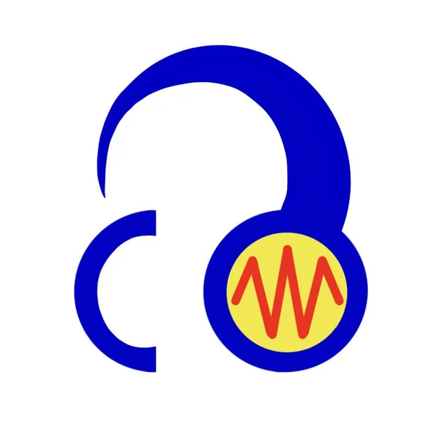
got bored, throwing in an unserious suggestion - i feel like people are both oversimplifying and overcomplicating things, i’m not sure where this is in the balance but i tried to take an angle i haven’t seen yet
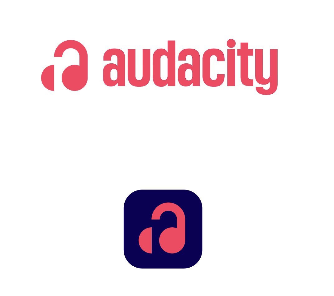
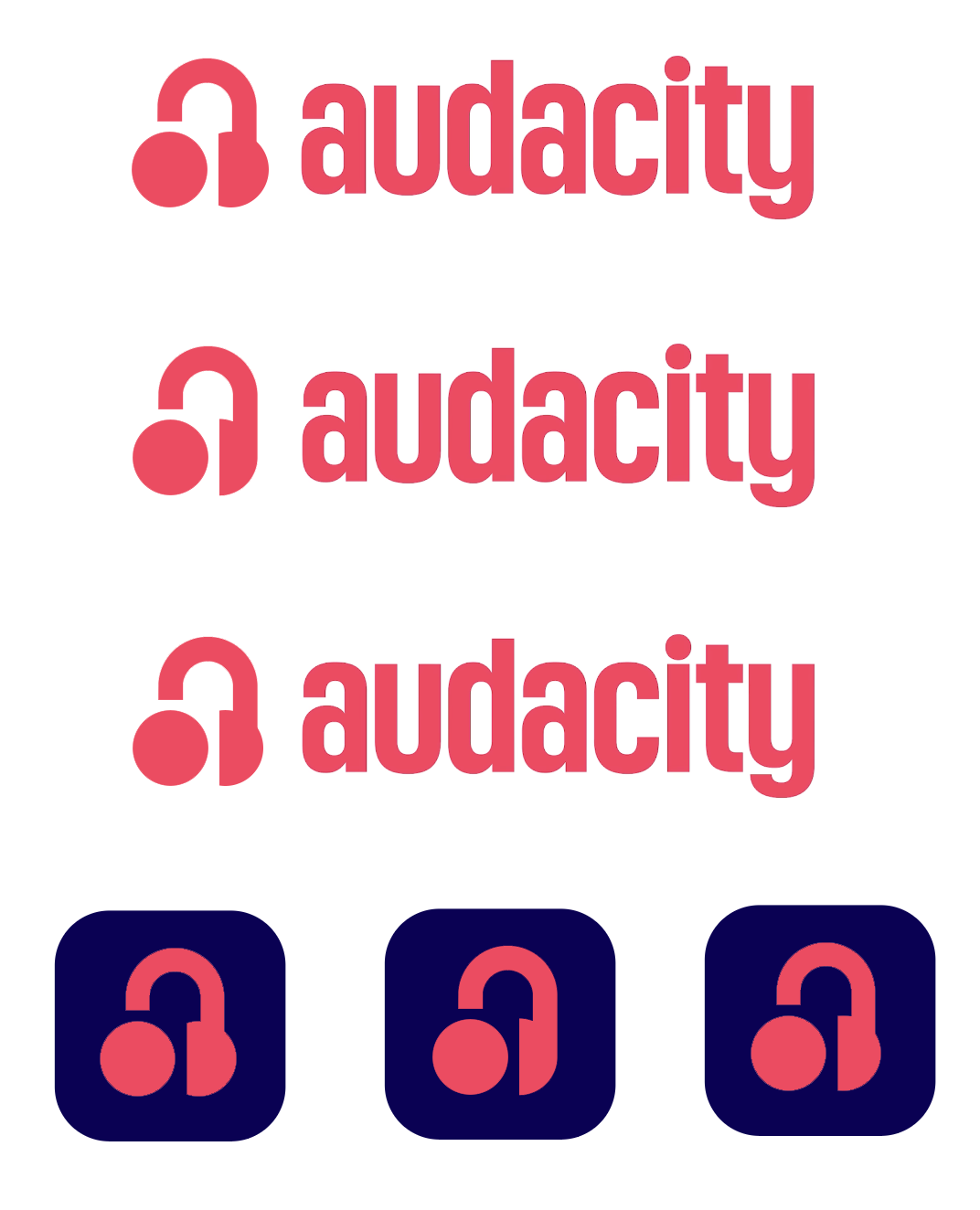
Here is my personal suggestion! Tried to keep it as close to the original muse branding as possible without any design incosistencies while also keeping the spirit of the original logo, I have three versions here:
Has a similar color scheme to the old logo (but could conflict with the musescore color scheme)
Copies the red color scheme from the proposed rebrand
Keeps the blue but makes it a little more distinct from the other muse group apps
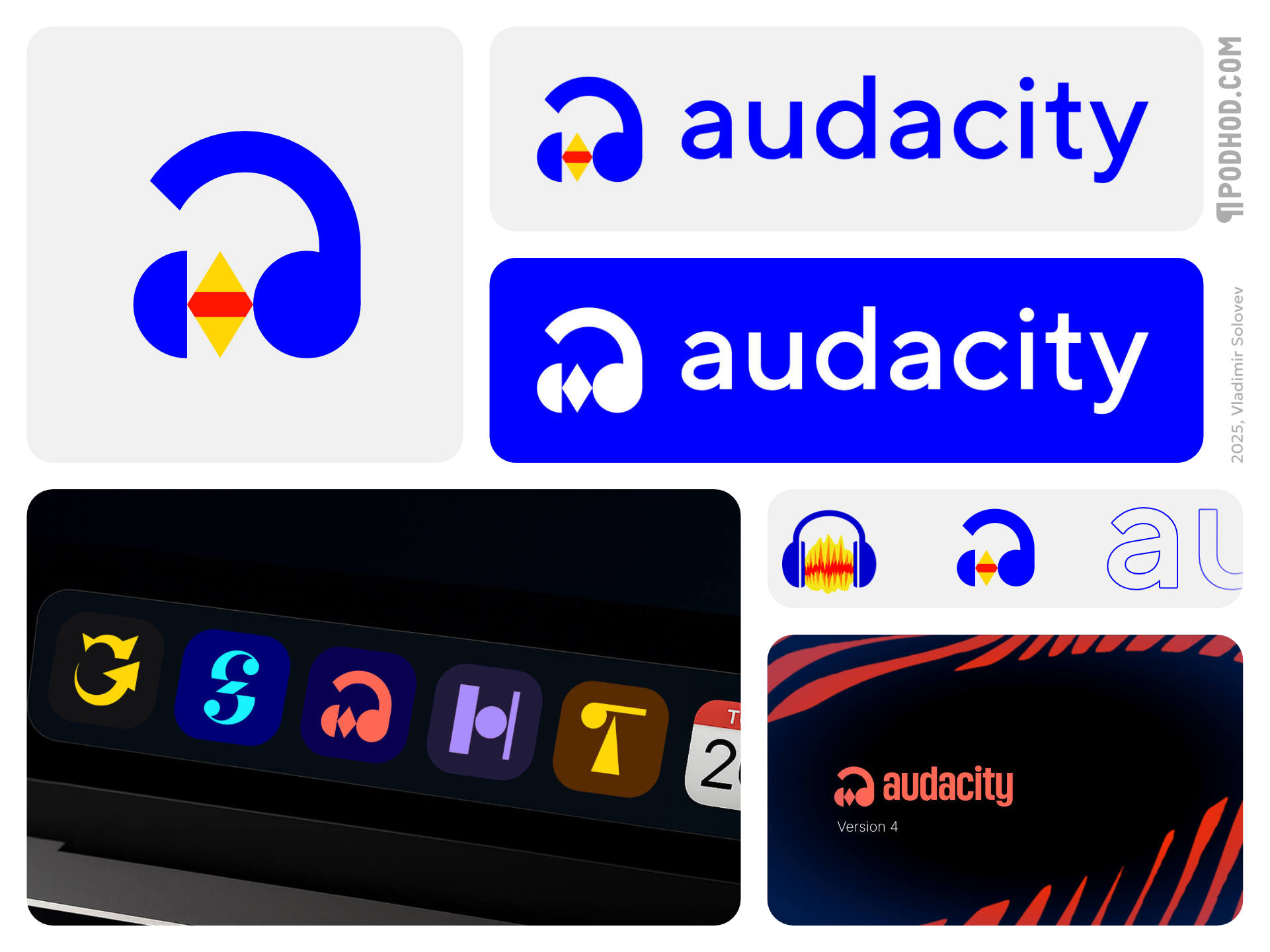
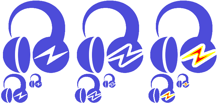
Here’s a few more iterations / variants. In keeping with the other Muse logos, I went single color only (for the first two) while maintaining the overall new shape of the logo + the half circle redesign that adds perspective, but altered in a way that makes sure it works single color.
I also included the lightning as a simplified negative on the right side of the logo; first purely as a negative, then as a bolt separated by an empty area, then finally as a colored version to better pay homage to the original logo.
[snip iteration]
Edit: further adjusted for equal spacing between the headphone half circle components as to the lightning bolt, since before, the lightning bolt gap was huge while the half circle headphone gap was narrow: