Normally I don’t care, but this time I think it’s too much even for more to not care.
The software redesign is definitely a big change, and I will certainly miss the older, more familiar and more simple in presentation layout. Though that is not why I’m commenting.
I strongly dislike the new logo. It completely looses its original charm and does not at all inform the user of what the software is or dose. If you showed the logo to 1000 random people, I can guarantee that they would not guess it was a pair of headphones let alone audio editing software.
Even worse with older users returning to the software. They might think it’s a fake or another OBS vs Streamlabs OBS situation, and like me miss the clear and unmistakable logo, especially in this sea of flat, corporate, brand safe, unintelligible junk.
You could have done it gracefully like Firefox or Pizza Hut, but instead you took the jaguar approach, and will most likely alienate a lot of your core users.
At a minimum, you should have kept the audio visualization between the speakers. Please for the love of Gaben, I’m sure this isn’t your priority but this, this needs a thorough rework.
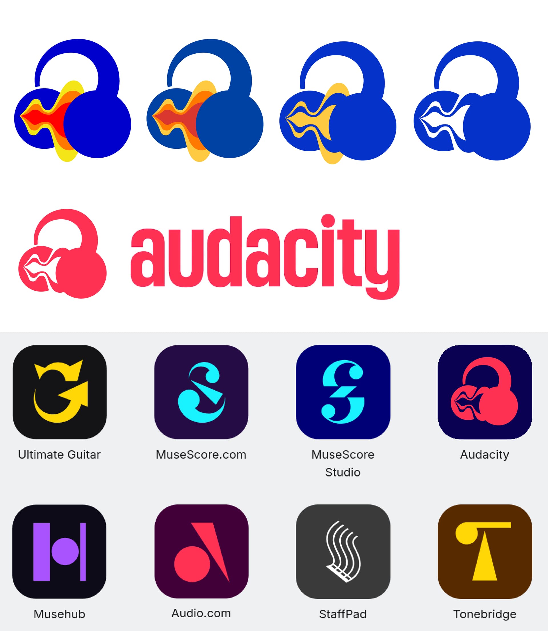
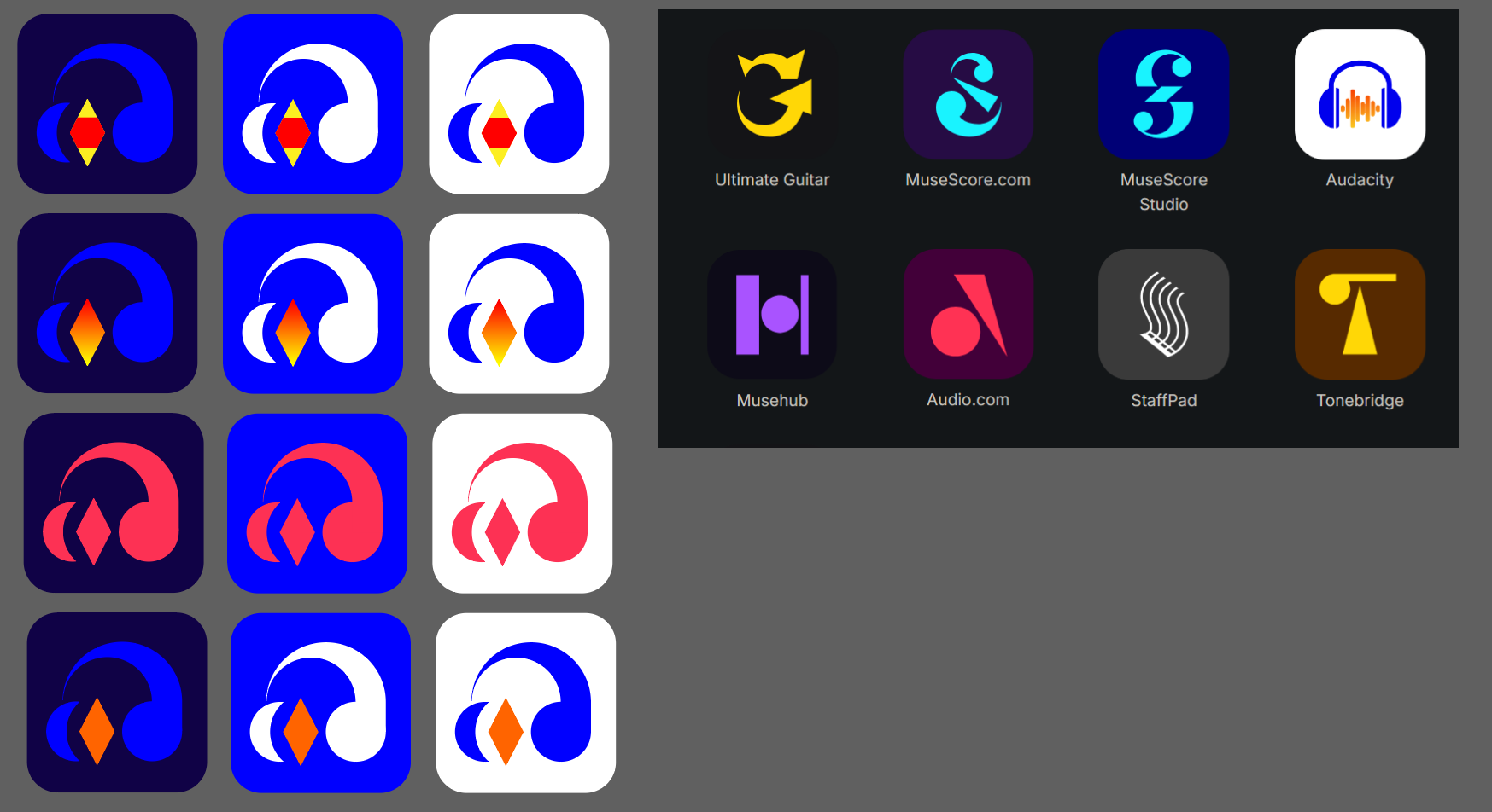
While I don’t really like the removal of the waves and the color change, my biggest issue with the new logo is just how awkward it is. It just doesn’t really sit right, and I doubt an average person unfamiliar with audacity would tell that those are supposed to be headphones. So here’s my suggestion. If nothing else, at least take an inspiration for the shape.
It reuses the same basic shapes, but by setting the band further back and cutting off the left (right?) ear cup, it makes up the shape of a lowercase ‘a’ in the negative space.
Hi guys, after seeing Tentacrul’s great Audacity 4 video I found this thread, so I figured I would try contributing myself to all those interesting logo re-designs Feel free to give any feedback or to extend the idea yourself !
Now that you had your first impression, I’ll explain my thinking process:
From reading many comments, at least 2 elements in the shape of the original logo made it iconic
The Headphones.
The Sound-wave (which is currently not is the new audacity logo, though probably half of the people expressed this was as much of an iconic part).
I would personally argue the third iconic element is
The use of the 3 primary colors, blue, yellow and red (and also a pinch of orange)
Though the very pure primary colors used arguably provide bad readability in some contexts and can look dated, I feel like they could be kept (with some eventual updated palette) when the context of the logo allows it, while a simpler monochromatic version would take its place in more difficult contexts, with small resolutions for instance.
About the current new logo design that was displayed in the video, I don’t hate it, but I would say it lacks most iconic properties of the original logo, or at least, it lacks the character one would expect from a branding associated with the Audacity software. The unified minimalist branding of the various software under the Muse Group is understandable, but I feel like there can be enough margin for Audacity (a software having a long history before joining the group) to distinguish itself from the rest.
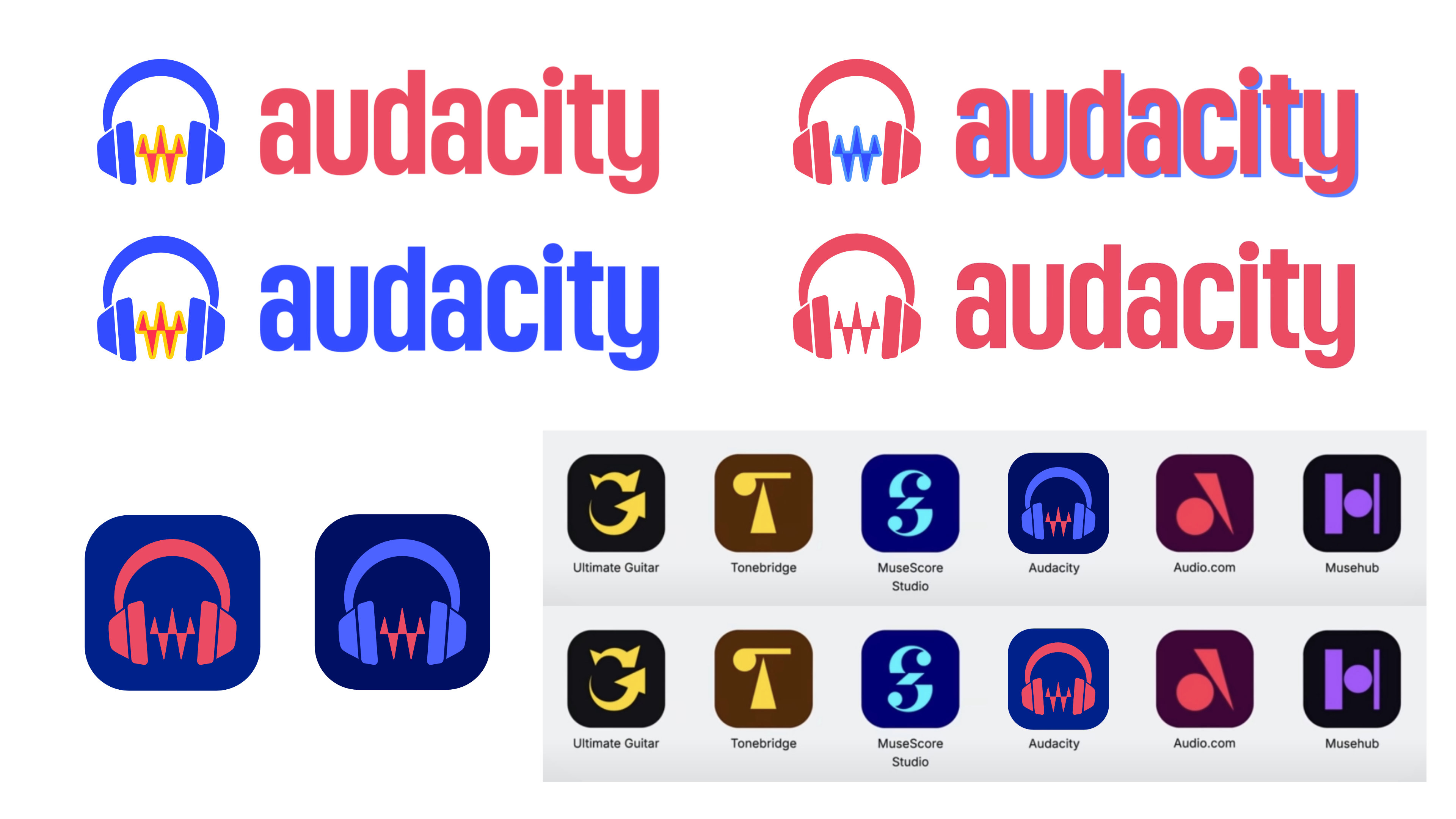
So here is the design this thinking got me to:
I tried to keep the headphones, the sound-wave and the primary colors while avoiding over-complicating the design.
For the headphones, I started from the new logo, but to get a bit more personality out of it, I changed the proportions, leading also to a slightly tilted logo, with a bit of perspective, giving the whole thing a more playful, almost cartoonish look. I actually think this is what makes this design inviting.
The waveform has been made less spiky, and its overall shape can be attributed to an inspiration to Bauhaus graphic design, to which I arrived when thinking about the use of bold primary colors.
The first logo is with the original colors, second with a more muted palette (which is also Bauhaus inspired), third and fourth provide a bi-chromatic and monochromatic options, using a more modern (electric) blue. I also included some mock-ups.
What do you think ?
I did this with Inkscape, if you want the svg just ask
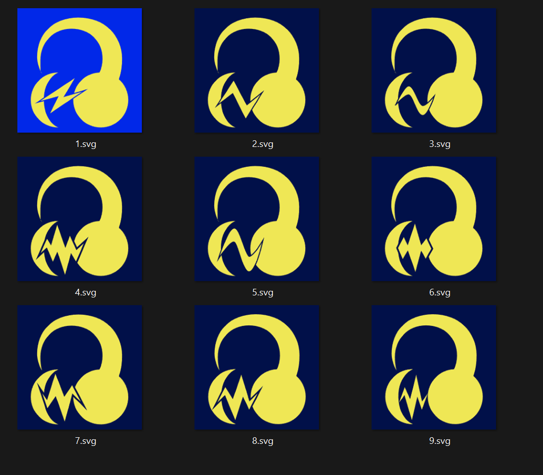
I don’t have a problem with the new logo. I just enjoy making logos and I like how everyone has been creating their own, that’s pretty cool. I do think the new logo is a little bit oversimplified, that’s why I added the noise spikes back.
The new color is jarring, but the current ones are way worse haha. They’re ultra-saturated. I’m okay with changing them, even if it takes a while to get used to it.
In the spirit of the classic Audacity Logo Gallery, we’re excited to open a space where everyone can post their ideas and concepts for the new Audacity 4 logo.
I combined AntiVector’s take on it (mostly the specific less jarring blue he chose) with chubacca’s (I like the modification he did with the angle on the headphone and the addition of the wave). I think the waveform thingy should stay. I always have find the audacity logo hideous and ugly, but I’m not ready to get rid of these colors. It’s too much identity to throw away.
I actually really like chubacca’s, along with the way HAL combined it with AntiVector’s.
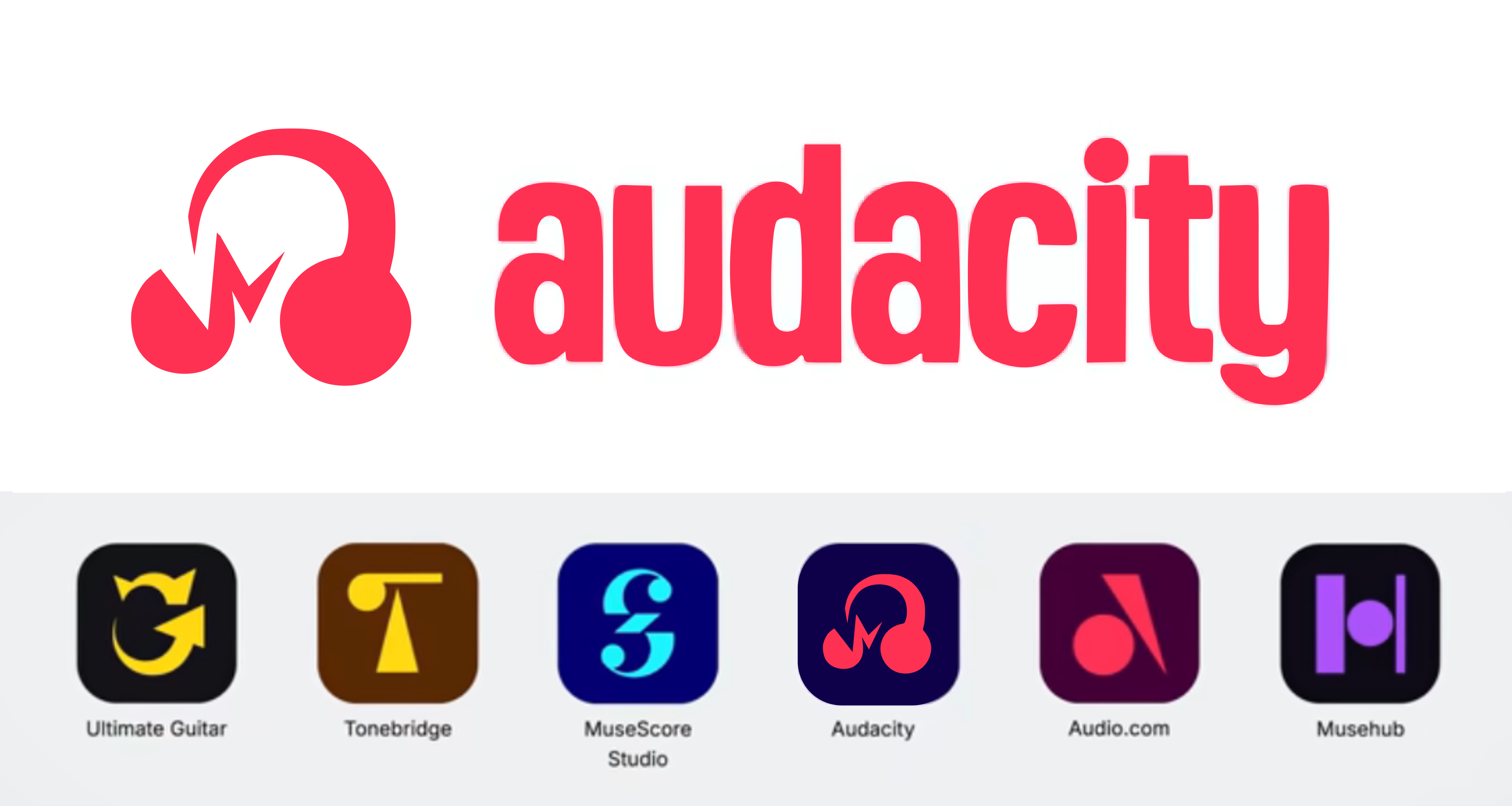
However one thing I always wanted to try even before this new redesign was announced is getting the waveform itself to spell out the app name in cursive, and the announcement of a logo change felt like a good opportunity to try that premise. So here’s my take:
I think it actually came out really well; the new design turned out to be a great base for the concept.
I tried to give the wordmark the sort of vibe you might expect from a signature-styled badge on an old amplifier. Thought it would add a bit of pizazz while also reintroducing all the major elements of the old logo but throwing nothing away from the new one; it’s basically just the old one at an angle now.
I recently watched the video and am exited for version 4! As many have mentioned, the logo redesign felt a bit off. I found this thread just now, so I thought I’d chime in
To me, the immediate reaction to the proposed logo was: It kind of resembles a fool’s cap, an association I’m not a fan of and that I can’t get out of my head
From this thread, I personally like the suggested ideas by AntiVector (post #2), by u/The_SpM7 (post #46, posted here by LWinterberg) and by ThatIsDavid (post #71) the most.
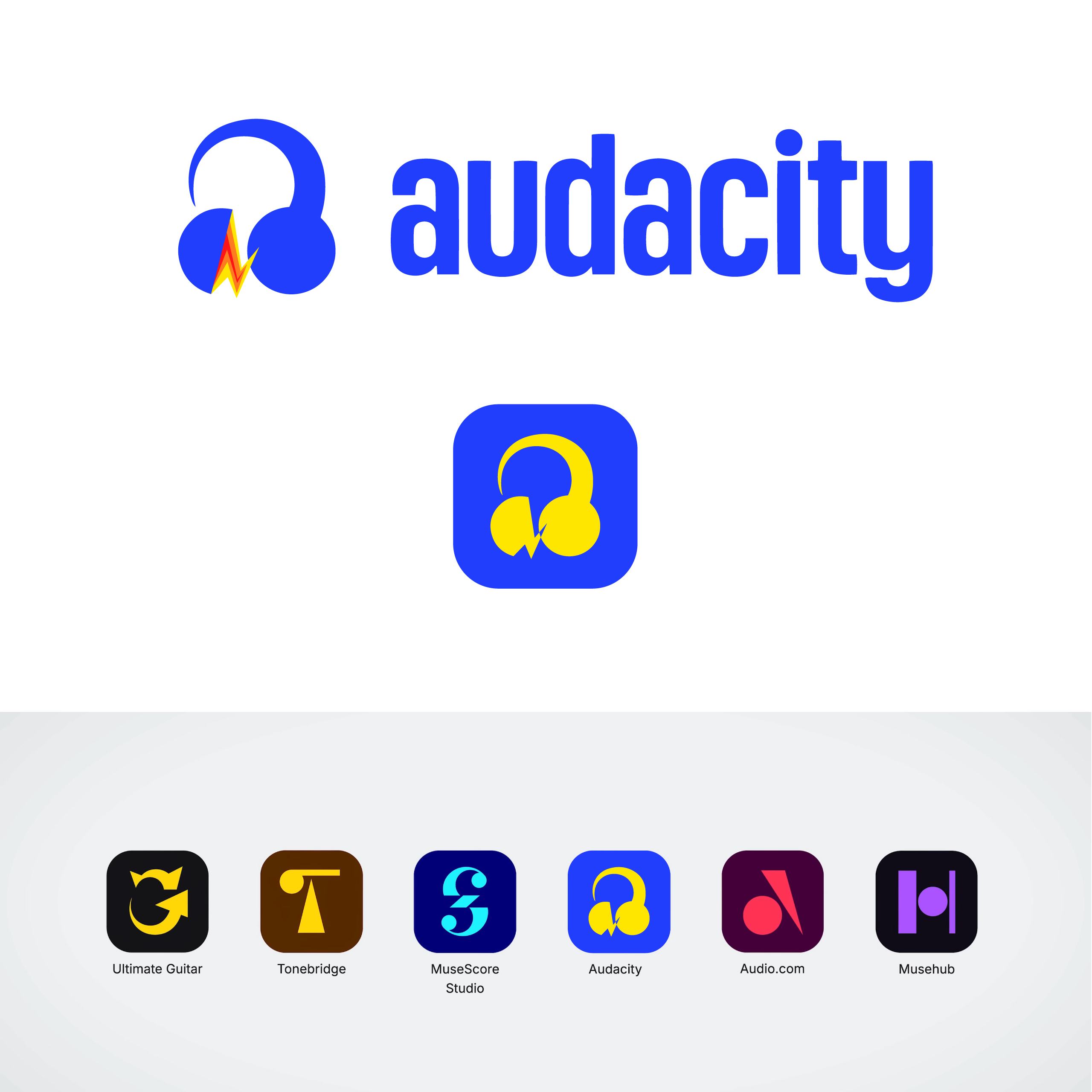
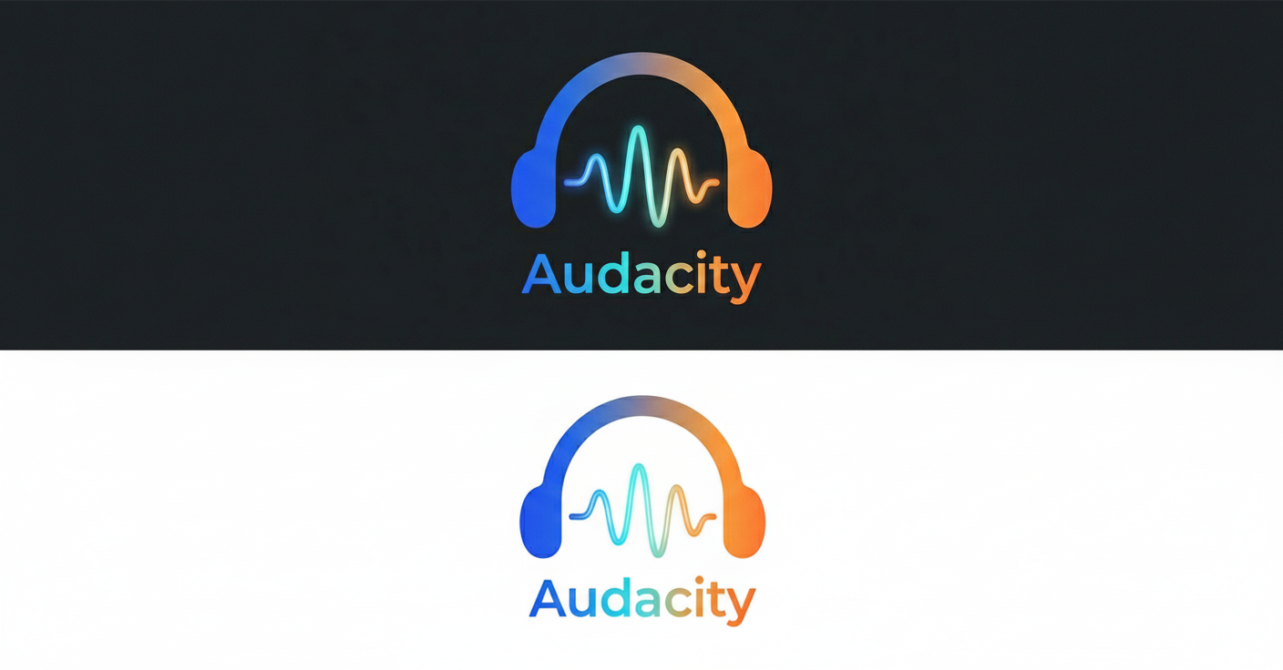
Taking inspiration from those, I tried creating my own mockups, aiming to retain the essence of the original logo and using the font/colour from the redesign.
However, I’m not a designer, so it might be a bit off or maybe too bland, idk. It definitely doesn’t quite fit the other muse branding as well as e.g. ThatIsDavid’s suggestion.
P.S.: I’m not (yet) allowed to post multiple links, so the references to the other posts are just given by their id (which is the last component in the url)
I liked vovkasolovev’s version the most, just based my version off it with more curves. I guess they bailed on the magenta version, so i’m trying out anything they had before
My two cents is that it HAS to have the classic colors. At the very least, blue. I think people would warm up to it more, and especially feel more like it’s “audacity”, if it kept those colors. I can’t see a good reason for the color change. Red and white is not “audacity”, and changing the colors I don’t feel would sacrifice it’s fit with the rest of the muse group icons. Ideally it’d have blue and yellow.
I also agree it needs the waveform in some way or form.
I Recently saw Tentacrul’s video on Audacity (How We’re Redesigning Audacity For The Future) and it gave me an itch to try and design a new logo for it. The new one looks more like something for a new project rather than a redesign of Audacity. After some tinkering that’s what I came up with:
Lots of great stuff here!
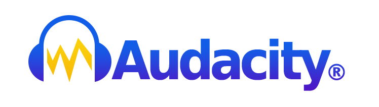
Here’s a refresh of the current one, staying as faithful as possible to the original but aiming at a more pro look.
(I actually found this thread afterwards and figured I might as well post it here)
I’m just giving you an example of the new logo of Audacity as many of the users are emotionally connected to the older one. This examples maintains the features and colors of the older one. I think it’s better than the Red Logo of Audacity 4. Please come in with your suggestions.


 Feel free to give any feedback or to extend the idea yourself !