Most of my projects are multi-track, so I use Mute and Solo a lot… and I’m struggling with Solo in 2.2.1.
The quick summary is, I expect the default behavior to be the “Multi-track” setting in the Solo button preferences. The “Simple” behavior (Shift-Click to add/remove Solo tracks) make sense in a certain way, but it doesn’t match what I’m used to… on old analog mixing consoles (showing my age!), so if it matches what these new-fangled devices do, I’ll let it go.
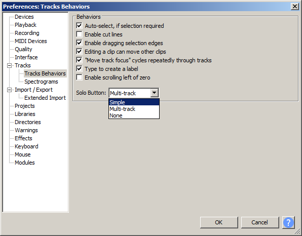
That said, the manual is not helpful. The Track Preferences page, which ought to explain this, says nothing at all about the Solo button, including the Simple / Multi difference, and in fact it’s missing any information about the Track Behaviors sub-heading in the preferences. So, perhaps this post / gripe / request boils down to “Please include Tracks Behaviors in the manual.”
“Multi-track” will suit those used to mixing desks and other professional audio software.
Perfect! And, in fact, I just experimented with the three settings on that drop-down - I guess I didn’t mention that in my original post. So, my two points are:
The default isn’t what I expected, but I can live with that because it can be changed.
I could not find the manual page for that particular preference. Is there a way to get to it, other than clicking within the graphic on the Tracks Preferences page? I suggest that menu sub-items should be explicitly listed (“See also…”) on such pages.
You can also get to the page you need by clicking on Preferences in the left hand navigation bar (readable by screen readers tor the VI community)
The click on the Tracks Behaviors (also screen read for the VI)
But yes, the Manual is heavily based on hypertext with many, many clickable links (images, imagemaps and test strings)
and yes, that is heavily biased to non-VI users.
It is not very comprehensive - I seem to recall that we tried to implement it.
I can see that adding entries there for “Solo” and “Mute” - and a shed-load of other things could help VI (and indeed no VI too) users.
Would that help do you think whbjr ?
Yes, definitely. And I’m not the first to say that the documentation always lags the actual program! (I’m guilty of that with more than a few projects of my own…)
This is is the alpha Manual for the upcoming 2.2.2 (which hopefully will be released quite soon now)
I’ll look at spending some time in the future to extend the Index with further useful entries. My scope for that is quite limited right now because soon the manual will need to be locked from editing as part of the release process (the Manual gets bundled as part of the release for Windows exe and Mac DMG installations).
OK - you gave me a busy morning - once I started there I though “why not just carry on”
You should find now that for anything you can click on in the “amazing imagemap” on the Manual’s front page there is now also a text entry in the upgraded index.
I also took the opportunity to do a little alphabetic indexing to make it easier on they and to aid readability. It actually makes it easier for me as an editor too as I can now edit each alphabetic section separately
Peter - Glad I could help! Give me a call when the dirty dishes start to pile up, I’ll nudge you that way, too.
Not only am I glad that you’re spending time on indexes, I’m glad that you’re making it easier for you - and, presumably, for the hordes of other indexers still to come.
as a starter I added entries for Solo, Mute, Pan and gain in the Index as sub-entries under the pre-existing Track Control Panel entry
Um, yes, but… The index entry for “Track Control Panel - Solo Button” goes to the right place, the Solo section of the Tracks page. But on that page: “There are two other options for Solo button behavior in the Tracks Preferences.” That link goes to the top of the Track Preferences page, which does not have a text-based link to Solo (i.e, searching that page for the word “solo” comes up empty). It really should go to the Tracks Behaviors Preferences page, and to be really helpful, there should be a tag on the Solo section at the bottom of that page, so that a “#Solo_Button” tag would work.
Unless I’ve missed something, this is the only item (in this scope) which deserves this special treatment; the Mute, Pan and Gain elements do not have any Preferences attached to them.
It’s possible that I’m asking for too much, and I completely understand if that’s true. All I know is, I’m stumbling through the documentation, and it’s currently non-trivial to find what I’m looking for.
“… the hordes of other indexers still to come.”
hahaha
as a starter I added entries for Solo, Mute, Pan and gain in the Index as sub-entries under the pre-existing Track Control Panel entry
GOOD catch Win
I’ve fixed that and I did as you asked and added an anchor for “Solo” on the Tracks Behaviors Prefs page - but because the Solo section is right at the bottom of the page it showas a lot of other stuff above it. I’m thinking it may look better to just link to the top of the page (where the dialog is seen showing Solo - and you can search for the text “Solo”).
Well, I have to admit that I prefer it with the tag and the jump to the bottom of the page… but if that sets a bad precedent, I can do without it.
For the index, again I think it would open the floodgates - if the Solo button gets an entry, then all sorts of “small” single-paragraph items should also be promoted. Let’s keep it as-is until the next Solo fan shows up.
I’m guessing that you are not a blind user, and have not tried using the manual with a screen reader.
The Audacity team invest a great deal of time and effort trying to make the application and its documentation as accessible as possible to all.
You may also notice that there is a small text item above the image that says “Skip the image”. That is for the benefit of screen reader users so that they don’t need to tab through click target in the image map.
You are correct! However, when reading manuals, I am much more text-oriented than image-oriented, so I’m likely to look at the image and say “Yes, that’s what my screen looks like,” then move down to the words to find the answer to my question.
The clickable image on the front page of the manual is a tremendous convenience for sighted users that use pointer devices, but note that each interface element is also numbered and corresponds with an accessible text link (in this case “13 Track Control Panel”.)
Good point, but this is (to coin an expression) the exception that proves the rule. This image clearly has numbered sections, and the text-based index to those numbers is directly above the image. If that were the case for all the other screenshot-clickable-images, I would have no trouble navigating the manual.
You may also notice that there is a small text item above the image that says “Skip the image”. That is for the benefit of screen reader users so that they don’t need to tab through click target in the image map.
Ah - I had not seen that. But that skips to the Tutorials section, which is nothing like an index or list.
If you want to discus accessibility, you’d do better to discus with David Bailes who knows far more about this that I do. He has been our accessibility advisor for the past 10+ years and is is contactable via the Audacity4blind mailing list.