I find the management of tracks a bit cumbersome sometimes in projects that have many tracks.
Issue: when tracks are added by drag-and-drop, they always go to the bottom of the stack. Suggestion: When an existing track is selected, incoming drag-and-drop tracks are inserted immediately underneath that track.
Issue: moving the tracks in the stack is cumbersome, involving opening the menu and selecting one of the four move up/down/top/bottom for each one. Suggestion: Either implement drag-and-drop repositioning and/or make the up/down-arrow keys move the currently selected track(s) up and down.
Issue: No way to collapse/expand all tracks. Suggestion: Allocate key bindings to these functions, and menu entries to the Tracks main menu items.
Issue: Access to Mute and Solo buttons lost when a track is collapsed. Suggestion: Make the left-hand track control panel wide enough to accommodate the Select, Mute, and Solo buttons side by side. This would have several advantages:
all three of those buttons could then be available in a collapsed track.
the extra width would provide more space to write out the track name.
the track sampling information (“Mono 44100Hz 32-bit float”) would all fit on one line, so the expanded height of the track could be less.
the level and pan sliders would be wider and easier to set with greater precision.
The only downside to this change would be the extra real estate taken up by the wider control panel. I would be happy to forego that in exchange for the extra functionality.
We have just modified the “Mix and Render” feature so that mixed tracks appear in the place of the last selected track (rather than at the bottom).
This raised some questions about the meaning of “track focus” (the “current” track that has the yellow border). It was realised that the meaning of the yellow border is not always clear.
The complication of your solution is “which” track does an imported track get placed under, given that multiple tracks may be selected.
This has implications that go beyond importing tracks, and the whole issue is being considered by the developers. It is important that features work in a consistent way, otherwise the application becomes confusing.
OK, I’m a little red-faced in that most of what I was on about already in the software! Thanks for taking the time to RTFM for me.
I do think the rearrangement of the control panel is still worth considering.
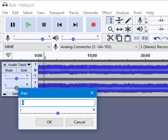
I like the Shift-P, Shift-G for access to those settings. Small point: I tried this key sequence:
Shift-P, tab, right arrow
i.e: open the Pan adjust window, move the focus from the edit box to the slider, adjust the slider with the arrow keys - except that the arrow keys don’t seem to work on the slider when it has focus. I would have thought this was native behaviour for the slider control.
I agree with your comments about the need to preserve consistent behaviour. I was a little confused initially between the current track (yellow border) and the selected track (light background), but when I found I couldn’t get yellow borders around multiple tracks I figured out that the yellow border was the current track, or the focused track, and was the sensible place to insert the drag-and-drop tracks into, and it would also be the track that would be nudged up and down in the stack with the arrow keys.
“Shift + P” is mostly used by blind users. It’s a lot more common for sighted users to use their mouse.
Typing in a value is a lot easier for blind users than a slider.
What I would rather see (as I wouldn’t want to lose track waveform real-estate width) would be for Collapse to vertically shrink the track such that the Mute and Solo buttons still showed:
This could be managed with a new preference setting where you could choose
a) full Collapse (i.e. as now) - default setting
b) Collapse with Mute and Solo
The downside of b) of course is that you get fewer tracks displayed on the screen.
If you double click in the slider widget you will get a window pop up where,
a) the slider is wider
b) you can set the value numerically by typing.
BTW a single left-click on the slider widget (in this dialog or in the sliders in the Track Control Panel) will show a the current setting value of the slider.
I think this is an excellent suggestion - all we need to do is to ensure that it works the same as the revised Mix&Render - i.e. if multiple tracks are selected then the new imported track is positioned under the lowest of those selected tracks.
If no track is selected then the imported track goes to the bottom.
And for consistency Tracks > Add New Track > …
should behave the same way - right now this always just goes to the bottom.
I think I may need to log an enhancement request for this - do you agree or disagree Steve ?
I think the developer’s are already aware - at least James is. You may recall the recent discussion about uses of “focus”.
As the next major release will be about the Audacity Project format, I doubt there will be any work on this within the next 12 months, so perhaps a good idea to have an outline proposal as a reminder.