oh dang, theres this older theme i wanna get working on 3.7 like you got this one working but idk how to use that program you used. any way you could help converting it? i cannot seem to find anywhere with a guide.
its this one specifically fyi
I see that @v.muller has just posted a reply, but I’d like to note that by my estimation your theme is version 2.2/2.3.x for all the buttons, but colours look like version 3.1.x. Those extra colours are for the title bars above the tracks. Also there seems to be a bug converting from 2.3.x making spectral brush button (4th row) grey. So I’ve combined the two versions here. However there’s still plenty of work for you to do to if you were to fix the theme up, just because newer versions contain things old ones never did.
For anyone who is more of a laymen for python scripts, here’s what I did to run it. First you need to download the program from the github page. Click Code->Download ZIP->Extract. Then you need to download Python. Python can be installed quite minimal, the only thing you should opt-in in the installer is the “tkinter”, which is needed for the UI. The other library you need is PIL which is for image processing. The way I installed PIL is using “pip install pillow” command or something like that from shell… It’s been a while so google how to install PIL. If you’re missing either of these libraries you’ll get an appropriate error message. Also I’ve been using Sublime Text to ectually run the python program, cause my first python install didn’t run properly or I couldn’t figure it out, but that’s probably me messing up so this step shouldn’t be necessary.
Thanks for the quick reply! I used the theme for about 5 hours last night and really enjoyed it!
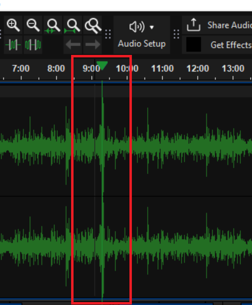
This black bar is so hard to see when I am editing. I consistently lose my spot. Then the green bar gets lost in the green background when the audio levels spike.
It would be nice if they were a color that really stands out so I can quickly glance to where I am.
Regarding the CursorPen (the aforementioned vertical bar when selecting a point on a track), it looks like it was meant to be the same as track selection (when dragging on a track to select a certain duration) for consistency reasons. The selection being relatively dark is important for waveform legibility and it being easy on the eyes, but then the pen is a tough to discern sometimes, as in your screenshot. To stand out better I made the pen light grey. Changed the PlaybackPen to a light shade of green too. Imo both of these changes are an improvement, but lmk what you think.
This is way easier for me to keep my position and be able to glance at where I am! Thank you!
How you played around with custom keyboard shortcuts to improve your workflow? I typically program python and audio is new to me. I want to get a good workflow setup!