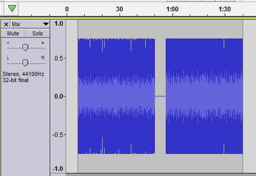
Inside the real waveform, there is a smaller “RMS waveform” which I’m afraid sits really badly with my autism. In fact, it’s one of the two Big Things that completely puts me off using Audacity. (Yep, really that bad!)
Is there any way the “RMS waveform” can be permanently hidden or removed from the waveform display? Or at minimum can it be made the same colour as the main waveform display so that I don’t have that disgusting-looking multi-coloured wave-within-a-wave display?
Apologies in advance if I’ve missed some Very Obvious way to do that; and I’m hoping that there is a way to do it.
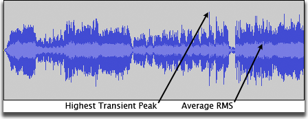
The “disgusting” pale-blue area does provide useful information …
The pale blue RMS area reveals at a glance that the version on the right (above) is louder.
To Support: thanks for the pointer. Though I don’t do C, thus cannot compile from the individual sources, I tried some custom themes (Audition Light and Dark Orange) and they stuffed up all the Audacity buttons, I’m afraid.
However, the built-in Dark theme isn’t too bad and makes the double waveform more tolerable. The spooky pointing finger icon when selecting using the trackball still freaks me out every time, though. It’s like I’ve gone back in time to 1985 (!). But seriously: it’s genuinely scary for some reason.
I know which colour to change to remove the RMS pale blue from the palette …
But unless you have the ‘ImageCache.png’ of the version of Audacity you’re using, some the buttons are bolloxed.
This version is only going to work properly on Audacity “3.2” …
Trebor, thanks for that. My issue really is that I find the “double waveform” confusing and unsettling. I’ve plumped for the built-in Dark theme meantime.
But three thoughts occur to me:
“Surely” (?) with each release, there are copies of the ImageCache.png files for each of the built-in themes, to use as a starter for theme hackers, posted somewhere online, no?
And from what I can figure out, the ImageCache.png works rather like the theming in an old DJ program whose name I can’t recall right now; but each area at the top of the image maps on to a button or whatever object in the UI, and with a full palette of colours at the bottom, right?
So … again “surely” somewhere there is some kind of reference to both a) what each area at the top corresponds to in the UI, and b) how the colour map is used along with those images: in other words, a chart if you will of the colours used in the object images and which of the ?110 or so colours in the colour map at the foot of the image each objct image colour corresponds to, if that makes sense?
Again “presumably” (?), there must be some relatively uncomplicated way to automate — from the codebase for each release — a simple list of the the underlying individual object image files used in that release, and the name of their corresponding UI object?
It just strikes me that if all three of those relatively easy to provide things were “around” online for each release, it would make “adjusting” existing theme files for each new release a heck of a lot easier: do you agree? I think I already mentioned that I don’t “do” C, so the other option isn’t really open to me.
Thanks for all your help with this: it’s appreciated.
Although I personally find the RMS waveform very useful, I have to think it would be quite easy for the powers-that-be to add the ability to turn it ON or OFF in the interface preferences.
Hopefully they’ll go ahead and implement that for you and others who could benefit from it.
I can see how a ‘visible’ RMS would be useful for some applications, yes; just not for mine. And I genuinely find it disturbing for some reason so IWBNI there were a simple checkbox in the Interface or Tracks Behaviors Preferences to toggle it on/off; captioned something like Display RMS waveform; and defaulting to Checked. Which in reality, would just toggle the colour(s) used to display the RMS waveform.
While I’m here , shouldn’t it correctly be Tracks’ Behaviors; as in ‘behaviors of the tracks’?
I have changed the cursor to look like this instead for Audacity 3.5. I have no idea why a pointing finger is part of the default cursor set. It’s not from Audacity anyway.
The imagecache is pretty bad as it breaks for each update we do to add icons. We’d like to get rid of it in favor of the system which generates the cache file, and just use that directly. But there’s many other priorities which put that particular project in the back seat.
I think custom themes are the answer here, not yet more toggles in the preferences. Toggles add complexity to the code and, importantly, to the preferences. Too many preferences become overwhelming to users very quickly.