Hi guys, after seeing Tentacrul’s great Audacity 4 video I found this thread, so I figured I would try contributing myself to all those interesting logo re-designs ![]() Feel free to give any feedback or to extend the idea yourself !
Feel free to give any feedback or to extend the idea yourself !
Now that you had your first impression, I’ll explain my thinking process:
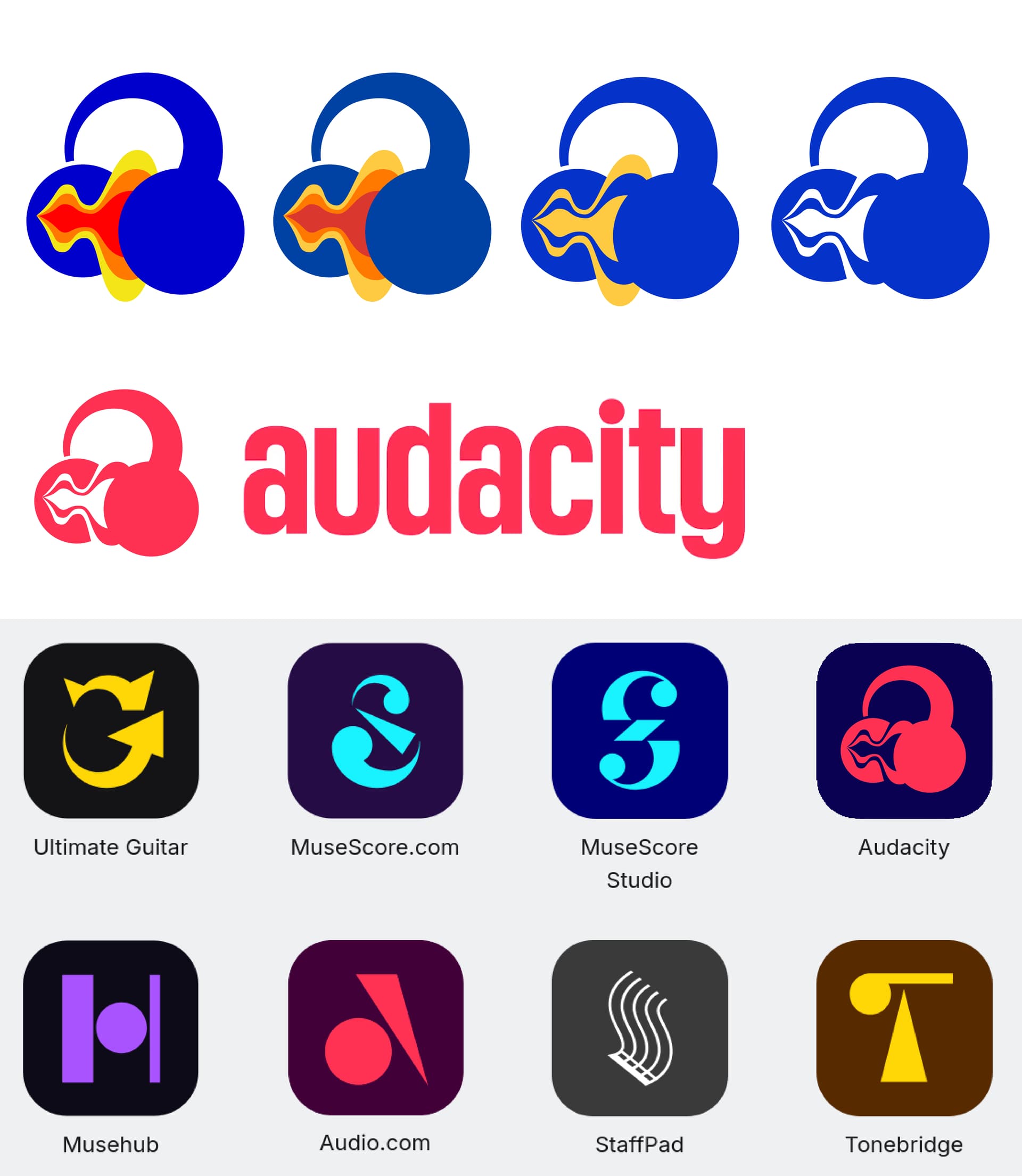
From reading many comments, at least 2 elements in the shape of the original logo made it iconic
- The Headphones.
- The Sound-wave (which is currently not is the new audacity logo, though probably half of the people expressed this was as much of an iconic part).
I would personally argue the third iconic element is
- The use of the 3 primary colors, blue, yellow and red (and also a pinch of orange)
Though the very pure primary colors used arguably provide bad readability in some contexts and can look dated, I feel like they could be kept (with some eventual updated palette) when the context of the logo allows it, while a simpler monochromatic version would take its place in more difficult contexts, with small resolutions for instance.
About the current new logo design that was displayed in the video, I don’t hate it, but I would say it lacks most iconic properties of the original logo, or at least, it lacks the character one would expect from a branding associated with the Audacity software. The unified minimalist branding of the various software under the Muse Group is understandable, but I feel like there can be enough margin for Audacity (a software having a long history before joining the group) to distinguish itself from the rest.
So here is the design this thinking got me to:
- I tried to keep the headphones, the sound-wave and the primary colors while avoiding over-complicating the design.
- For the headphones, I started from the new logo, but to get a bit more personality out of it, I changed the proportions, leading also to a slightly tilted logo, with a bit of perspective, giving the whole thing a more playful, almost cartoonish look. I actually think this is what makes this design inviting.
- The waveform has been made less spiky, and its overall shape can be attributed to an inspiration to Bauhaus graphic design, to which I arrived when thinking about the use of bold primary colors.
The first logo is with the original colors, second with a more muted palette (which is also Bauhaus inspired), third and fourth provide a bi-chromatic and monochromatic options, using a more modern (electric) blue. I also included some mock-ups.
What do you think ?![]()
I did this with Inkscape, if you want the svg just ask ![]()