The May 2026 files: New iconography by grliszas14 · Pull Request #10868 · audacity/audacity · GitHub




Personally I care about the look of:
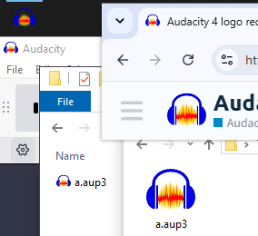
- the icon in my taskbar in Windows
- the top left corner window icon in Windows
- the icon of files in Windows Explorer
- the tab favicon of the forums in Chrome
- the logo at the top left of the forums website
Don’t care about the big version(s) that much.
Here’s a tool for testing the icons, more or less live:
Audacity Logo/Icon Tester
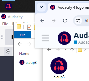
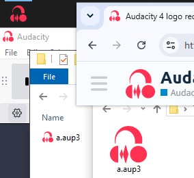
Turns out the May 2026 headphones are nearly perfectly square:
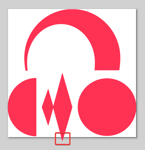
Perhaps they could be trimmed like this:
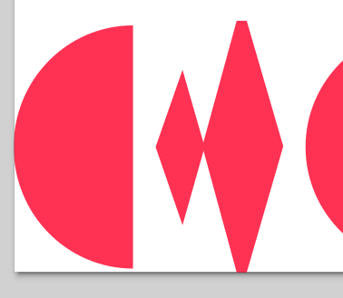
or like this:
at least for the icons where squareness matters and every pixel (square 16, 24, 32… pixel sizes) matters.
I had some fun with some of the designs:
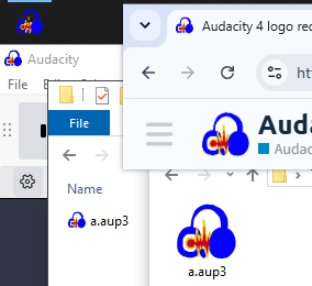
from Audacity 4 logo redesign thread - #5 by LWinterberg
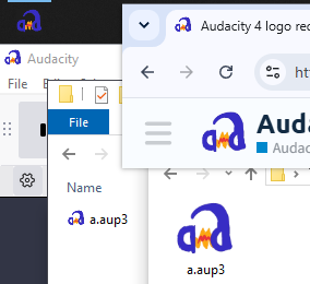
from Audacity 4 logo redesign thread - #9 by NicCrimson
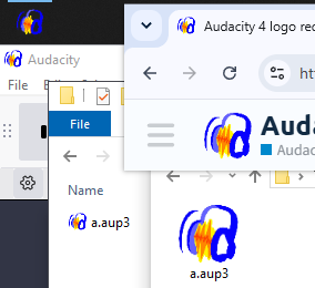
from Audacity 4 logo redesign thread - #65 by hintoflime
Two non-serious attempts:
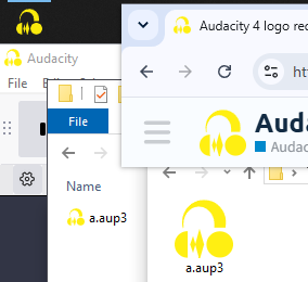
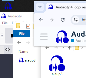
ouch.
P.S. the May 2026 design looks much better. Thanks for improving it!