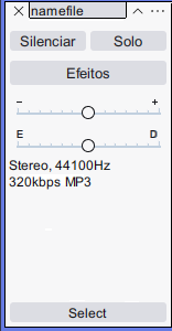
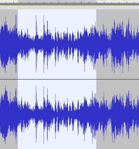
Hello! Please, restore the theme, so that it’d be like in all previous versions. If I choose “classic”, it became someway different, the color of selected part became bright-white rather than dark-grey. The color of the left column also has changed, it
became different. How inconvenient it’s! Please, restore so, that it’d be exactly like before. I get used for many years, I don’t wanna re-learn.
Here are a couple of things to do to get the previous look. Refer to the themes section of the manual. Themes - Audacity Manual (audacityteam.org)
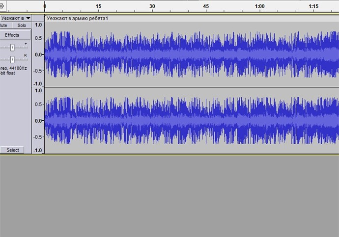
The second is to click on View in the top tool bar. Then go to the bottom of the list and add a check mark next to “Show RMS in Waveform”.
Thank you! But why did the left column become too wide and the right column more narrow?
It’s not quite the same “classic”. Here’s the real one. Please, redo so that it’d be like on the screen:
I’m also having problems with the theme/update, which is the following:
1- The information could be improved instead of removed. I’ve used the info a lot when changing the Hertz or seeing if it’s a 32-bit or 16-bit FLAC or WAV
2- The new theme is oddly spaced, and the name part seems a bit Claustrophobic and empty, atleast for me. Maybe some stuff could be arranged

3- No light blue volume thingy. It was very useful to check (depending in what you’re gonna do)
4- Selected color is darker than unselected. Despite the dark-ish background (which seems ok), atleast for what I’ve always seen at programs, is that the selected is brighter than the unselected counterpart because it highlights more.
For the selection (at the main music sector), it’s okay to get that white highlight, but some type of a gray for unselected
Atleast for me, that’s all the main problems that I have seen in Audacity (not affecting me much), otherwise the update seems nice honestly
This topic was automatically closed after 30 days. New replies are no longer allowed.

