However, the exported TXT files do not contain this information, but only 511 entries consisting of Hzs and levels from the bins starting at 43.066506 Hz.
Is there no way to get the analysed peak information as in the Frequency Analysis window, or is it the user’s responsibility? I can parse them by finding the bin with the highest dBFS, but am curious if there is an automatic way to get the peak information displayed in Audacity.
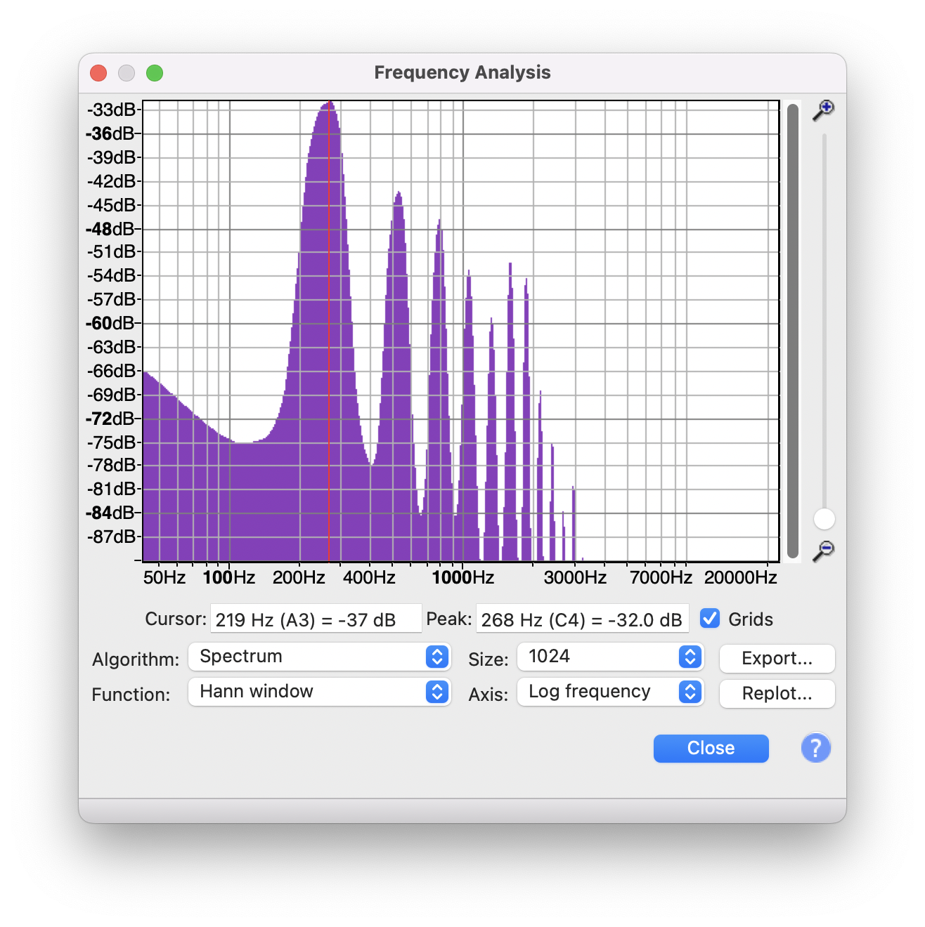
Yes, increasing the size will also change the base frequency of the bins and of course increase the number of bins. However, my question is not about the image, but about how to get just the peak information when exporting a TXT file.
Plot Spectrum derives its data from FFT analysis. The analysis returns pairs of frequency/amplitude data points. That is the data that you see when you export the data as a text file.
Plot Spectrum also displays the data a graph, using cubic interpolation to provide a smoothed graph. In the past there have been long and detailed discussions about whether cubic interpolation is the best / most accurate way to display the data (and how best to handle quantization to pixels). The upshot of those discussions was that there is no single way to interpolate the data that is “best” in all situations, but that the way that Plot Spectrum interpolates the data is reasonable for most situations.
As an example, say that we have the following data:
Hz    Value
500    100
2000   100
8000   100
You would probably plot that as a straight line, and by interpolation you would probably assume that the value for Hz=1000 to also be 100.
Now let’s increase the “Size”, and we get the following data (for the sake of simple figures, the value units are made up):
Our estimated value for 1000Hz was clearly a long way out, but from the limited amount of data in the first analysis there is no way that we could have calculated a more accurate estimate.
In short, the exported data is the actual data, and the plot is a “good guess” estimate based on the available data.
If you want to, you can import the (txt) data into any plotting application (such as GnuPlot or a chart in MS Office) and choose whatever kind of interpolation you want.