I’ve used Audacity off and on for years and was always impressed with how intuitive it was. I mainly use it for cutting sound clips for import into virtual worlds (OpenSimulator based mainly, but also Second Life) and have always succeeded. I haven’t used the program for quite a while…
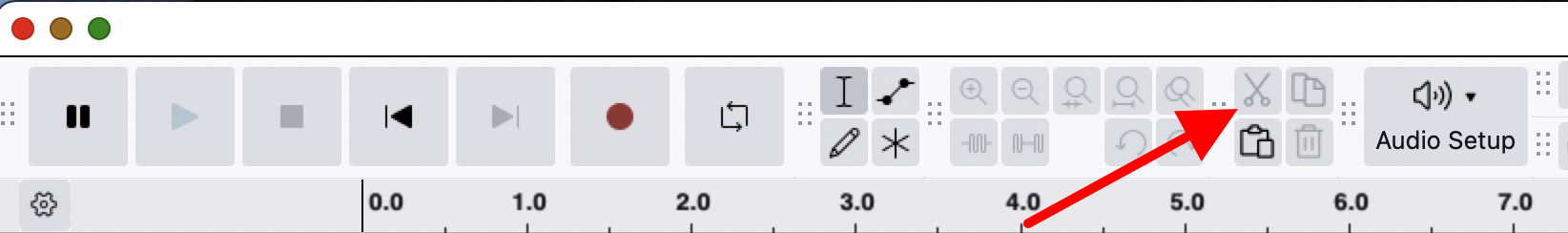
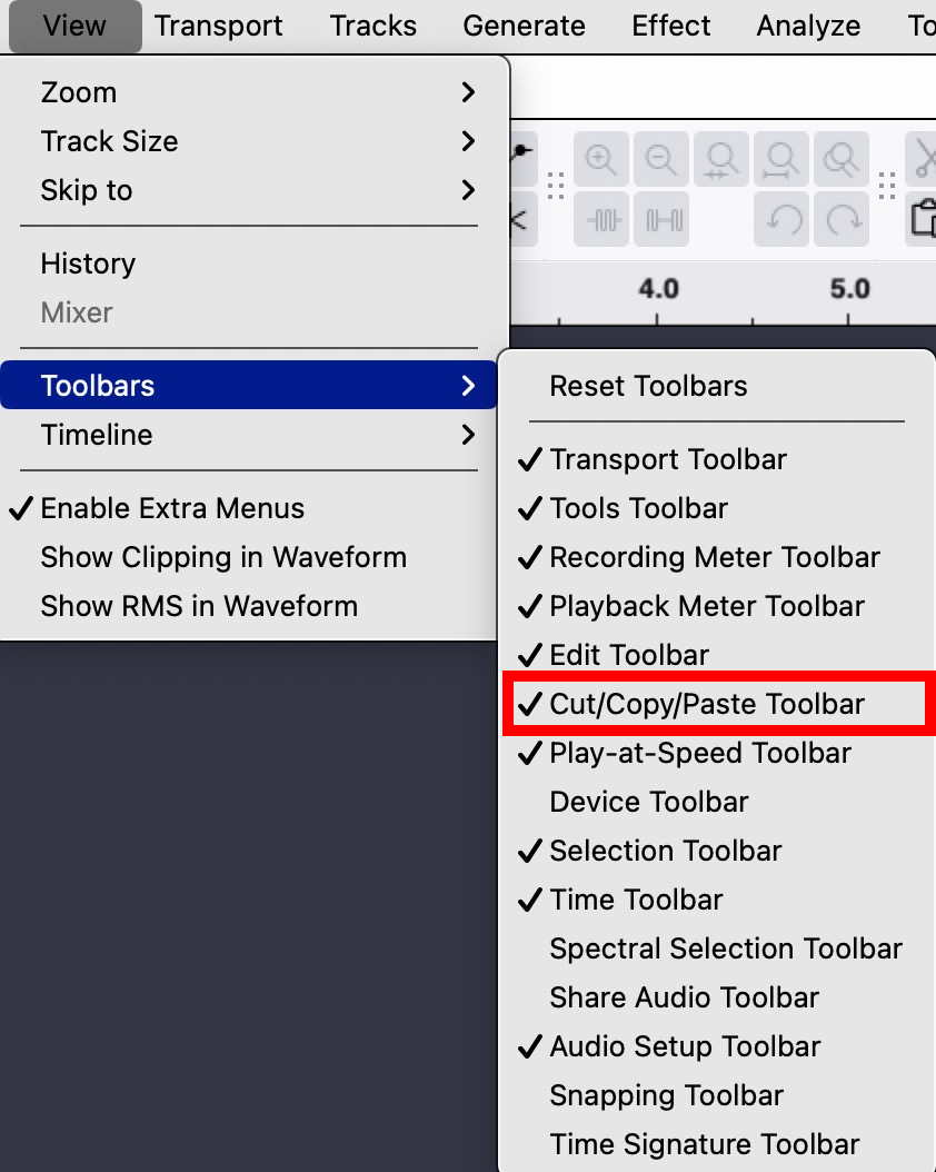
I installed the current version in the Ubuntu 24.04 repository and upon opening the program I was immediately faced with an interface that utterly confused me - where is the scissors icon for cutting a large sound file into individual sound clips? For the life of me just do not understand this current obsession for hiding the different functions behind other things. I suspect that what I am looking for is hiding behind the cryptically labelled multi-tool that when clicked does nothing to reveal what it actually does.
Basically Audacity has gone from being an easy to use, intuitve tool to one that I find impossible to use. Why oh why is there this obsession with fixing things that are not broken?
Is there a way to get the old interface back? Surely I am not alone in being needlessly frustrated by this change. By all means make things ‘streamlined’ for those that want it, but please allow Classic look to mean just that, together with the older interface layout where things like the scissors/shears icon is clearly visible.