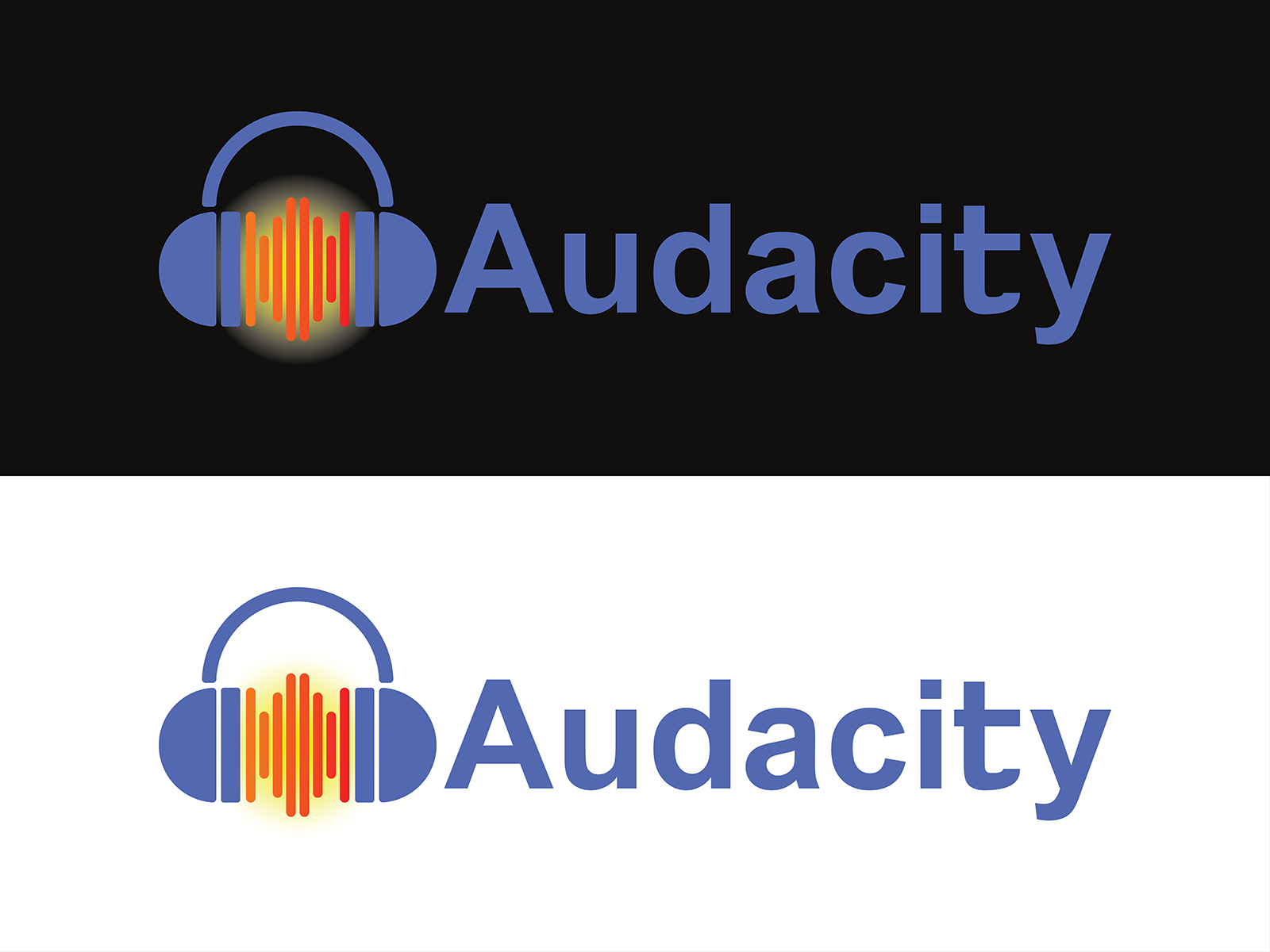
My versions of ‘Modern’ audacity logos
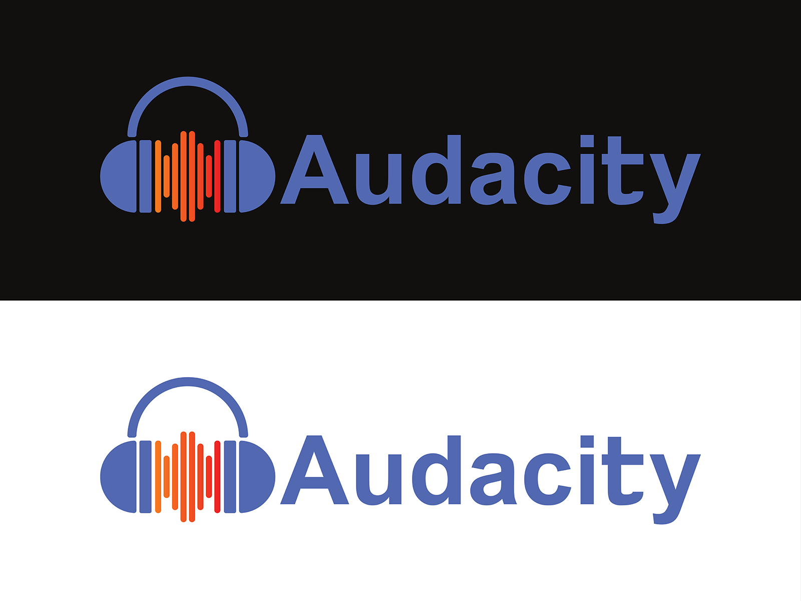


Thanks for your contributions kostakop. I’ve added them to the Logo Gallery page.
Just a bit of (highly subjective) feedback:
The vertical bars remind me a bit of the Soundcloud logo.
I prefer the versions without the yellow gradient background - the gradient looks a bit out of place against such a flat logo.
Yeah me too, I was trying to incorporate the yellow in but it didn’t turn out
Love the modern look of the last logo! ![]()