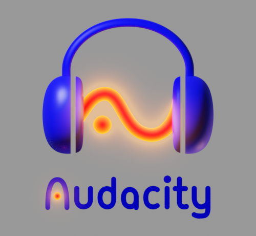
The more I look at hudstock’s logo the more I find it visual cues that are right on point with the application.
To add to my previous post
- The smooth sound curve suggests a smooth and satisfying sound quality, where the original red sound wave looks aggressive to the ear and “low poly”, which is synonym to low quality
- the dot looks like a drop, as if the headset is dropping some bass
So it’s a very visual way of representing a smooth sound and would I add, is even prone to be animated, were an eventual official video channel to be created and looking to make a nice intro.
Once more I express my wish for this logo to be considered, which I find to be the only legit proposal, even though it still needs improvements.
Here’s my quick attempt at bringing closer home:
And here’s the Blend file if anyone’s interested :