I am a graphic designer and am using Audacity in the attempt to plot the speech of a football fan as he listens to the game.
To do this I have used circles as a symbol, and features such as size, saturation and page position as signifiers of duration, amplitude, pitch etc of utterances.
I am having problems with measuring pitch. If my speaker said the words ‘come on’, I can get the amplitude from the waveform but do not understand how to measure the pitch of his voice using the Spectrum.
If someone would be so kind as to explain this to me I would be forever grateful, meant to graduate this year and am in a bit of a blind panic!
Thanks in advance.
how to measure the pitch of his voice using the Spectrum.
There is no “The Pitch.” All musical instruments including the voice have multiple pitches and overtones and that’s what gives them lush, rich quality. Purer tones, like a flute have one primary tone, but even they have breath, chiff, and quality overtones.
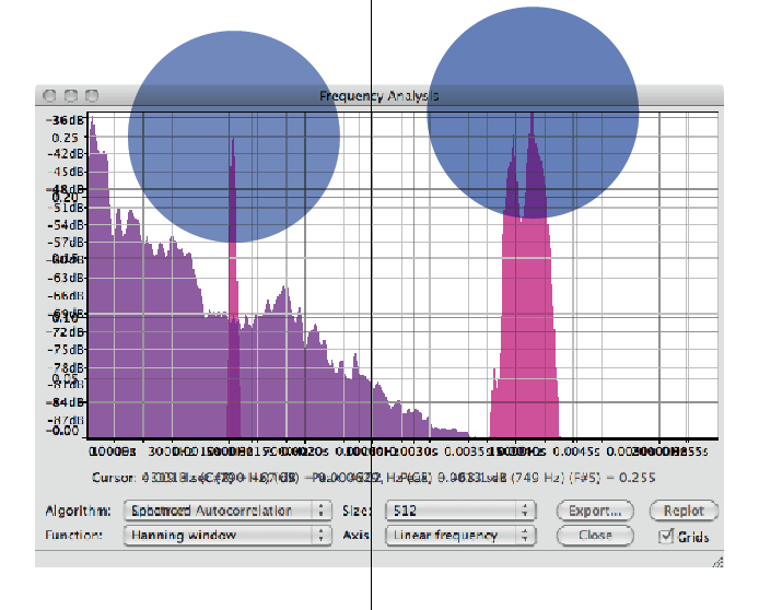
This is one single piano note in Analyze > Spectrum Analysis.
That one big peak, usually the lowest one, is the fundamental and the “name” of the note – I think G1 in this case. Two or three octaves down from middle C. The frequencies are listed, too.
This is rough to do with a human voice – especially one involved in cheering or other words or dialog. If they’re glissandoing (to coin a word) it’s hopeless.
Thanks very much guys for the informative responses.
I am taking utterances of speech such as ‘go for it’, selecting this in the waveform and then using the plot spectrum tool.
Please have a look at the attached file to see.
The size of the circle is based on the duration of the utterance.
I have overlaid both the enhanced correlation and spectrum graphs, because I believe the spectrum graph averages out the reading, whereas the enhanced correlation graph plots it in time and gives average pitch readings?
If someone could tell me if I am actually getting a correct reading here or if I am way off the mark i’d be really grateful! I am under the assumption that the enhanced correlation function gives a reading of where the audio’s pitch changes, is this correct?
Really sorry for the rookie descriptions, a real novice to this whole thing. If anyone has any suggestions/help that would be amazing. Thanks
Taking a deep breath because this is rather complicated…
The “Spectrum” graph splits the audio frequency range into many small frequency bands, then looks at the total amount of sound there is in each band from the selected audio (up to a maximum selection size of something like 10 million samples). It is easiest to make sense of this plot if you change the horizontal axis from Linear to Logarithmic (button below the graph).
The “Auto Correlation” graph uses a complex but computationally efficient method for pitch detection. The time scale at the bottom does not relate to playing time of the selection, but is how much one frequency component of the waveform is shifted in relation to another frequency component. The algorithm is based on work by T. Tolonen, M. Karjalainen. “A computationally efficient multi-pitch analysis model.” IEEE Transactions on Speech and Audio Processing, Vol. 8, No. 6, Nov. 2000. which is only available on-line by paid subscription A computationally efficient multipitch analysis model | IEEE Journals & Magazine | IEEE Xplore
The clearest description of the algorithm that I’ve found freely available is here: OpenStax though I’m still not really sure how to interpret these graphs so I only use the standard Spectrum plot.