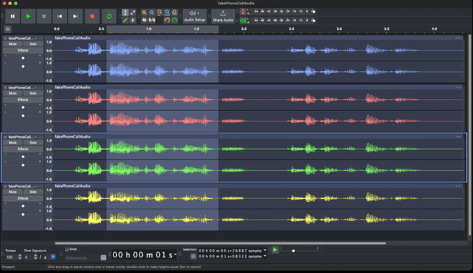
I use Audacity on Mac in dark mode, I’ve noticed that some of the icons are small and hard to interpret. Simply adding some colour would help. Also the waveforms are not so easy to see on a dark background, lighter colours would help. Final point, some dialogues use black text on charcoal, unreadable, with white graphs, not ideal. I’ve mocked up a sample screen to show how it could be improved, what do you think?
