Hello,
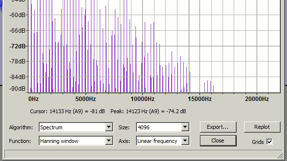
I am analysing some noise from industrial equipment and have been asked by a noise expert to do the spectrum analysis with a linear scale on the x-axis such that harmonics are more easily recognisable. At the moment the range goes to 40,000Hz while I’m only interested in <500Hz. Is this possible to do ?!
Zoom In to a spectrum analysis is a Feature Request.
The work-around, since the accuracy of the display goes up as the dragged size of the window goes up is to repeatedly drag the window larger and push it off the left of the screen as you go. Then reposition the window so the portion of interest is in screen center.
OK, thanks. Using Trebor’s pictures it does look like the harmonics are easier to pick out with the linear plot which I think is what the acoustics guy suggested. I’ve just spent an hour downloading other software to try and achieve this with no success. Unfortunately I can’t zoom in and get the definition between the frequencies I’m interested in with Audacity on the linear scale so guess I’m stuck with using the log scales which I daresay will be OK…
If you re-sample a copy of your audio by dividing its sample-rate by four,
that will effectively allow you to zoom-in on the lower frequencies on the spectrogram …
[click on this image to see it in its entirety].
NB: you’ll have to click-on “replot” after resampling , (as the frequency analysis won’t automatically update itself).
SoX has nice spectrogram plotting feature.
SoX does not have an equivalent to Audacity’s “Plot Spectrum”, but it does have “stat” and “stats” effects that can output a wide range of statistical data.
SoX is documented here: http://sox.sourceforge.net/sox.html
The basic syntax for a spectrogram is:
sox my.wav −n spectrogram
where “my.wav” is the file to be analyzed.
To plot a spectrum up to, say, 500 Hz with SoX:
sox my.wav −n rate 1k spectrogram
The “rate 1k” parameters tell SoX to analyze with a sample rate of 1 kHz, which thus outputs a range up to 500 Hz (half the sample rate).
Note that “Plot Spectrum” in Audacity can output the analysed data as a text file, which can then be imported into any suitable graph plotting application to create custom graphs. http://manual.audacityteam.org/o/man/plot_spectrum.html
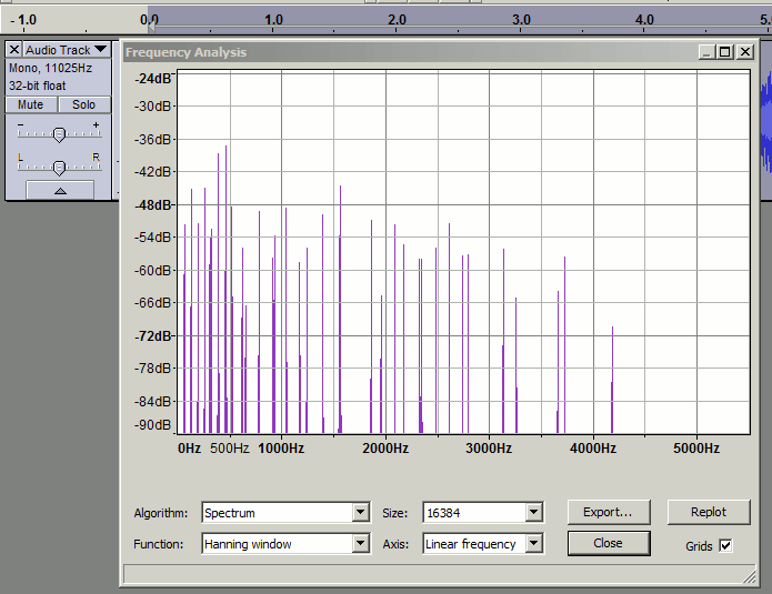
I haven’t managed to get SOX working in Windows 7 but the export function and then graphing in excel works really well although quite time consuming. Plus the resampling rate also works but I find I have to use a value of 3500 rather than 1000 otherwise I get an error message saying there is not enough data. My recordings are ~20 seconds and done in wav 24bit 96k format.
The “Size” setting in Plot Spectrum sets the number of samples used for each FFT window. There must be at least this number of samples available in the selection.
After resampling 20 seconds of audio to 1000 Hz sample rate, there will be 20 x 1000 = 20000 samples.
If you wish to use a window size bigger than 20000, use the “Repeat” effect (Audacity Manual) so that there are more samples available.
Bad idea, this introduces an artificial periodicity/comb effect. It is better to padding the audio with zeros at the beginning and end (for non-rectangular windows).
In fact, plot spectrum should do this automatically imo for short selections.
I can see that effect if I use hundreds of repeats, but we’re talking about just two or three repeats. With only three repeats the effect seems negligible, or can you demonstrate that there could be a significant effect?
As an example, attached is the spectrum test for a 49 Hz sine tone generated at 48 kHz, then resampled to 1000 Hz, then repeated three times (total 80,000 samples. Other than the -2 dB spike centred at 49 Hz, the level remains below -100 dB throughout. spectrum.txt (729 KB)
I agree that padding with silence would be better but then for quantitative measurements it would be necessary to scale the results.
Of course the resampling needs to be very high quality so as to avoid alias frequencies creeping in, but the default settings in Audacity should handle that pretty well.