I often use the functionality to export waveforms to PDF or SVG to illustrate scientific articles. In this regard I have a few interrelated questions.
REQUEST TO ADD FUNCTIONALITY — In Audacity versions before 3.6.4 and at least until 3.0.0 it was possible to export the waveform to PDF via File > Print. Q: Could this functionality be reintroduced? It was very handy!
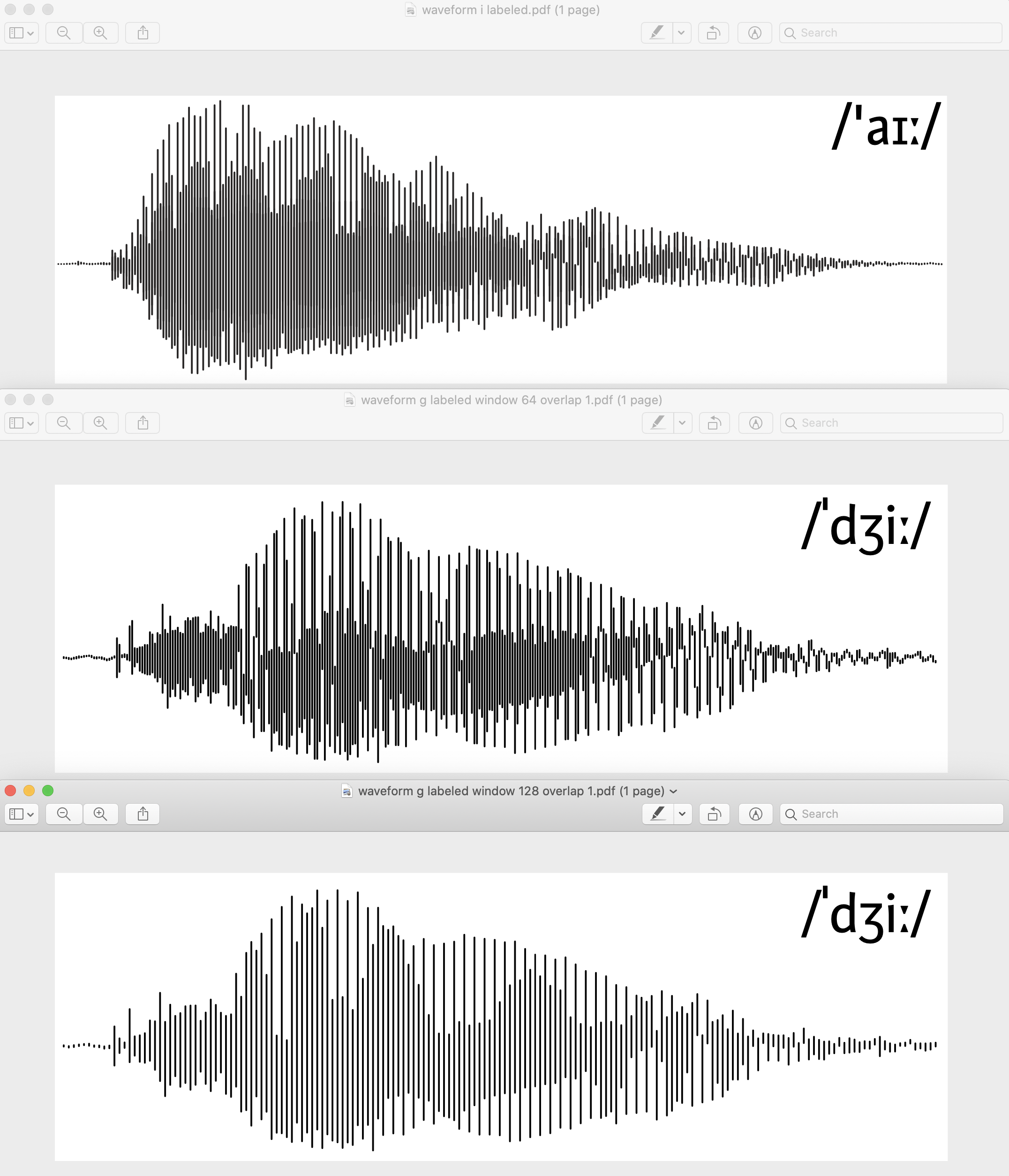
BARS VS POLYLINE PLOT — In v3.0.0 the PDF waveline plot is a polygonal line, with each data point linked to the next by a diagonal line. However, my PDFs show a bar plot, made of vertical lines separated by a space. I can’t reproduce this behavior anymore. Perhaps I post-processed the plots in other software. Q: How do I make the older Audacity versions print bar plots of waveforms?
BAR PLOT METHOD — I wrote my own code to generate bar plots from audio files, but the results are slightly different from what I achieved with Audacity (see above). Specifically, the bars do not overlap gently. I experimented with different sampling window lengths and overlap lengths. My method consists in a sliding window of length n and step d from which I take the minimum and the maximum values and represent them as a vertical bar in the plot (i.e., I visualize the change in dynamic range along the audio signal). Q: In which file of the Audacity source code is the relevant code that produces the bar plot?
FIGURE. Bar plots of sound waves. Top: produced with Audacity. Middle & Bottom: my method.
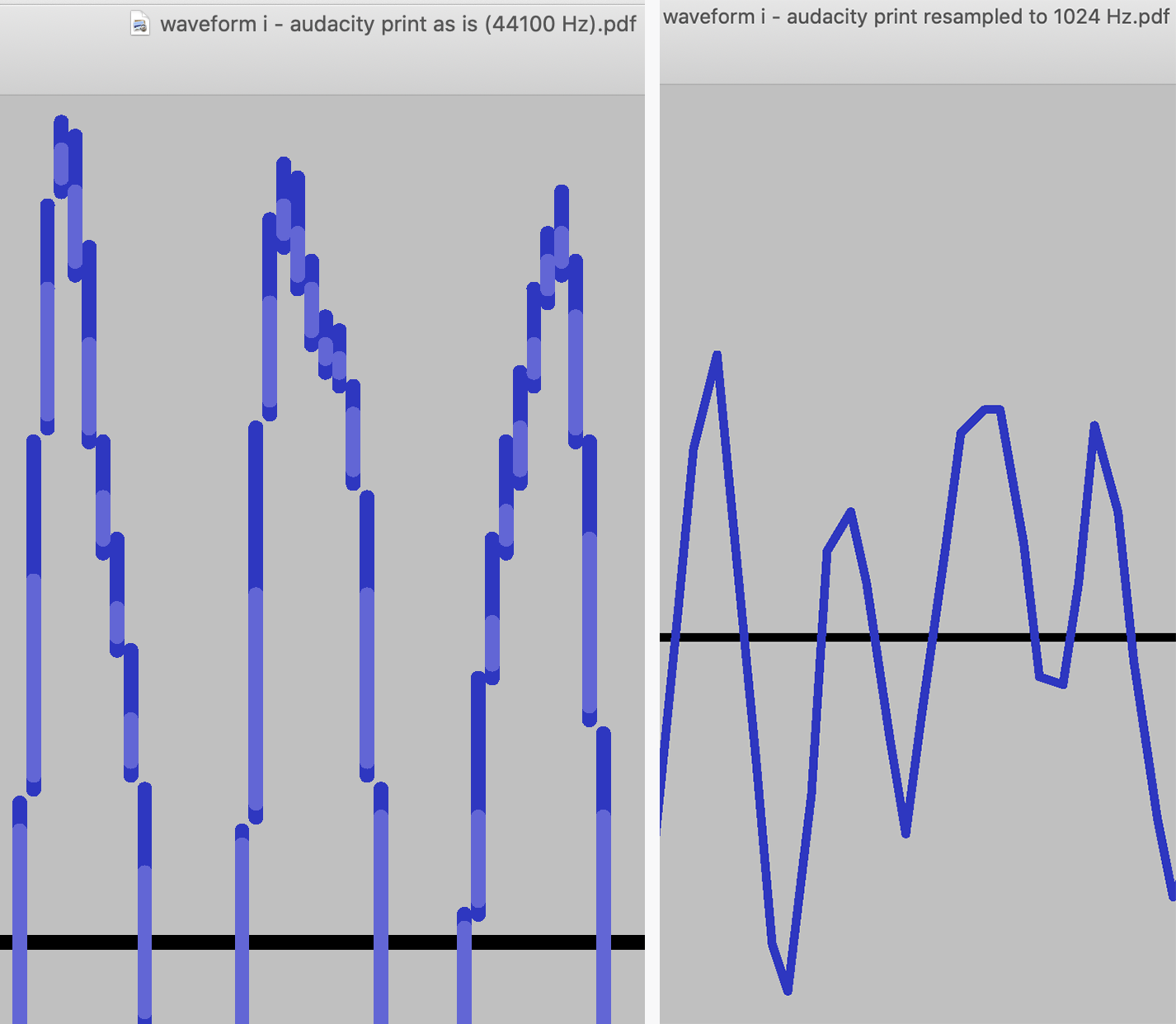
Thank you! Indeed, you can change the GUI waveform plot type from “connected dots” (polygonal line) to “stem plot” in Audacity’s “Preferences”. However, in v3.0.0 you can observe the following behavior while printing (File > Print):
At 44100 Hz the print is a stem plot, indifferent of your display setting. On one hand, this is the behavior I was looking for; on the other hand, how do you print a “connected dots”-type plot?
After resampling to 1024 Hz the print is a “connected dots”-type plot. My reason for resampling is to have a less cluttered waveform.
In short: Q: Is it possible for the printed waveform to have the same plot type as the waveform displayed on the GUI?
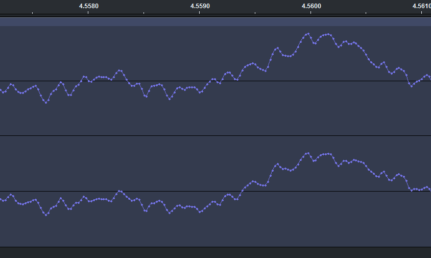
PS: The question also remains about what exactly is the method used to generate the stem plot. In the screenshot below you can see how variable the overlap between bars/data segments are. Also, there are two shades of blue – what do they represent?
FIGURE. Printing the same waveform at two sampling rates with the “stem plot” option in “Preferences”. (The two screenshots do not represent the same data ranges.)
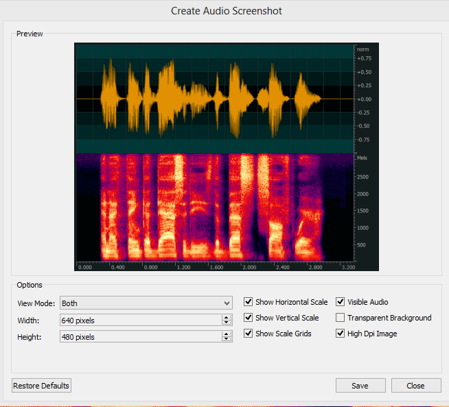
I was using Sonicvisualizer for spectrograms, and Tony for pitch visualization (https://www.sonicvisualiser.org/tony/). Thanks for the link to Praat, which I find great, in particular in context of this thread, since it allows to save waveforms to PDF. Otherwise I do my signal processing and visualization in Matlab https://www.mathworks.com/products.html, with post-processing of the plots in Adobe Illustrator.