I wonder how to change the default ugly look of the Audacity UI in such a Linux distro as Kubuntu 18.04 and such a desktop manager as KDE.
My eyes want to bleed whenever I start Audacity ![]() And I’m pretty sure I have a sort of the default setup, which makes me think, that this affects literally everyone with the same setup as I described above.
And I’m pretty sure I have a sort of the default setup, which makes me think, that this affects literally everyone with the same setup as I described above.
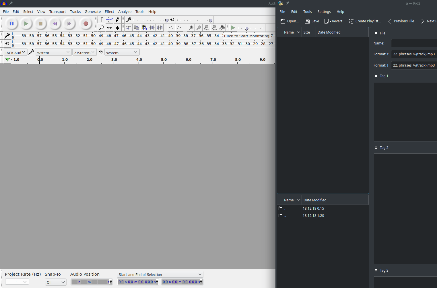
This is a screenshot of the Audacity UI to the left and a sample program from KDE ecosystem (Kid3) to the right just to see the difference:
And if you thought for a second that maybe choosing a Dark theme would do, behold:
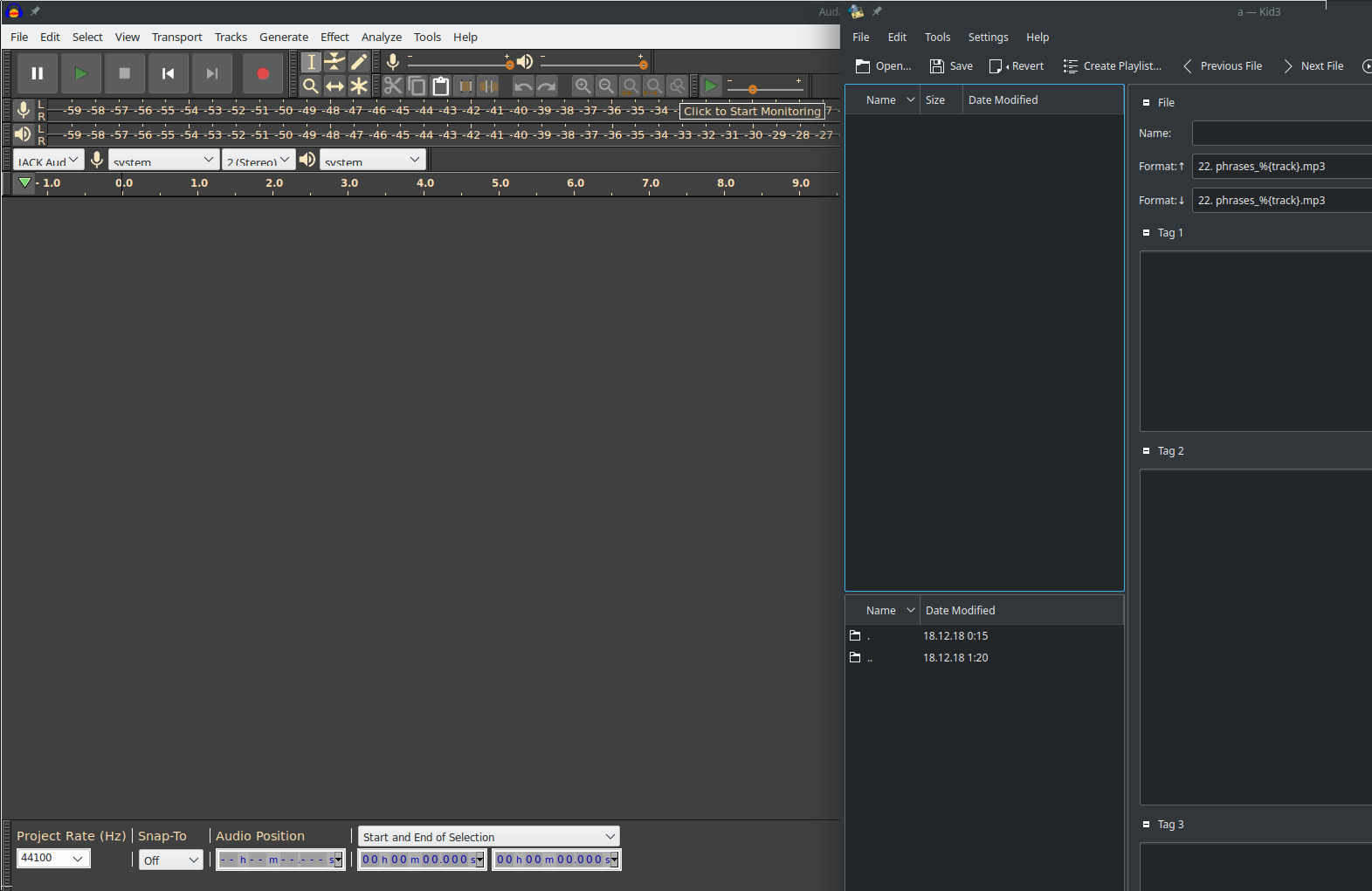
- the overall drak doesn’t fit the system dark;
- the contrast of the light elements (e.g. text) is to high;
- the menu, drop-downs and almost all the controls haven’t been themed at all.
And in both variants the most troublesome part is definitely the device drop-down lists. Basically they don’t fit into UI and you don’t really see the full text.
Folks, is there a way to make it look at least a little less ugly? Or at least to make the UI text to score a hit?
Please, forgive me, I do understand that this is an opensource software and so… So I don’t blame anybody really ![]() It’s just that… do you find this acceptable? For years? Why it hasn’t been corrected for this many years then? Questions… questions…
It’s just that… do you find this acceptable? For years? Why it hasn’t been corrected for this many years then? Questions… questions…