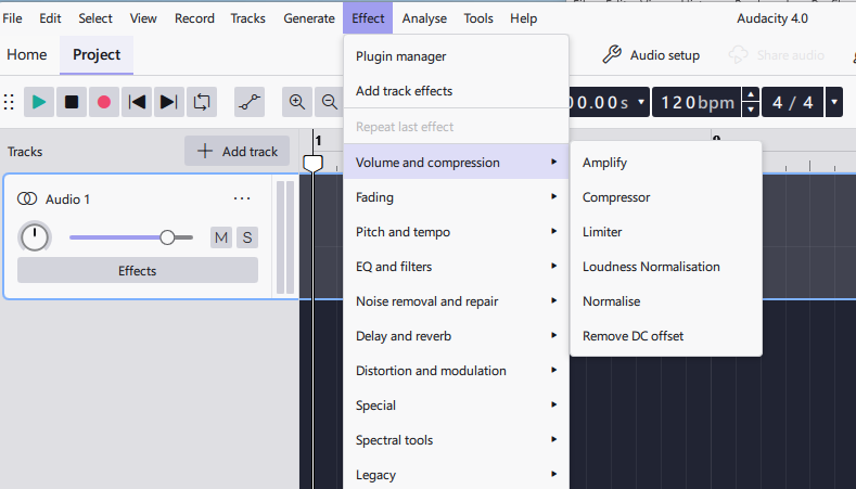
All menus in Audacity 4 are double-spaced. Not only does this look awful… it’s a waste of space. It also means more mouse movement to get to the required item and is totally impractical for long lists of items such as the VST plug-ins list.
This double-spacing issue is the case here in Audacity 4 on a Windows 11 OS (latest update).
I would humbly request you give the user the option to choose normal single spacing, or whatever was the case in Audacity 3, or simply put the default spacing back to how it was before.
Thank you for your consideration.
All menus look nice here, as usual, on macOS 14 “Sonoma”. Please post a screenshot so that we can see what your problem is.
Audacity 4 has menu items spaced out (probably double spacing) like this here in Windows 11:
These menu items are too far apart. No other software I use has menus with this spacing. It looks and feels plain wrong.
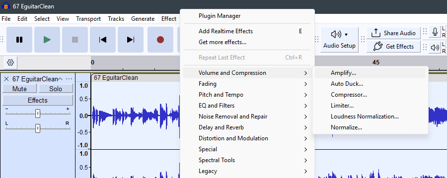
In contrast, Audacity 3.7.9 looks like this:
This is way more compact and suits long menus where there are many items. There’s less mouse travel and less eye travel. It complies with standard expectations. Personally, I prefer this and find it easier to look at and to use.
So I’d humbly request single spacing for v4 the same as it was in v3.7.9. The slightly larger font in v4 seems fine but NOT the spacing.
indeed, it looks unusual / odd, thank you for the examples.
So far, I was of the opinion that the look of the menu depends on the operating system and, maybe, some settings you did there. Is it the same computer or is it only the same version of the operating system?
However, since I am only using Macs and Linux, I couldn’t tell you where to do any adjustments (if they are possible). Let’s wait for the Windows experts…