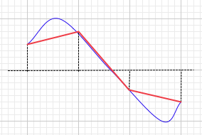
Perhaps we are - maybe we’re getting tied up on semantics, but I’m having trouble with your phrase “what the samples are supposed to represent”.
As I see it, the data in the computer is nothing more than sample values - these are represented by the dots. As far as the procesor is concerned, there is no analogue waveform, just sample values. To represent the data correctly, there should be no line at all. However, in most situations, the joining of the dots makes the visual data easier to read for the user.
The line between the dots, whether straight or curved, is indicating inter-sample values, but these values do not really exist except in the the analogue domain, and that is either pre A/D or post D/A. In either case, drawing a curve suggests that Audacity can predict either, the analogue wave prior to digitisation, or the analogue wave post sound card. In either case we would be looking at what the DACs do, not the digital data which has no inter-sample values unless we extrapolate the data (essentially up-sampling).
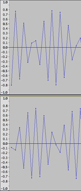
Here we see a 3000 Hz sine wave that has been recorded at 8kHz (upper track).
The lower track shows that 8kHz sample rate wave after it has been rendered by the sound card and re-recorded at 48 kHz.
This would suggest that it would be quite reasonable for Audacity to interpolate the data as you suggest, but now let us look at another example.
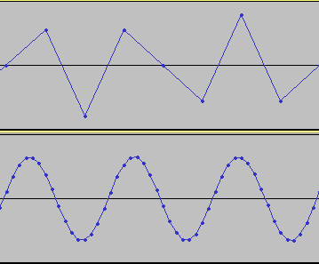
In this next example the top track is a recording of a 2770 Hz square wave - recorded at 8kHz sample rate.
Now should our “analogue line” (inter-sample values) represent the theoretical waveform prior to A/D conversion, or post D/A conversion. As we will see, the two are very different.
The second wave is the 8kHz recording, rendered by the sound card and re-recorded at 48kHz. We can immediately see the difficulty that the sound card had, though I doubt that the result differs much from the mathematical optimum.
It is interesting to note here that this track has considerably higher peak amplitude than the original, although the record setting were the same for each of these tracks.
The third track is the original square wave at 48kHz sample rate, and is a fair indication of a square wave.
The final track is the 48kHz wave, rendered through the sound card and re-recorded. It appears that the sound card has produced errors in the sample values, (the horizontal lines are no longer straight, but jitter up and down), but this is not due calculation errors in the sound card, but rather by ripple caused by bandwidth limiting. Perhaps both the third and fourth tracks should indicate this ripple?
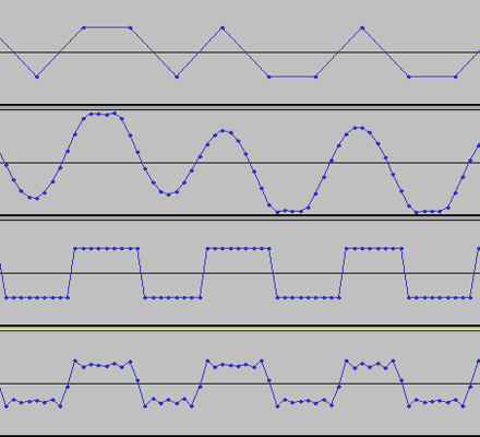
The questions here are:
Looking at the first track - would it be better for Audacity to draw a line that represents the wave before or after conversion to the digital domain - noting that in the digital domain there should be no line at all.
Looking at the third track, should the line show a square wave as it does, or should it show the ripple that will be produced due to bandwidth limiting?
Looking at the fourth track, should the line be a curve indicating the overshoot and subsequent ripples?
(I’m not really asking for answers here, just voicing my contemplations.)
Finally, let’s look at a couple of milliseconds of real world audio rather than test signals:
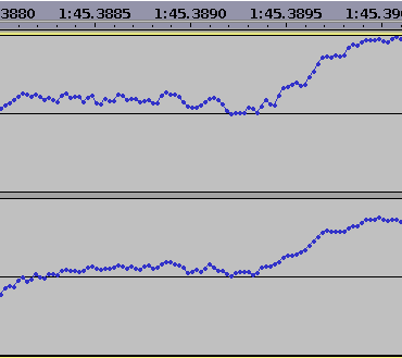
For this scenario, is there really a problem with using straight lines to join the dots? Is it worth the effort of programming a windowed sinc function into the rendering? After all, Audacity is intended as an audio editor, not a scientific signal analysis tool.
You may be interested in this project: Sonic Visualiser