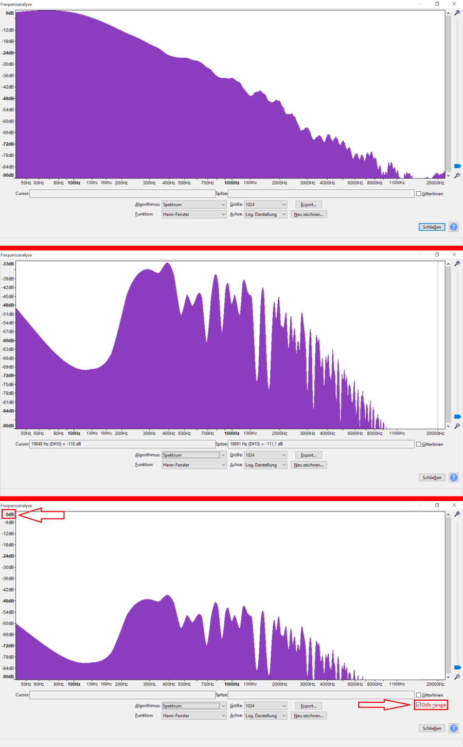
I really like Audacity and its frequency analyzer,
but I dislike the fact that the y-axes’ range depends on the actual loudness of the audio.
When you compare for example a bass sound with a pad sound, both look similary loud at the first view.
This is very confusing, especially when you take screenshots and layer them.
Picture 1 = Frequency spectrum of a bass sound
Picture 2 = Frequency spectrum of a pad sound
Picture 3 = Frequency spectrum of a pad sound how it should be
Perhaps not everybody would like this feature, so a checkbox would be the perfect solution.
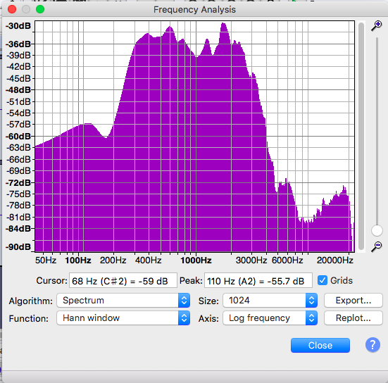
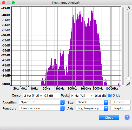
You might consider running the “Size” variable up a bit. 1024 is not a lot of detail in the display.
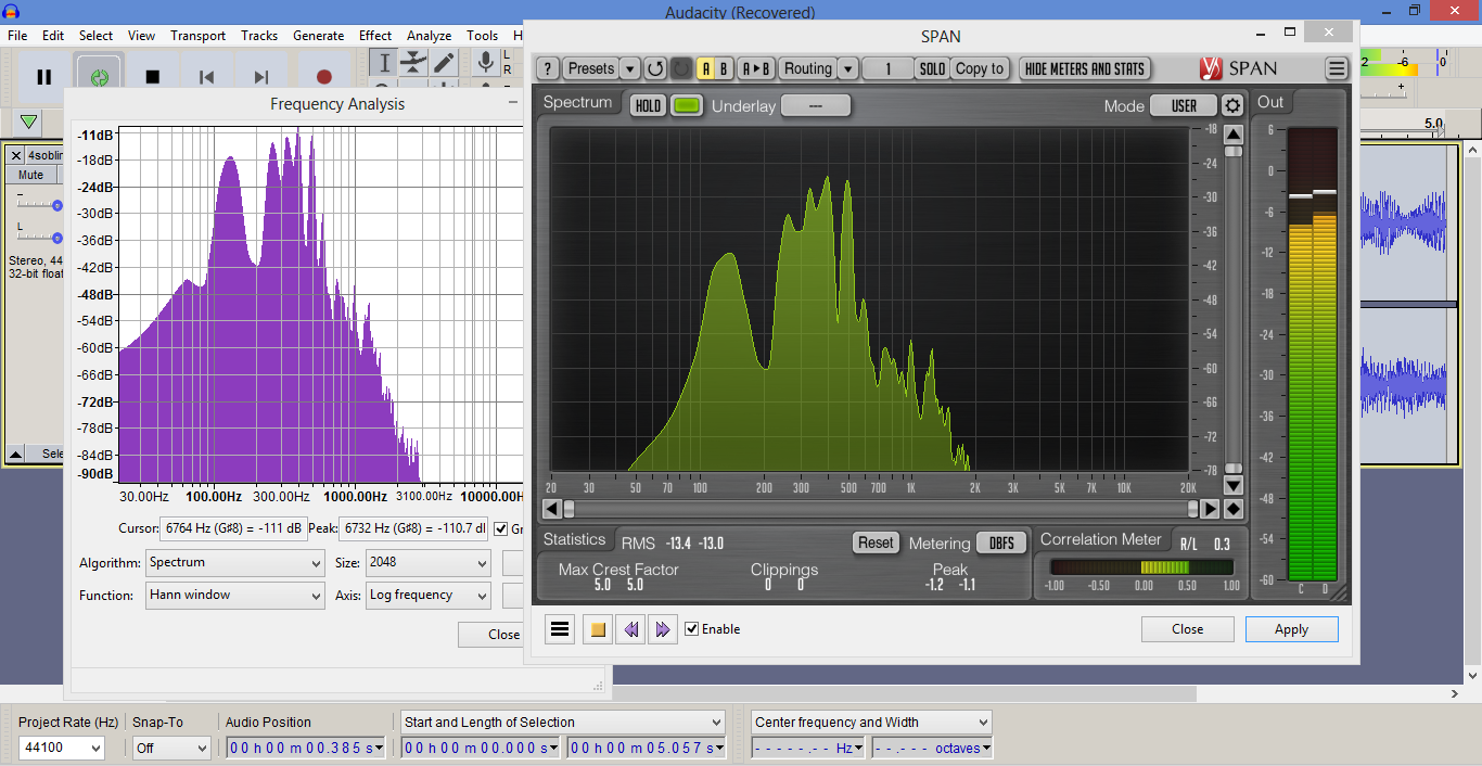
I’m pretty sure I know what happened. if you’re a new user, it’s better to put something on the screen and Auto Volume is a good, easy way to set the display.
But you’re right. Moving graphs drives me crazy.
I can save even more work. Once you set the screen values, provide the ability to post two graphs at once.
And while we’re here, note the frequency ranges moved between my two illustrations.