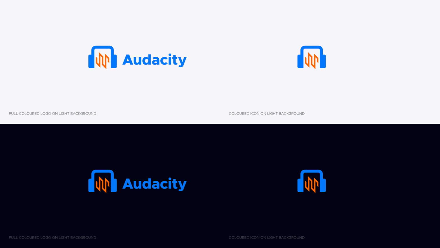
The current Audacity logo is really recognizable. It has been what it is for so many years it’s not a wise idea to totally reshape it into another design.
My goal was to stick as much to the old logo idea and redesign it so it catches up with modern graphic design standards.
My logo proposal is flat, brighter than the current one. I wanted to remake headphones shape and utilize a waveform in a minimal, easy to read style. Brighter colors indicate that its the interface is simple and user-friendly.
Can you guys tell me any thoughts on my logo redesign? I’m trying to make a consistent update rather than redesigning it from scratch.
I wanted to make it as similar as possible to the current logo but using grid to design it. Do you find it keeping with a connection with the current image? Or is it too different from the original?
Please note that while it is always interesting to see ideas from Audacity users, the Audacity Team are not looking to update the logo again any time soon.