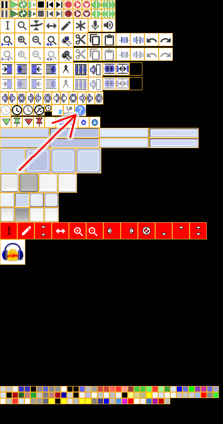
A couple of minor issues from one of the Audacity developers:
The little down arrow button on the time controls is pretty hard to see and the help button is blank.
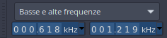
I assume that he means this arrow on the timeline controls:
and this help button:
A couple of minor issues from one of the Audacity developers:
The little down arrow button on the time controls is pretty hard to see and the help button is blank.
I assume that he means this arrow on the timeline controls:
and this help button:
Thank you for the feedback.
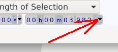
The little down arrow button on the time controls is pretty hard to see
Ok, that part of the bg is defined by the TimeHours color (row 3, column 13), which also affects the background of the time units in the clocks.
I can definitely make it brighter, even if that would cause a bit more contrast in the “striped” look of the clocks.
The best solution of course would be to make the arrow white or light grey, but I assume it’s not possible…
the help button is blank
Strange to hear this… the help button has a big, bold “?” in it (it’s clearly visible in all versions I uploaded here)… ![]()
But maybe the deveolper is testing the theme against a bright GTK theme, so the “?” wouldn’t be visible.
I see the problem, the button should be visible against any theme.
So I’ll make a circled or boxed “?”, it’s better.
I’m not sure what he meant, I’m just best guessing.
That was my guess.
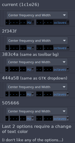
Regarding the first issue, there’s a problem.
I’ve tested basically any shade of grey in the theme palette and no one really works.
The clock becomes very dull on the background (clocks should pop out from the background IMO, in my experience it’s important in the workflow).
Please see attached image.
Furthermore, this theme is originally meant to be used together with the Arc-dark GTK theme. I know the arrow isn’t themeable, but many elements that aren’t temeable are in fact themed in the built-in themes. That arrow should really be light gray, and precisely #d3dae3. Please forward this to the developer. Thank you
The Help issue is solved, though.
BTW, I’m aware of other issues in the theme that can’t be fixed through custom theming, but can be fixed in built-in themes.
I’ll address those issues in case the developers decide they want to code the theme in.
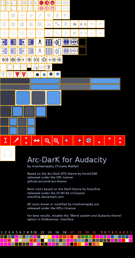
Hi, here’s a proposal for a solution to the problem in time controls, using a different approach.
That looks nice, and importantly everything is visible. How does it look in the context of the whole interface? (I’m imagining that it looks good).
Well, I’m still getting used to it, I didn’t really want to have such blue spots and I’ve struggled to find a desaturated shade that doesn’t hurt my eyes… but now I kind of like it! ![]()
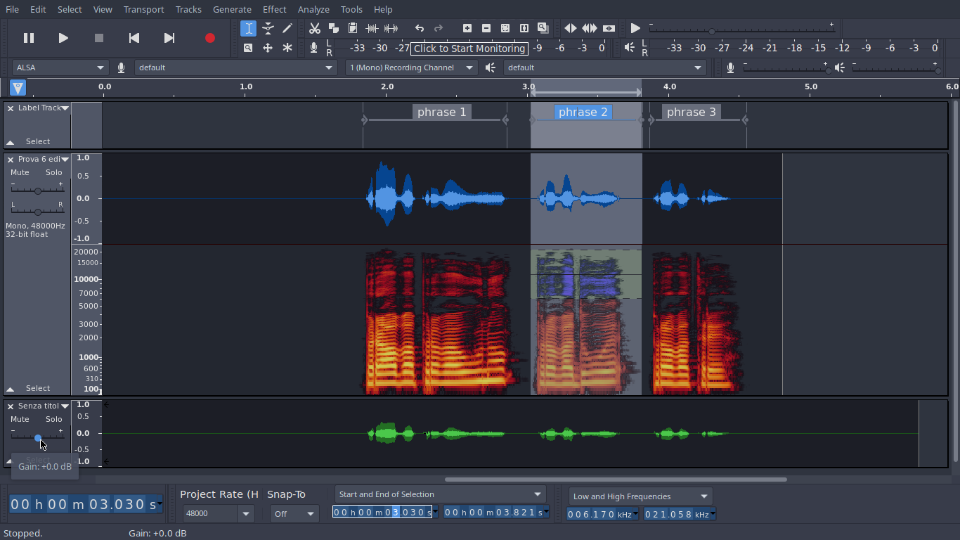
Here it is in the bigger context, together with the updated ImagCache.

HI!
How can I install/use this theme on audacity?
It looks soo nice and refreshing (first time I’m gona try to change the theme on audacity) ![]()
EDIT:
Ok. I do my homework now, and read the READ ME. Your idea looks so nice and I hope it can added to the program in some close future.
Cheers!
You are of course referring to the READ ME link posted in the pink and blue box at the top of this forum page. Glad you found everything you needed.
Thank you so much!
BTW, can you confirm that
Users<username>\AppData\Roaming\audacity\Theme\ImageCache.png
is the right path to install a custom theme under Windows 10?
I’m trying to do so right now but the program (v. 3.0.2) keeps showing the default Light theme…
Solved… Windows has the bad habit of adding an extra “.png”…
UPDATE
This is an updated version of the theme, including the color for line 2, row 2 (“CursorPen”), which is now used by Audacity to draw the cursor line when stopped, as well as the dividing line between waveform and spectrum in multi-view.