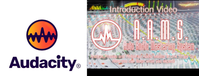
Here is my Audacity logo redesign proposal. I know there are many. This one is certainly different that the rest. Here are some of my thoughts.
Logomark
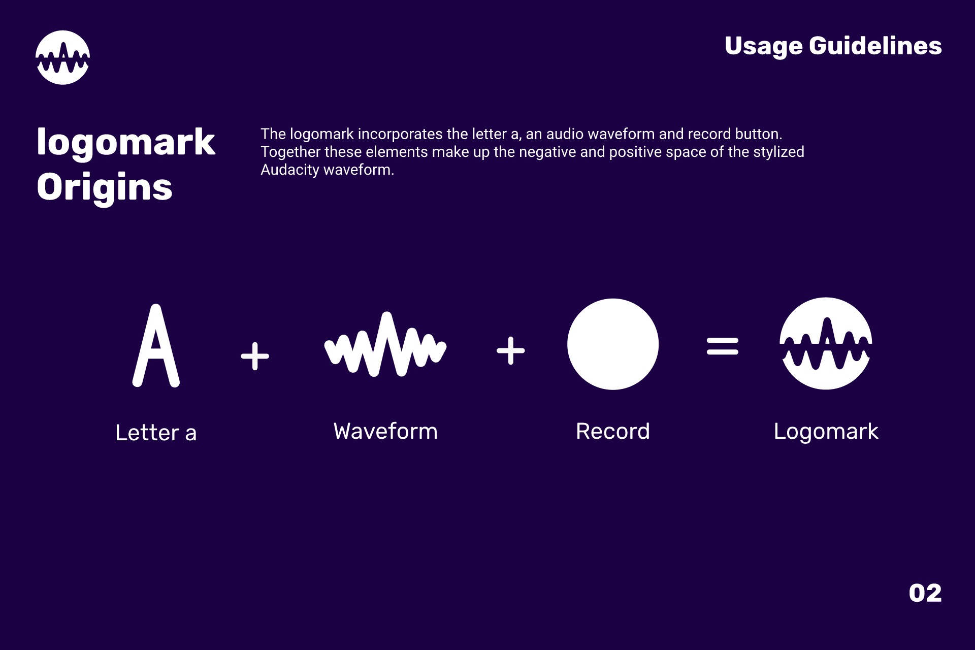
The logomark is a stylized waveform utilizing negative space to create an “A” for Audacity. The waveform is also an ode to the current Audicatiy ideogram.
The goal for the logo design was to capture what Audacity is all about. Play, record, and edit sound. A waveform was already apart of the Audacity logo and with some adjustments can be the focus of the brand. This waveform icon is designed to be readable when scaled down.
In the past, the Audacity logo featured headphones as a prominent feature. With the advent of smartphones and advances in UI design, headphone icons have become synonymous with elements used for web, app or default phone menu items or packaging design info. Because of the current trends a headphone icon can be difficult to effectively represent what Audacity is all about in an era dominated by mobile technology. Over the ear headphones aren’t the only way users play, record or edit audio. Many use in-ear headphones or mid range to high end studio monitors. Regardless of how users listen to their audio while working in Audacity, the waveform will be the most prominent element they will see. This makes the stylized waveform an ideal candidate for the Audacity logo.
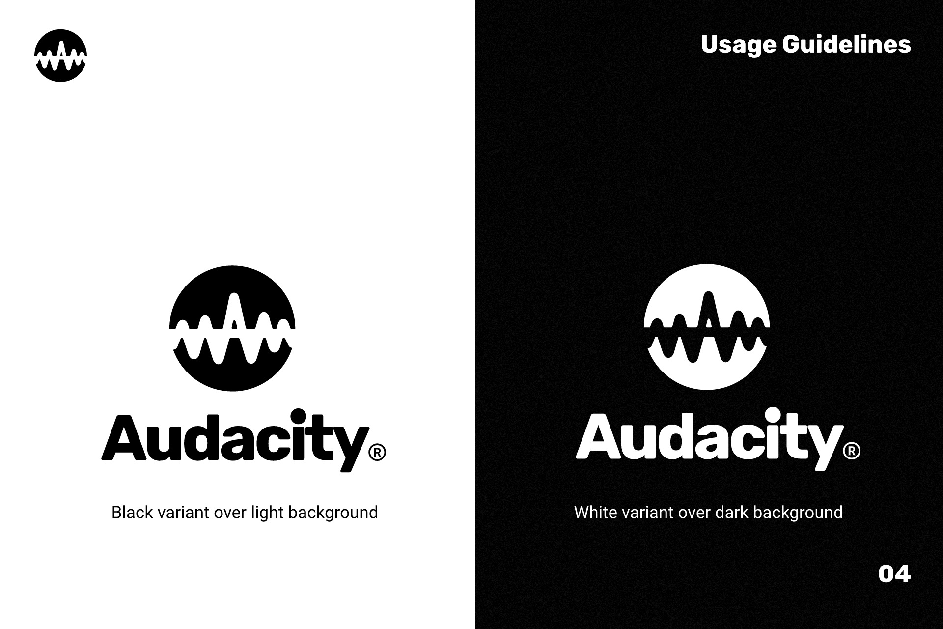
Wordmark
This wordmark is a slightly altered version of the Rubik font.
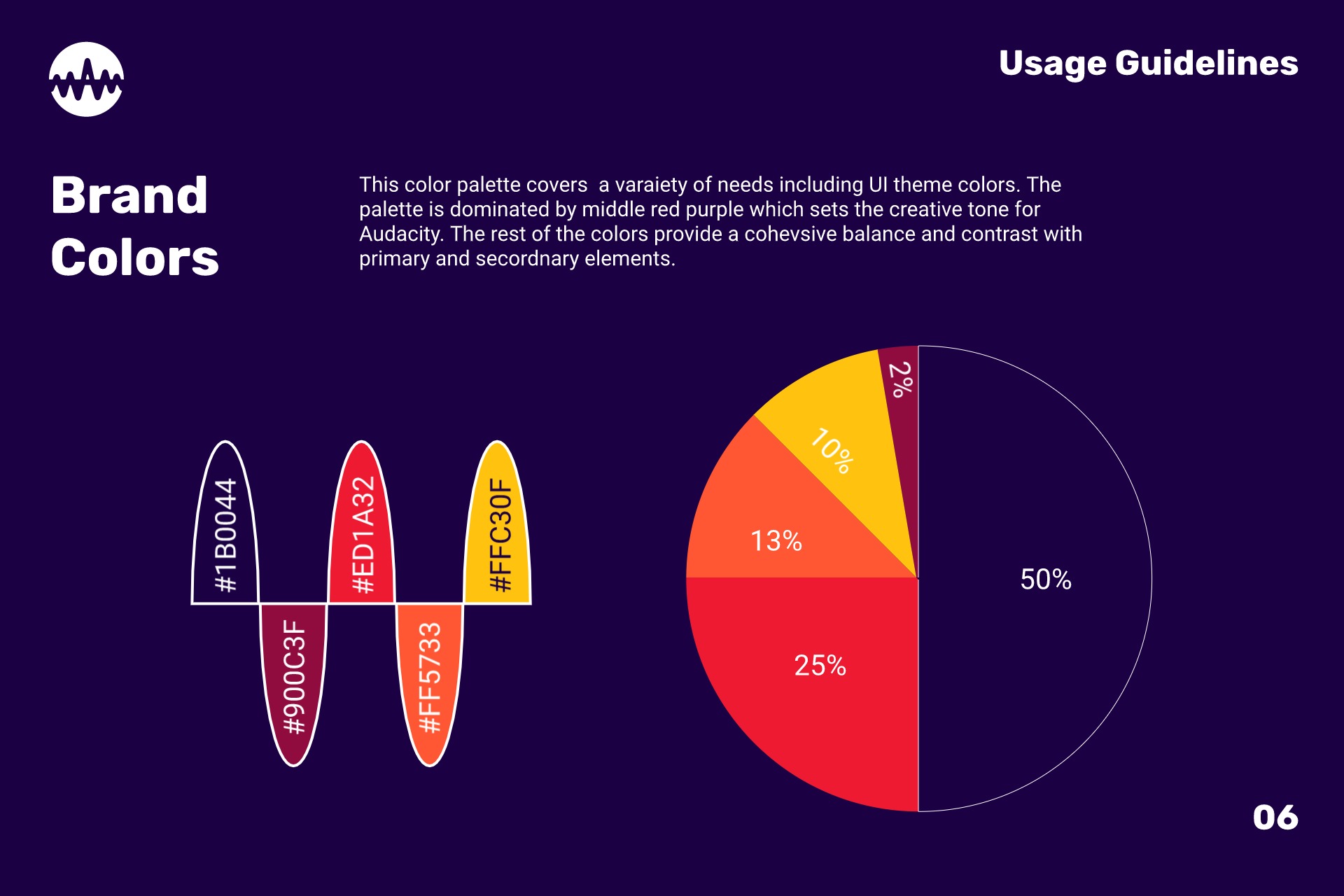
Brand colors
The current brand colors are Red, Dandelion yellow, Orange and Blue. Taking into account color phsycology, these colors are intended to stimulate the feeling of hunger. Fast food chains have these colors ingrained into the minds of many customers. Mcdonalds, Burger King, In N Out Burger, Pizza Hut are just a few examples of this palette used in food marketing and branding.
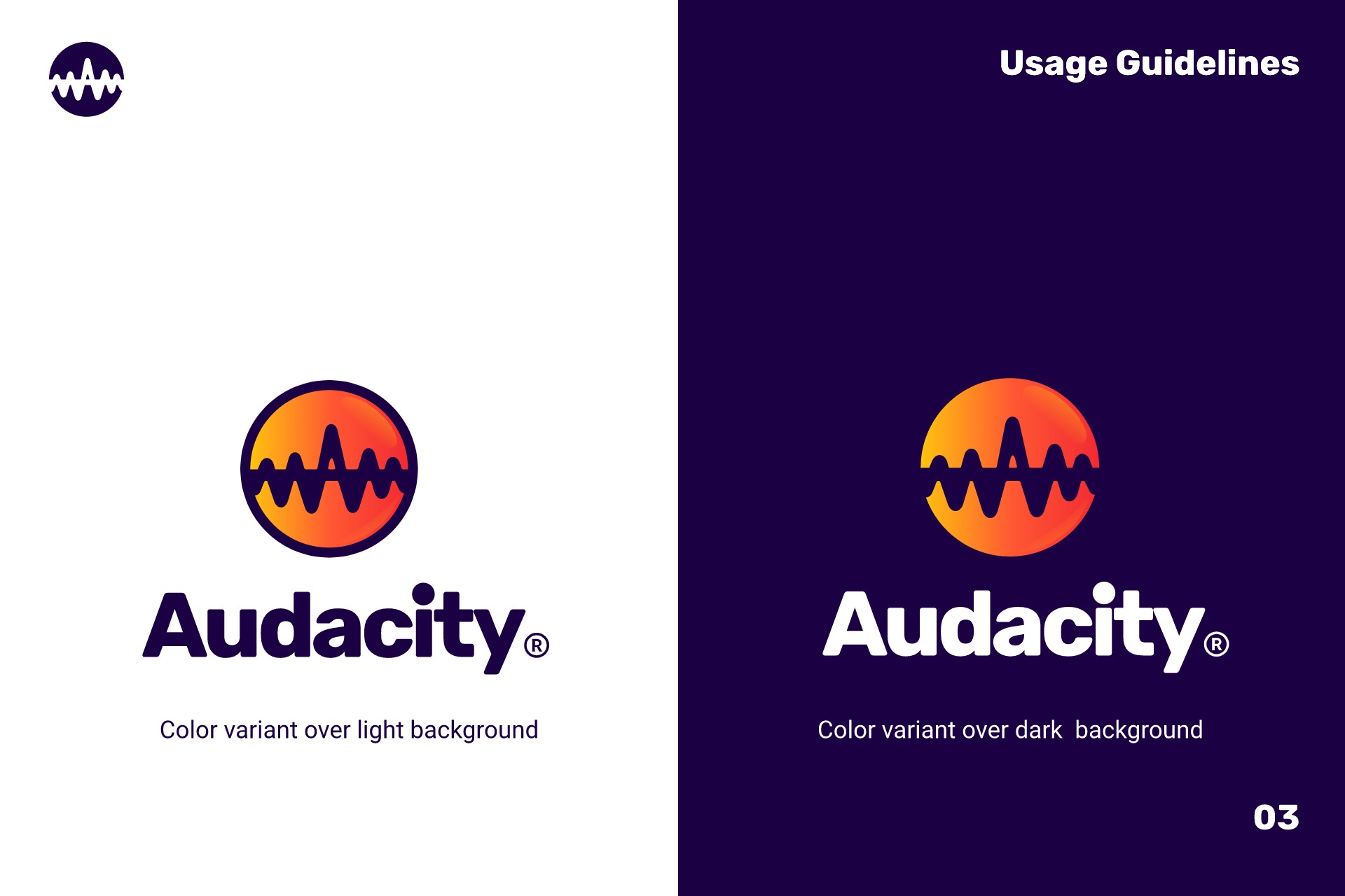
The color palette I propose consists of middle red purple, pink raspberry, Portland orange and mikado yellow.
These colors are cohesive and help spark creativity, joy and enthusiasm while recording and editing audio in Audacity.
Summary
This design may be too much of a stretch from the original however I have taken many things into consideration such as brand perception and color physchology to make deliberate design decisions creating this logo. I believe these assets can be valuable to the Audacity brand aesthetics. I hope this can be a something to consider. If interested I have all assets available in svg and png. Thank you for taking a moment to read my proposal.