I’m a new Audacity users, so this question has probably been addressed before, but I could not find it in the FAQ.
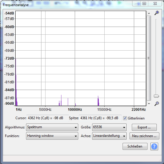
I imported my data and selectes Analyse/Plot Spectrum. To be able to do further manipulation I exported the spectrum as txt.
The problem is that the sepctrogram graph by the exported data (I am using DIAdem) did not match what was shown on the sepctrogram graph in audacity. The frequencys by the exported data have a higher amplitude.
My questios is why the sepctrogram graphs do not match. What do I Export when I use the Export function for the Analyse/Plot Spectrum.
The graphical representation in Plot Spectrum requires two types of approximations:
Where there is more that 1 pixel per frequency bin, pixel values are interpolated between the discrete centre frequencies.
Where there are more than 1 frequency bin per pixel, each pixel value represents a group of pixels.
If I recall correctly, Audacity uses cubic interpolation in the first case. I don’t recall exactly what it does in the second, but I think it takes some kind of average.
Unless you are performing the same translations, your graph will look slightly different.
The raw (numeric) data that is exported, comes directly from FFT analysis, normalized so that a 0 dB sine wave at the centre of a frequency bin will be 0 dB.
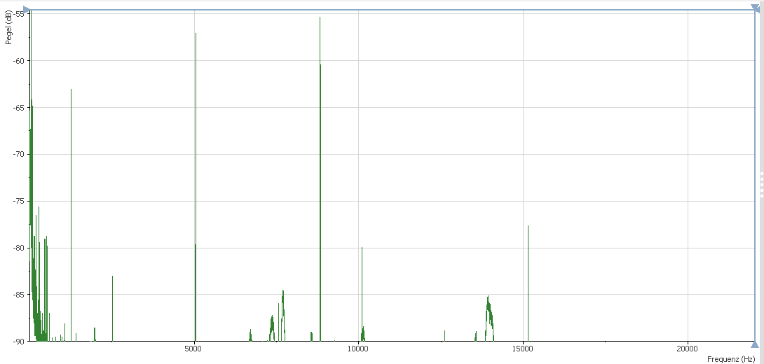
How do you create a plot outside of Audacity? I have exported the Audacity data into excel and then plotted it but the peaks look nothing like what Audacity shows. Ideally I would like a graph that shows the fundamental frequency and then the harmonics.