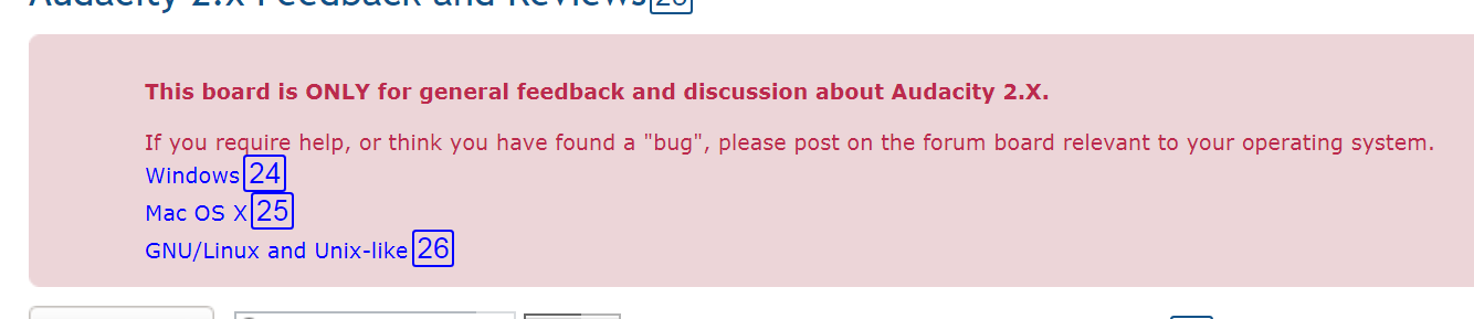
This panel appears near the top of every page and consumes excessive vertical space:
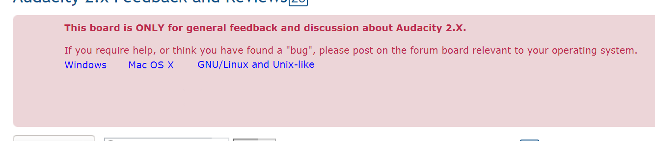
considerable space could be achieved:
There appears to be an “unnecessary”
(linefeed) before any text (other similar panels do not have this “wasted” space at the top). The 3 hyperlinks for the various operating systems could easily reside on a single line with a bit of internal spacing (worst-case - "hard space"s could be used).
One additional line could be saved (not done in my example) by removing the extra
(linefeed) between the 1st (bold) line and the line with the 3 hyperlinks. I’m not sure that doing so would be appealing.
PS - please ignore the boxed numerals in the 1st example (they are used by “Click By Voice”) and I neglected to remove them from the image.