I’d like to see that shrink/expand button at the bottom of the Track Control Panel made less wide - that would give us space for a “Select” button which would go where Koz has his red patch.
That way it should be pretty clear what you have to do to select the track.
If anyone else likes this idea I will write it up as an enhancement request.
I like the idea - there really is no need for the button to be so wide - but I think it could be useful to have a broader discussion about the track “info” panel.
For example, many new users fail to realise that the button with the track name is a button. The fact that this is such a common issue points a finger at the design rather than at the user. In my opinion, it is because the button has the track name on it that it is commonly seen as being just the name of the track. Conventional GUI design is to have an icon or text on buttons that indicate what the button does, but in this case the text refers to the name of the track and has nothing to do with its function as a menu button. If that button said “Menu” (and the track name was elsewhere), then I think it would be obvious that it was a menu button.
Another common complaint is that only very short track names can be read easily (unless the name as a track overlay is enabled). Why not have the name expand widthways on mouse-over so that the full name can be read?
I think it would be useful to look at, discuss, and create a proposal regarding the design of the track info panel as a whole.
I was hoping for a quick win with just this simple suggestion.
It took me may years to realize that the Trackname itself was a button - I always used to carefully click on the LDPT (Little Downward Pointing Black Triangle).
In many ways I’d be quite happy to have that button just say “Menu” - but that then begs the question of where you put the trackname - and how do you do it without eating more screen real-estate (maybe make the trackname overlay on the waveform be on by default).
We already tweaked the Track Control Panel a while back for better space efficiency in line with this proposal from Sergei Chebankov
I would not want to lose that efficiency.
Or allow the Track Control Panel to be resized horizontally as has been requested in the past - it carries 8 votes on Wiki>Feature Requests and I shall be adding mine.
Indeed it would - but I am deeply aware that to do so will take us a LOT longer - for a start there is this long-standing proposal/duscussion paper: Missing features - Audacity Support
As I said earlier in this post I was just looking for a quick win - a simple tweak.
I am deeply aware of the number of times we have had to tell users on this Forum how to select a whole track by clicking in the Track Control Panel (carefully in the white space).
Adding a “Select” button would not only be “discoverable” - it may help some folk avoid accidentally nudging the pan or gain sliders.
And just doing this simple tweak does not prevent us from continuing to discuss further changes to the Track Control Panel.
Appreciated, but it needs to be decided exactly how big the button will be, and where it goes, which I don’t think can be decided without considering the other elements of the panel, (at least to some degree).
We also need to decide whether selecting the track should be on clicking any “unused” part of the info panel (as now), or an actual “select track” button. I quite like the idea of a real button, otherwise we are assuming that users “just know” that clicking an empty part of the panel will perform a specific “select” command.
Exactly. How many times have we written about the “LDPT”?
I think that even a “hamburger” button
would be clearer.
In many other DAWs / audio editors, “Mute” and “Solo” buttons are depicted as small buttons with “M” and “S”. Is that too cryptic for Audacity?
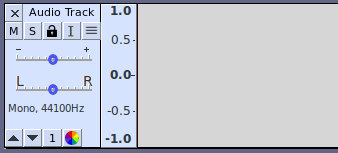
Well it seems to me from looking at the two buttons in the upper part of the TCP (Mute and Solo) that there would be plenty of room in a button of that size for the text “Select”. And Given the the shrink/expand button at the bottom of the TCP occupies most of the horizontal button space at the bottom of the TCP - it would seem that we could shrink that button to half-width, easily making room for a “Select” button.
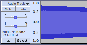
Over the years I’ve often wondered why the shrink/expand does fit the whole width as look would look cosmetically neater - but I realize that we need that little white-space square in order that the user can click in there to select the track.
This is why Koz so often posts his image with that white square in red.
And I remain keen for this to be a “quick win” - that can be done without “considering the other elements of the panel” apart from, that is, the oversized shrink/expand button.
I don’t think we would be taking away the ability to click in unused white space in the TCP. To do so would technically not be a regression (as functionality is not being removed - just its usage changed) but to do so may well annoy a fair number of users (including me)
LDPBTs are in quite common usage for dropdown menus in many other apps.
That said, I do note that we have two different/differing uses for the two LDPBTs in the TCP - so perhaps a hamburger should be considered at some stage.
After many years of having that in Audacity I would be loathe to change those.
Bells and whistles: Top:
X = Delete / close track
“Audio Track” = Track name. Tool-tip shows full track name (useful for long name). Click on name to directly edit the name (like editing a label’s text). On mouse-over, the text would become black on white and the pointer would become an I-cursor, indicating that it is editable.
Upper button row:
M = Mute
S = Solo
Lock = lock track (prevents accidental editing). Icon toggles between open lock when button up, and closed lock when button down.
I = Select track contents
Hamburger = Menu
Sliders:
1st slider = Track Gain (as now)
2nd slider = Track Pan (as now)
Text:
Shows mono / stereo and sample rate.
Bit format is evil and must die.
Bottom button row: ^ = Collapse
v = Expand
Note: When both Collapse and Expand buttons are up (as shown), vertical height will be the default, or the last “dragged” size.
Number = Current track number. Click to change track position in multi-track project.
Color wheel = waveform color picker
Additional comments:
All buttons to be available for keyboard shortcuts and scripting commands.
All buttons to have tooltips that give the full name of the button.
Right click on any button to open a “button options” menu - initially the only option would be “Help”, which opens the appropriate page of the manual.
We already use that size button for closing / deleting the track, and they are only a smidgen smaller than most of the toolbar buttons.
More importantly, I think every one of those buttons are existing feature requests in some shape or form.
I quite like the idea of a real button, otherwise we are assuming that users “just know” that clicking an empty part of the panel will perform a specific “select” command.
Which used to work a great deal better before the free real estate dried up.
Select the track by clicking the I-Beam, left. Snappy sentence. That works. Does that stand for something?
As I said above it replaces the red square patch at the bottom of the TCP that Koz often draws (see below)as a target for users for selecting the whole track.
I.e. at the bottom of the TCP alongside the “shrink/expand” LBT button - making the “shrink/expand” button narrower to accommodate the “Select” button. And geing there it remains visible when the track is “shrunk” or contracted really small.
Not sure whether the “Select” should be to the left or the right of the “shrink/expand” button.
We like consistency, and our other buttons have up / down states.
If the “Select” button is down on track 1, and you click the “Select” button on track 2, does the “Select” button on track 1 stay down or pop up? In other words, does selecting another track select the just the new track, or add the new track to the selection?
Will this button replace the current ability to select a track by clicking in an empty space on the info panel, or is it in addition?
An interesting question - I was expecting it to work like Koz’ mythical red square
I.e. click on it, track gets selected, button goes down - release mouse button, Select button pops back up.
We do already have buttons that pop back up after teh action is done - e’g. in the Transport Toolbar: Stop, Skip to Start and Skip to End.
(We could make a second click in it deselect the track - but that is not really necessary.)
Note that, as now, with clicking the the mythical red squares the user should be able to use Ctrl and Shift modification of the “Select” button to select multiple tracks.
Oh and as I said before we should not lose the ability to select by clicking in “white space” in the TCP - or double-clicking on the waveform.