Thanks for the feedback Trebor.
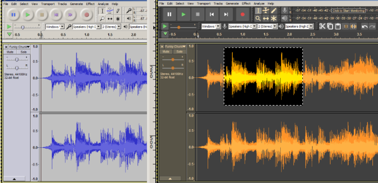
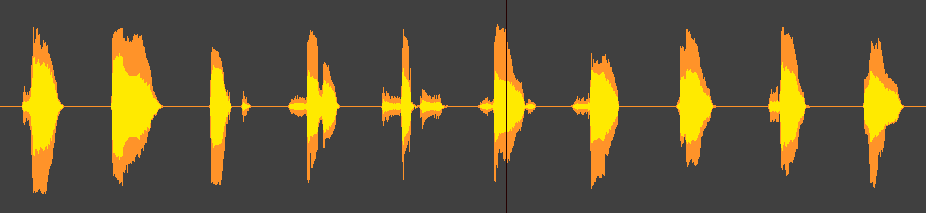
I agree that with real-world audio, the contrast between the two shades of orange is rather low (not so much of an issue with generated tones).
The Light Theme is currently the default, and as with other graphic elements, illustrations in the manual use the defaults where it is practical to do so.
If you look closely you may notice that many of the illustrations in the 2.2.0 manual have been cropped to make them more neutral regarding the selected theme (so as to save time and effort when there are changed to the default theme).
I think that the intention is to gradually propagate the theme across other GUI elements, but a lot more work is required to make all of the dialogs themeable, I think it makes sense to start with the main window and expand from there, which is where we are at now.
Personally, I like the “Classic” theme, but the consensus was to use one of the new themes as default so as to highlight the fact of new themes. The High Contrast theme was not really appropriate, and the dark theme looks rather incomplete because of the (many) elements that don’t yet support themes, so that leaves the light theme. Themes are a “work in progress”, so nothing set in stone.


