On the Windows board’s page we use bolding to emphasize words; on the Read Me (help) board’s page we use ALL CAPS; on the International> Spanish board’s page we use italics. We also use (at least two) different fonts in the headers from page to page.
I do not have a strong preference when it comes to emphasis style; using italics is, historically, the standard; all caps is a holdover from manual typewriters and is considered “shouting” and/or rude in electronic text where formatting is allowed but acceptable in electronic text which is plaintext; I lean slightly toward using bold where allowed because for many fonts and screen resolutions italics are hard to read or hard to discern as different.
As far as which font is used in the headers I will not argue for the details such as family (monospace vs. proportional, Times New Roman vs. Consolas etc.) and size but i would argue that the same font should be used in headers everywhere.
Thanks for the comments Edgar. That should be more consistent now.
The title “READ ME” is purposefully emphasized more than the other topic headings so as to draw attention to it.
A post that is all in upper case is generally regarded as “shouting”, but for a title I would consider it “emphasis”. If visitors to the forum read only one heading, I would hope it would be that one.
The purpose of the bolding was to get as many people as possible to state Audacity and OS version. I could be proved wrong but I doubt unbolding will help that purpose.
What we want to do is change the background colour and text colour of the “rules” but there is a bug in the phbBB CSS which makes that much harder than it should be.
My main consideration was using the same style of emphasis everywhere. I have no problem with emphasizing certain portions of the text. I do think that there was quite a bit of text across all of the pages’ headers which was inappropriately emphasized. I also have no problem with SHOUTING as long as it is kept to a minimum and only used where the text is extremely important and likely not to be attended to otherwise.
I agree there was too much bolding from a stylistic/shouting point of view, but with that low contrast dark maroon on light maroon I think bolding was absolutely necessary to make emphasis.
The main problem is that if you try to change the CSS text colour for the rules div, other text across the Forum changes colour in unwanted ways.
So for starters, let’s try styling the text with standard BBCode. Does this look better Windows - Audacity Forum ? I can certainly read it better. You can argue about the black not being a widely used Forum colour for display features, but e.g the Forum light blue text colour will be less readable on that background.
I am guessing it will be easy to change the background colour of the rules div if we want to, and style the text with BBCode. There was some buy-in for a light blue background colour when we discussed it in the past.
With custom BBCode we could (for example) put the important request for OS and Audacity version in a div with its own background colour.
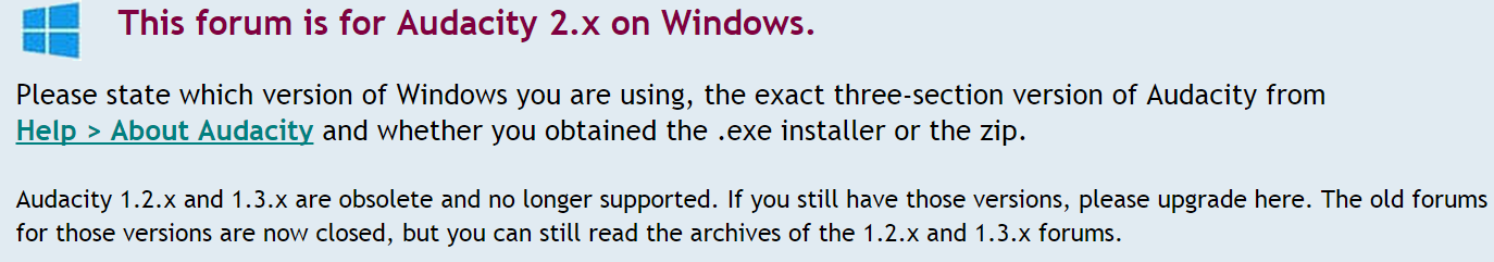
Please state which version of Windows you are using, the exact three-section version of Audacity from Help > About Audacity and whether you obtained the .exe installer or the zip.
Audacity 1.2.x and 1.3.x are obsolete and no longer supported. If you still have those versions, please upgrade here. The old forums for those versions are now closed, but you can still read the archives of the 1.2.x and 1.3.x forums.
==========================
For the above I used font size 140 for the title (we have a lot of vertical room because of the height of the icon), font size 115 for the “please state” (although 120 might look better) and size 100 (default) for the last line. Note that I have also put a hard carriage return in front of the menu span so that state on one line and also change the styling of it by bolding it and underlining it (notice here that using bold is not for emphasis but to distinguish it as a menu item). Here’s what it looks like in blue & pink:
I agree Help > Audacity should not be made to look like a link. It could possibly be bolded.
The blue background I had in mind was lighter, bluer and brighter (not part of the Forum style). However if the background can be changed on its own, I think even the blue Ed shows is an improvement.
I was using 120 size for title and first sentence but I changed per Ed’s suggestion to 140 for title.
Hard returns are rarely a good idea because they are unpredictable at different zoom settings. Width for an internal div could be set, or whitespace: nowrap can be used on the menu trail (both assuming custom BBCode works).
I bulleted both sentences. Is that better or worse?
The three font sizes looks OK, but with the bulleting I do not believe that is necessary to make the final sentence smaller. I do like making the title bigger like that – I would even try to go larger – it’s a title and might look just fine filling most of the vertical space consumed by the icon - just make sure that at a horizontal resolution of 800 it stays on one line, I guess.
Now that you mention it I understand that a hard carriage return is bad; underlining is also bad because it looks like a link (even though it’s the wrong color). However, I do think we need some method to ensure that a compound menu string (menu>item>sub-item) is visually defined as a single entity. It would be really nice if this could be defined just like (open square bracket)code(close square bracket) (open square bracket)/code(close square bracket). Personally, I would prefer to have the non-title text in a proportional serif font (Times New Roman etc.) then we could have menu items in a monospace, san-serif font (e.g. Consolas) in that dark green as in my images and titles in a proportional san-serif font.
Except that it isn’t really a title, it’s just the first line of the forum “rules”, and in my opinion it is already overemphasized and ugly without making it still bigger. Edgar mentioned his aversion to “shouting”, but huge red letters certainly look like “shouting” to me,
The “title” of the forum is “Audacity Forum” (at the top of the page in the header). The sub-board title is “Windows” (a little below the header).
We are not going to be able to force everyone to post the correct information in the correct places. Some people will always post on the first page they come to and will never read anything that we put there, even if we make it full screen and flashing. Better imo that we present a clear, helpful and welcoming forum for Audacity users.
Steve’s is right, it is not a title; it’s a sentence. Because it’s in a section set off in a different color and with an icon in the top left corner maybe it’s a bit visually confusing. Additionally, these are not all three “rules”; the first two sentences qualify but the third doesn’t seem to be a forum rule. Maybe a large “title” on the same line as the icon (and thus relating to the icon and becoming a title as it is not a sentence); then keep all the following text in the same size. Below I expanded upon the first sentence “… and newer” so that it is more in keeping with similar sentences on other pages which are considerably more restrictive/definitive.
Audacity on Windows
This forum is for help with Audacity 2.x on Windows XP and newer.
Please state which version of Windows you are using, the exact three-section version of Audacity from Help > About Audacity and whether you obtained the .exe installer or the zip.
Audacity 1.2.x and 1.3.x are obsolete and no longer supported. If you still have those versions, please upgrade here. The old forums for those versions are now closed, but you can still read the archives of the 1.2.x and 1.3.x forums.
If you look at http://forum.audacityteam.org/viewforum.php?f=46 I think “This forum is for Audacity 2.x on Windows” should be the same height as “Audacity 2.0.6 Released” in the Announcements. I set the first sentence of the rules to 120% and it is now the same height. The next sentence is now 110% and the final sentence is 100%.
I think the bullets help and this is currently much more readable than the rules for the other two platforms. These are rules, so a very slight outbreak of “instructionitis” is perfectly in order IMHO.
If we can agree to trying a different background colour then we might be able to reduce the instructional look further. For a start “This forum is for Audacity 2.x on Windows” need not then be in maroon.
We could just say “Audacity 2.x Forum for Windows”. That may be a little friendlier. No, it’s not for XP and later. We are still obliged to answer questions for 2.0.0 on Windows 98/ME.
As I said, whitespace :nowrap is needed (in a custom BBCode) to ensure the menu trail stays on one line. That can be done when we have agreed on more fundamental matters.